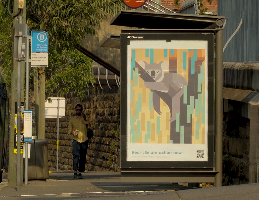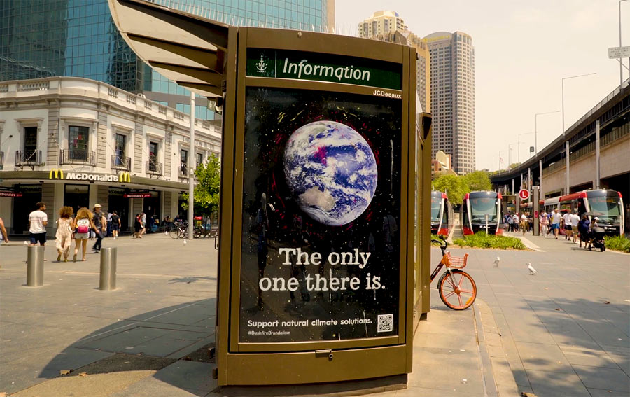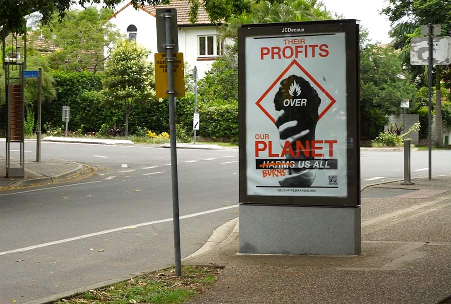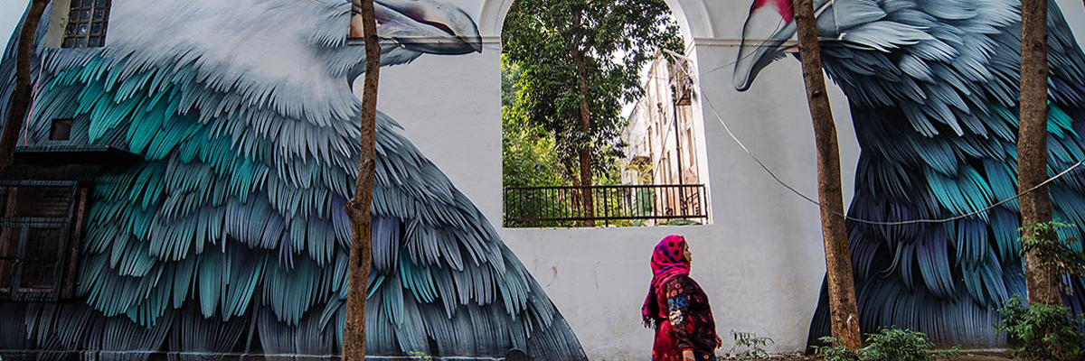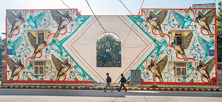
Our weekly focus on the moving image and art in the streets. And other oddities.
Now screening:
1. The Wanderers – Rone. A Film by Selina Miles
2. The Wanderers – Georgia Hill. A Film by Selina Miles
3. The Wanderers – Amok Island. A Film by Selina Miles
4. Barkaa – Blak Matriarchy

BSA Special Feature: The Wanderers -Rone, by Selina Miles
This edition of BSA Film Friday is dedicated to The Wanderers, a brilliantly human film documentary series by filmmaker Selina Miles. Today we share with you three of the six films. We published one of the films last week here – the film dedicated to Guido Van Helten. In next week’s edition of BSA Film Friday we’ll bring you the two remaining films.
“Directed by Selina Miles & Produced by Drew Macdonald This 6 x 10-minute documentary series explores Art as Adventure. The Wanderers profile six of Australia’s most exciting street artists as they take their work on the road to unexpected and unusual parts of Australia – discovering the influence of a new environment on their individual artistic styles.
From the Central Highlands of Tasmania to a farming town in regional NSW, a remote community in the Northern Territory to the islands in the Pacific, The Wanderers celebrates the amazing diversity of people and places found in Australia.
Along with a huge range of locations, each of the 6 artists featured in The Wanderers takes on a unique personal challenge. Whether reflecting on inspiration, learning more about Australian art history, or celebrating communities that often go unnoticed. This is a series about the discovery of self; of new cultures and places; and of Australia’s next generation of contemporary artists.”
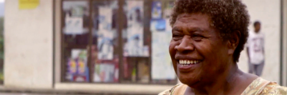
The Wanderers – Rone
“Melbourne Artist, Rone, travels to Port Vila, Vanuatu to update a cyclone-damaged wall painted several years earlier. He creates a series of portraits of local women, hoping to use his skills to form relationships with people from each neighborhood.”
The Wanderers – Amok Island
“Amok Island journeys to the Heron Island Research facility on the Great Barrier Reef, learning about the ecology of the area and seeking inspiration via underwater photography, before painting a mural at a nearby abandoned marine park.” The Wanderers
The Wanderers – Georgia Hill.
“Georgia Hill brings her monochromatic lettering and pattern work to the isolated central highlands of Tasmania, where she explores the history and remoteness of the area before painting a 10-meter mural in the historic Hydro town of Tarraleah.” The Wanderers
Barkaa – Blak Matriarchy
A powerful message and a dope track from Barkaa.
“Blak Matriarchy is a testament to Blak women… That through all the pain and trauma we carry we cannot be broken and we are still here! It’s a middle finger to all the people who discriminated against me and who were racist towards me growing up, a testimony to the strength I hold within myself and the power I feel as a Malyangapa, Barkindji woman.”