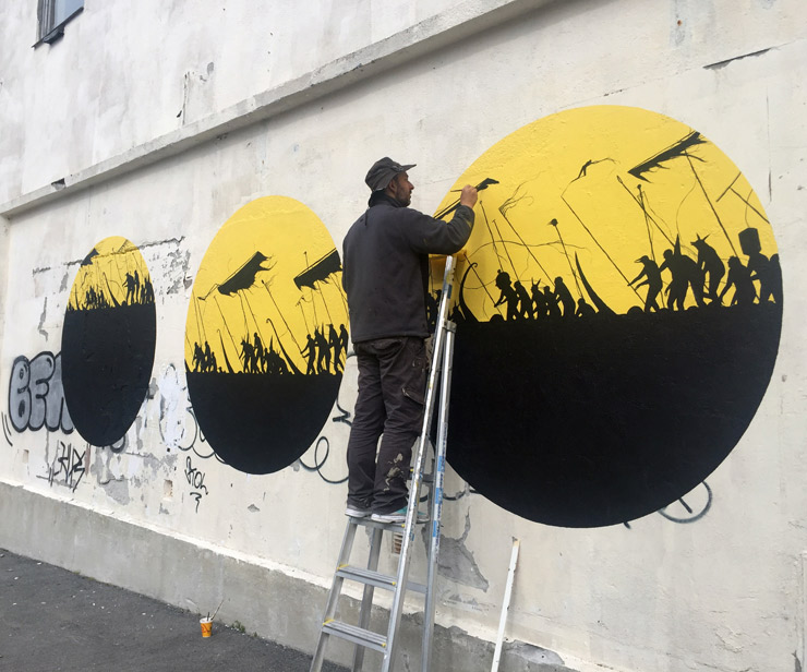
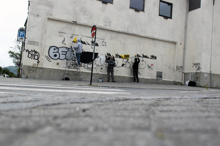
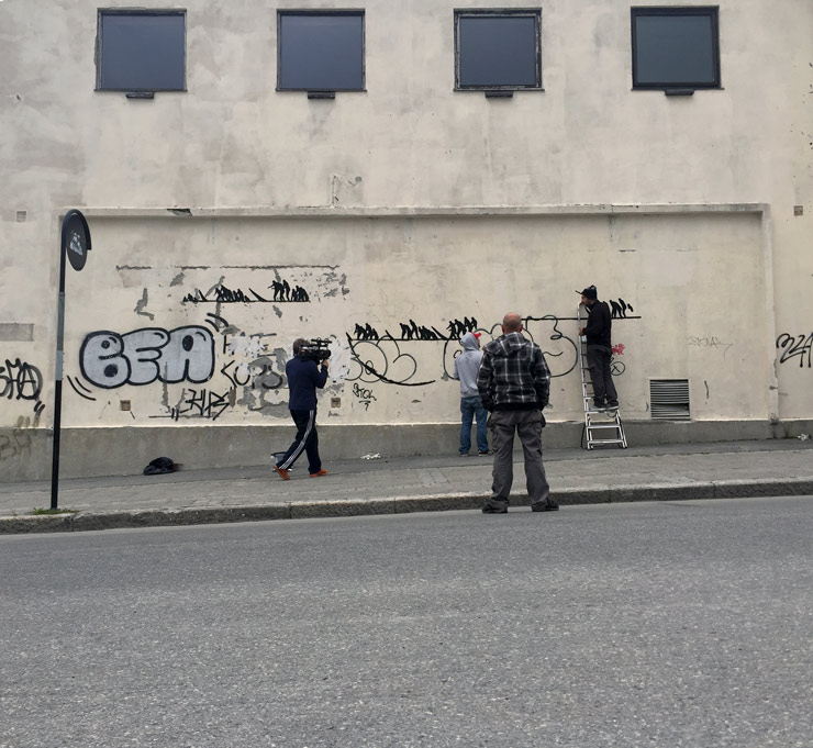
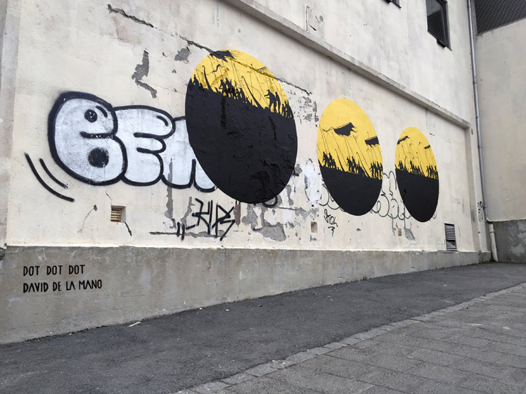
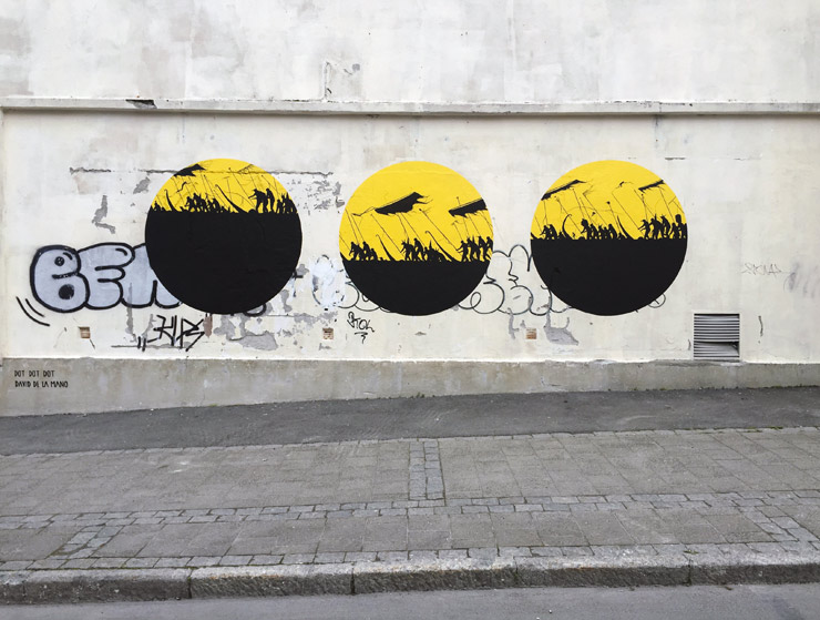
Because you just can’t get enough warfare, return with us now to the land of the Vikings…
DOTDOTDOT just collaborated with David de la Mano for an ellipses full of battling silhouetted Norsemen way up north, where the sun does not even go down this time of year. “The sun and the moon effect us there in every way in our daily life,” says DOTDOTDOT, so they call this one “Solstice”
UpNorth festival in the town of BODO says “The goal for the festival is to present high quality art for the public – in environments you wouldn´t normally expect to find this type of artistic expression.” That’s true, this city of 50,000 just above the Arctic Circle is not the first place we think of for piecing and bombing and putting up a stencil.
50,000? I think that’s how many people were at the bar last night. Seemed like it anyway.
Our weekly focus on the moving image and art in the streets. And other oddities.
Now screening :
1. Oh Joy! KUT Collective
2. EMPRESS BY YZ at New Exhibition in Beijing on Street Art
3. 3D Selfie Exhibition by Brain-Mash
BSA Special Feature: Oh Joy! KUT Collective
Oh those cat tails, waiving around in the country breeze. The mechanism of plant pollination has fascinated most of us since we were children chasing dandelions as they spread their seeds across the via fluffy light messenger. It’s the same way that genetically modified crops travel to nearby farmers fields and transform our food supply into Frankenfood eventually, thanks to big agribusiness.
But this sharply made video distills the joy of the flying cattail plant and brings it to the city in a big way. For you who always strive for finding magic in the simplest of forms and you who knows how to observe the magic that is constantly around us.
EMPRESS BY YZ at New Exhibition in Beijing on Street Art
Street Artist/ fine artist YZ was invited at the STREET ART: A global view at the CAFA Museum in Beijing – and here she is in action creating her piece for it.
Art From The Streets The History of Street Art – from New York to Beijing)
The “Art From The Streets” show runs from July 1 to August 24 at the 3B exhibition hall in the Art Museum of Central Academy of Fine Arts. It is jointly organized by the Department of Mural Painting Department of CAFA and the CAFA Art Museum, in cooperation with the Magda Danysz Gallery.
Street artists from Brazil, China, France, Italy, Portugal, Senegal, the US, and the UK will be on hand to show us their works. The opening ceremony will feature a live painting performance. This exhibition is an important archive exhibition of street art, where the audience can gain a better understanding of the history and development of street art.
Academic Advisor: Fan Di’an
Academic Director: Su Xinping
Curators: Tang Hui, Magda Danysz
Time of opening ceremony: 3:00pm,July 1st , 2016
Duration: July 1st, 2016~ August 24th, 2016
Place: 3B exhibition Hall, CAFA Art Museum
Opening time of museum: 9:30~17:30, Tuesday~Saturday (ticket sales till 17:00)
Address: No.8, South Street of Huajiadi, Chaoyang District, Beijing
Exhibition curated by Magda Danysz.
3D Exhibition Part 2 by Brain Mash
It’s all depending on your perspective of course, and Siberia based Brain-Mash creates brain-melting illusory paintings in these videos of preparation for a 3-D “Selfie Exhibition”. A team of artists and designers with background in graffiti, Brain-Mash also does commercial work together. This 3-D work requires a rare set of skills, and frankly it would be cool to see more of this kind of stuff on the street that is not selling stuff. Obviously when done right, it is amazingly engaging.
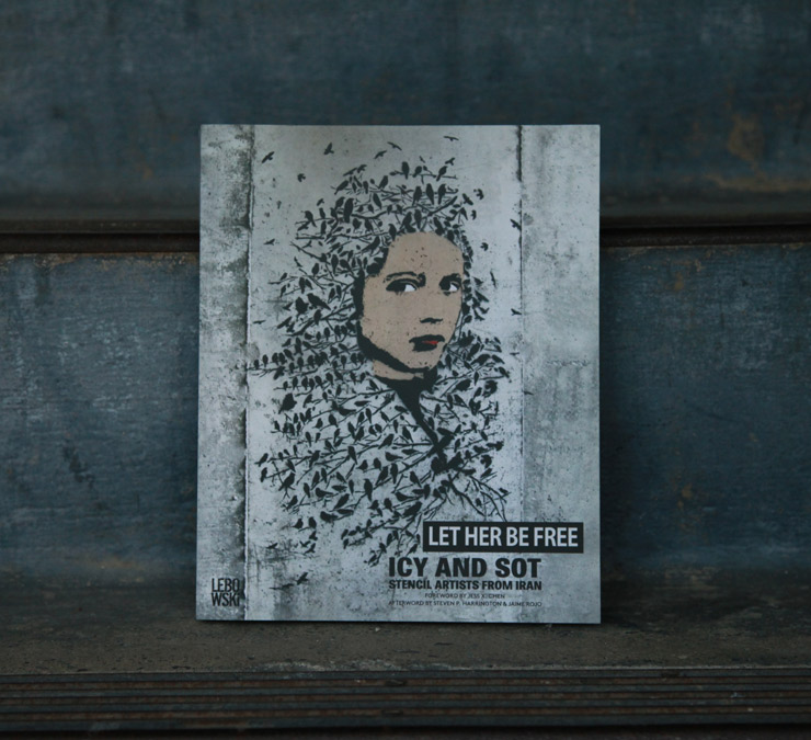
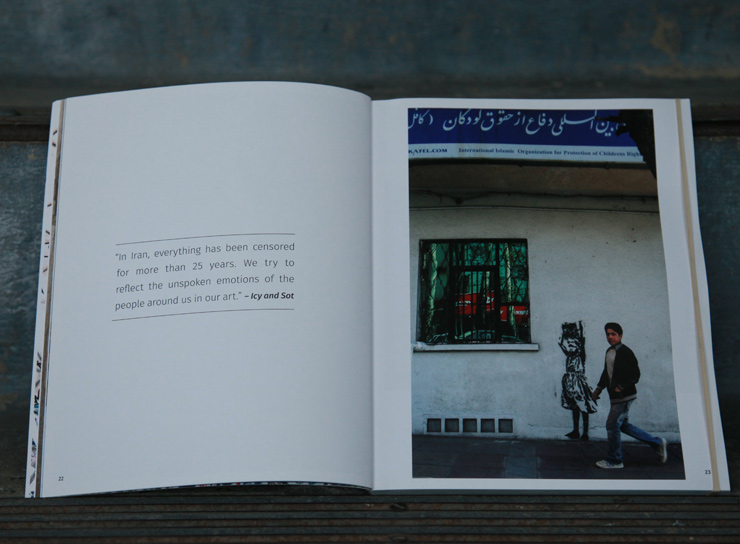
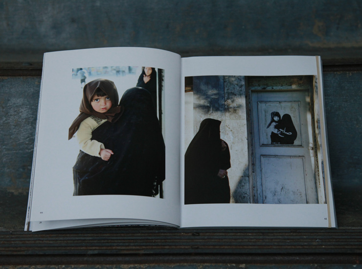
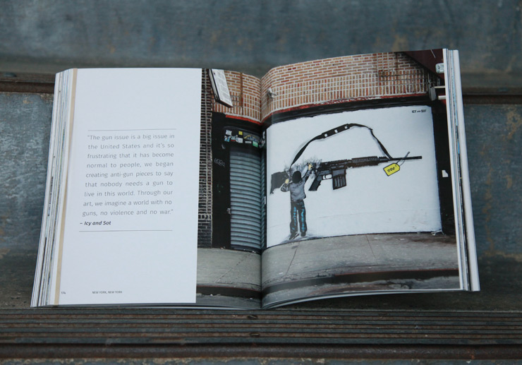
“We first met Icy and Sot the summer they arrived in New York. Their name was already preceding them on the Internet because even while still in Iran, they had developed a network of friends and collectors who had helped them to show their art in Europe. Images of their work had already caught our eye. We were lucky to be the first to interview them here.
That is how the friendship began–as immigrants to New York ourselves, we had a good feeling about them because they exhibited the right signs for success here. We’ve seen what sort of steely core you need to have internally to survive in this city and what alchemy of dreams, determination, and luck one will need to succeed as artists. We’ve watched many hopefuls come and go, feeling chewed up or put off by the love/ hate relationship most people have with this city. From the beginning, Icy and Sot appeared to have what it would take to persevere. Later we learned that they didn’t really have any other option.” – Steven P. Harrington and Jaime Rojo in “Let Her Be Free”
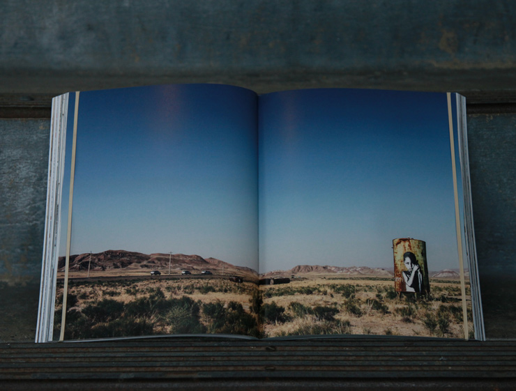
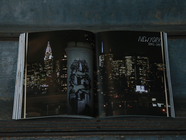
BSA is proud to tell you of this new book, the first monograph of Iranian Street Art brothers ICY & SOT, which we dedicated many hours of design, editing, interviewing, and writing to, in addition to contributing photographs by Jaime Rojo. Along with the brothers and book designer Cassandra Brinen, we spent many hours in New York meetings in apartments and cafes sorting through images and stories to find the narrative and the flow of the pages and chapters (even laying all the pages across a living room floor), all the time wondering if we could finish it in time and to the quality level and taste level everyone was looking for.
We’re pretty happy with how it turned out and we hope to meet a lot of New Yorkers this Saturday for the books official debut! Luckily, there will be plenty of brand new stencil pieces for you to see in a pop-up exhibition as well.
Published by Lebowski Publishing under the guidance and vision of owner Oscar Van Gelderen and with a forward by Jess X. Chen, “Let Her Be Free” tells the story of the first 10 years of ICY & SOT working on the street, first in their hometown Tabriz, then Tehran, then moving to Brooklyn, New York to start and continue their odyssey. You don’t find artists who are as driven and focused and willing to work like this very often, nor those who have personal and political convictions and who are using their work to express them.
We were lucky to have enough photos that charted their early years and could tell their story, and of course it helps that they are good documentors as well – a lesson for all artists! As they continue to grow professionally and personally, we look forward to them challenging us and developing their craft even further.
We’re all looking forward to meeting you this weekend – the guys will be there signing books – and if you cannot make it we hope you’ll have time to look at the book the next time you are in a bookstore or library.
Our special thanks to editor Roel van Diepen for his kind and patient expertise.
Icy & Sot “Let Her Be Free” Lebowski Publishers. Amsterdam 2016
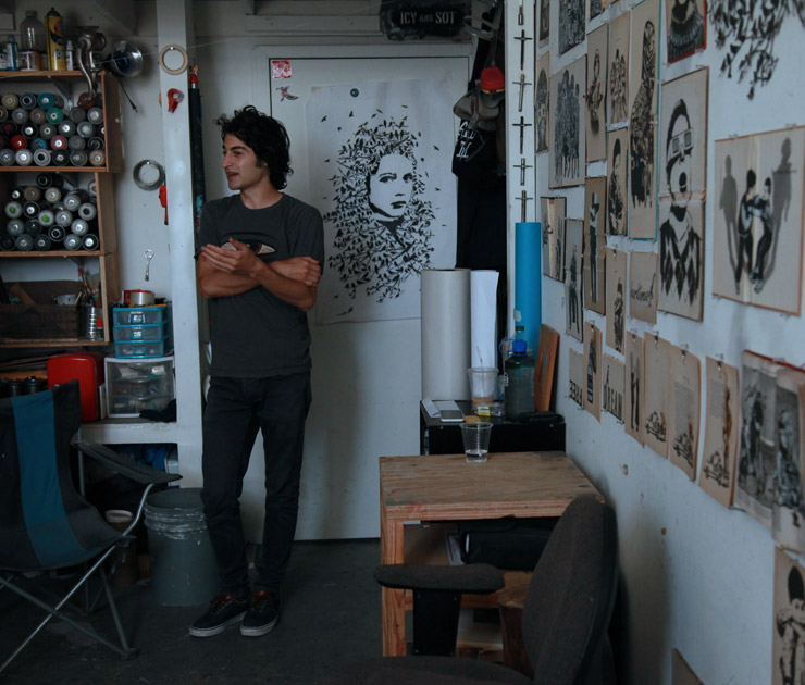
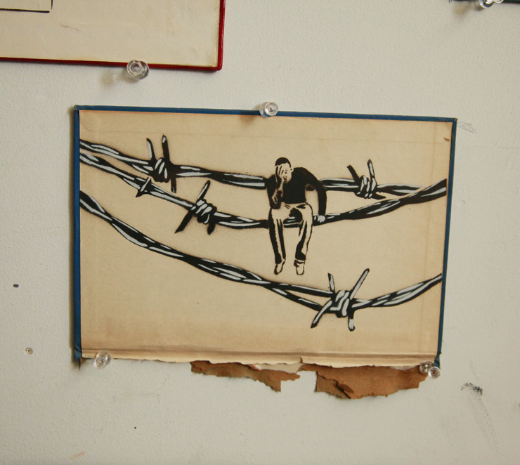
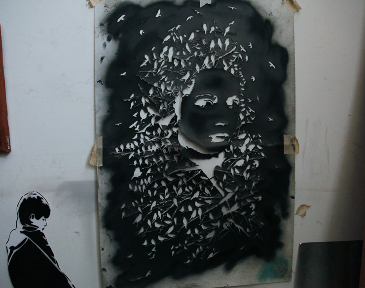
We visited Icy & Sot at their Brooklyn studio while they were busy at work getting ready for the exhibition that accompanies the book launch and asked them a few questions and took photos of some the pieces that will be on view and and available to purchase. The show will be a retrospective in miniature – as most of the pieces on view were created as a compilation of their greatest hits throughout their very short career.
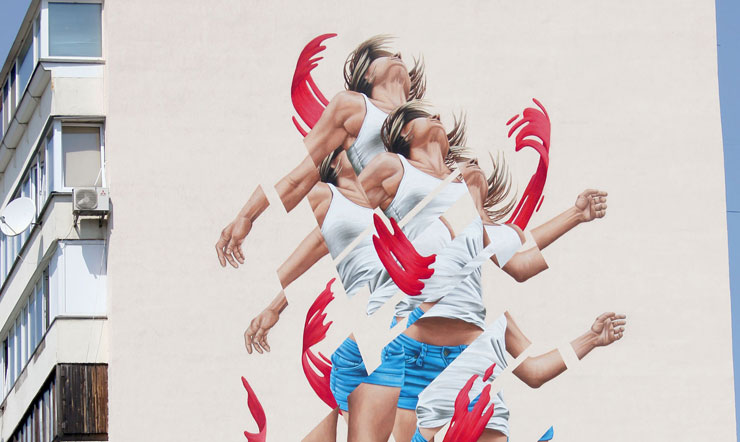
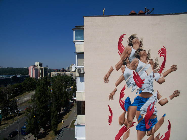
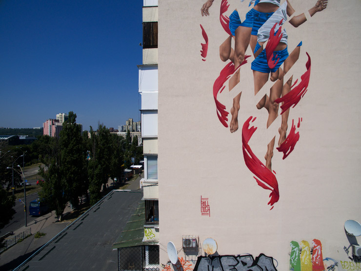
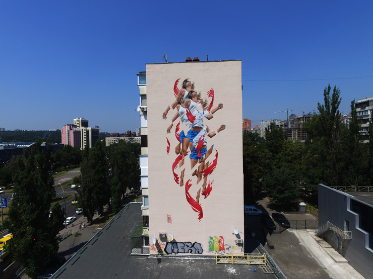
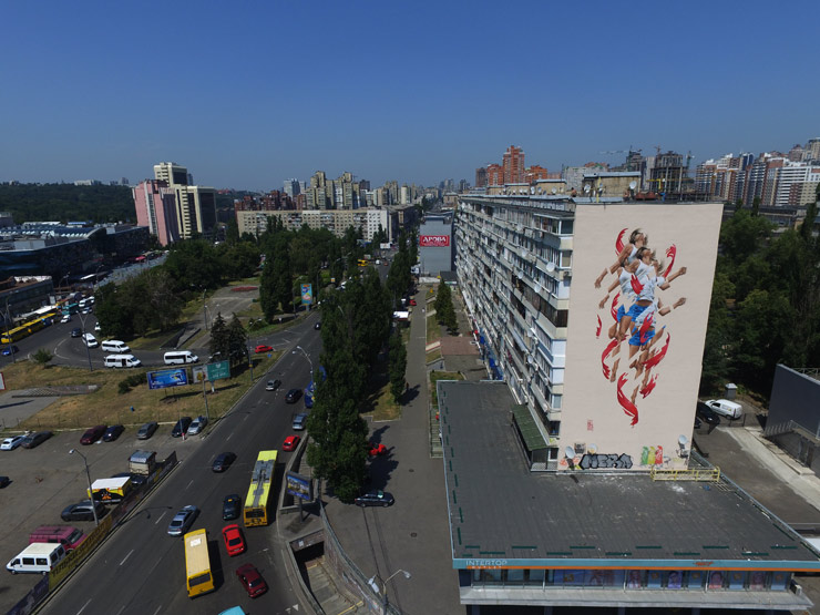
The fractured photorealism of James Bullough continues to rise on walls around the world, a precise sampling and re-laying of images that will be familiar to the viewer but rivetingly rearranged. Here in Kiev to participate in the ArtUnitedUs project, the Washington DC native who now lives in Berlin says he wanted to indirectly address the geo-political conflicts here and elsewhere on the globe that is leaving a great many people feeling stressed and discouraged.
The artist has been building a body of work that recasts the form as a digital image that can be sliced, slidden, replaced, relayered – which for most classically trained painters is anti-intuitive, as the corporeal is something to be contemplated, idealized holistically. The effect is jarring and leads the viewer to reexamine the image, perhaps trying to re-align the pieces – but we learn here that they are not always derived from one image only.
BSA:When you create this multiples effect, how do you describe it, and what does it represent to you – energy? spirit? altered perspectives? James Bullough: I began fracturing and fragmenting my figures a while back in an effort to abstract what I saw as fairly straight forward portraiture. This shifting brought a new sense of movement and energy to the work and the multiplying of elements (i.e.. hands, feet, faces, exc.) created a bit of a mind f*** which I really liked.
What may look like a simple random cutting and fracturing of a single photo is actually the result of hours and hours of work finding just the right image, or in most cases an amalgamation of multiple different images, and experimenting with countless different versions of fractures and abstractions until something really clicks.
BSA:Can you tell us about the process for this piece and how you would like it to convey a possibly optimistic message? James Bullough: The specific image I chose to use for this painting comes from a series of photos and paintings I’ve created this year called “Breaking Point”. With this series I asked my models to consider dramatic moments in life when things change instantly, good or bad, and you are not the same after.
With this direction and the choice of dancers and my models, I was able to capture amazingly dramatic positions and angles. Of the hundreds of photos that I have from this series, this image was the clear choice for the feeling of hope and transcendence that I was looking for. With the addition of the red brushstrokes swirling around her symbolizing chaos and confusion, and the fragmented figure breaking free, I offer a bit of strength and optimism to anyone seeking it.
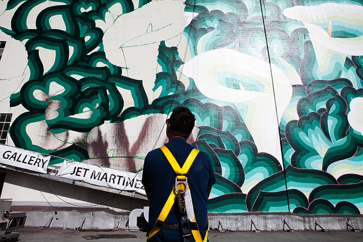
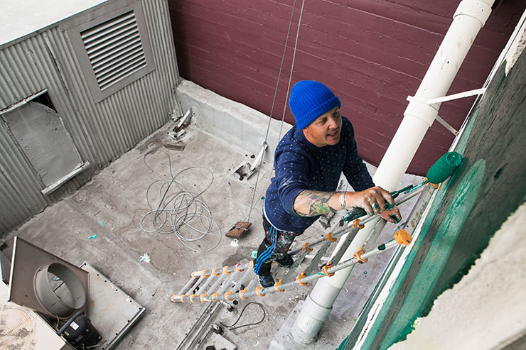
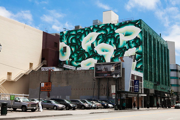
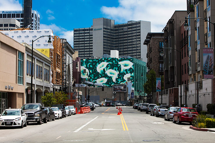
Athen B. Gallery in Oakland just produced a field of flowers with decorative muralist Jet Martinez in Oakland, California and if you were looking for something floral to look at, it will interrupt your view on this Downtown landmark. He says that beauty is necessary for this area that was ravaged by crack and high crime in the 80s and 90s.
“The I Magnin building for me has always been one of the most beautiful buildings in Oakland. A green tiled, art deco beauty, this building is a symbol of golden era from yesteryear. After the devastating effects of the Reagan drug wars and the crack epidemic, downtown Oakland became a shadow of the vibrant space it once was. Now, as downtown Oakland is experiencing a rebirth of sorts, I really felt a real responsibility to add to rather than subtract from this beautiful building and the downtown skyline. ”
Motifs come from the artists Mexican heritage, folk art, Amante paintings, textiles, and of course mural painters like Diego Rivera, who frequently featured the calla lily in his socialist commentaries. Now of course these murals are privately financed and are part of a business improvement district initiative and the presentation is strictly one of beautification.
But sometimes beautification is also cool, though to say that in the Street Art world today might get you chased out the room for encouraging gentrification or not being “real” street.
A. This is not Street Art, it is a commissioned mural.
B. Martinez is an accomplished painter AND a family man who talks about his kids and feels strongly that men can make a positive contribution to community by doing just that, creating beauty. “It is a way for me, as a man in society, to be able to contribute beauty and not just destruction. I think it’s really important in our time for men to embrace the making of beautiful spaces and I hope this achieves that goal.”
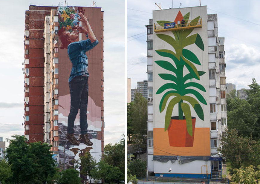
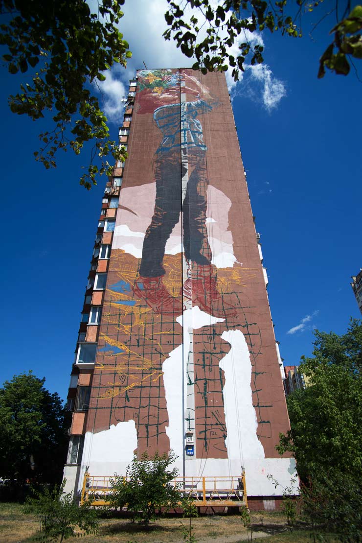
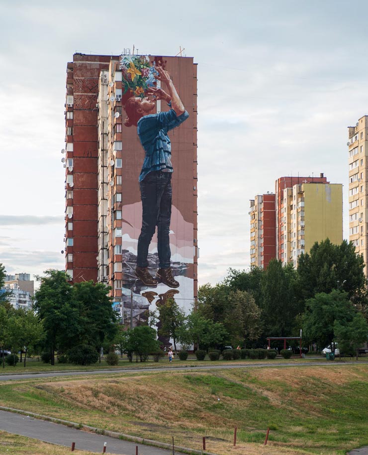
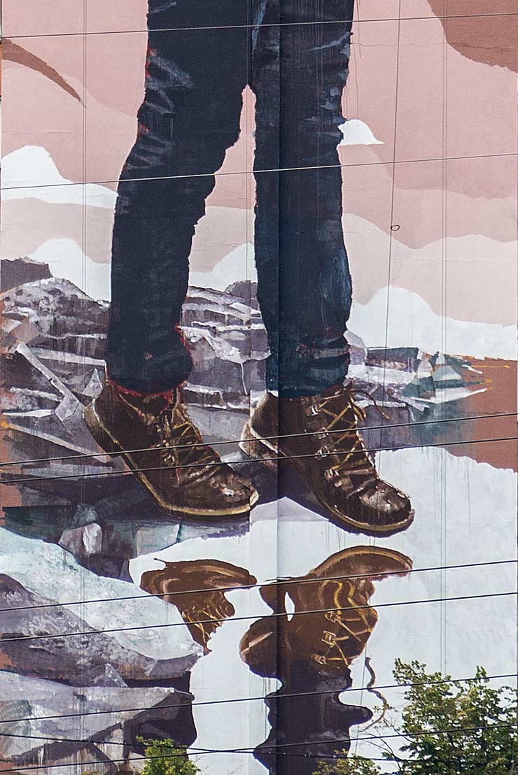
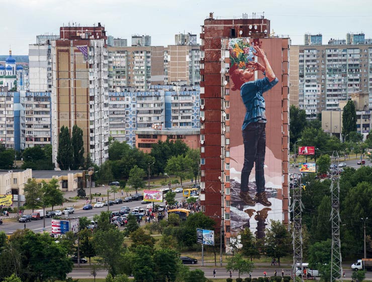
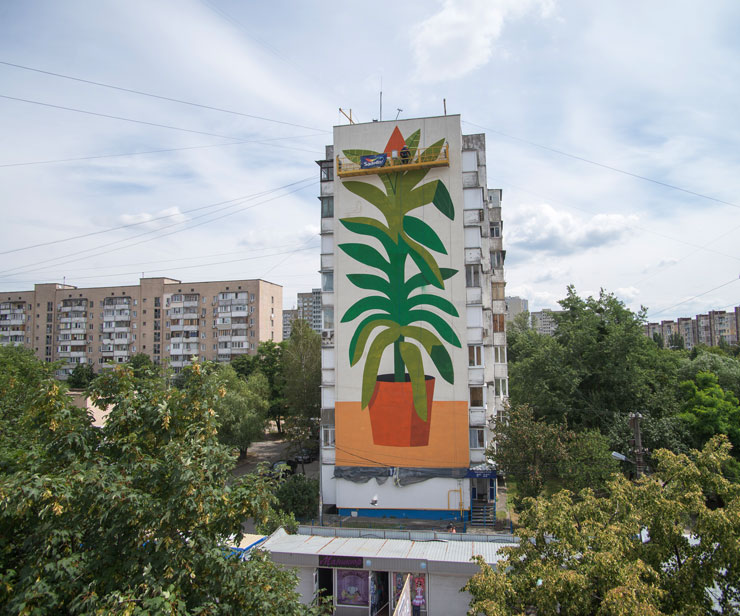
Both the Australian Fintan Magee and the Italian Agostino Iacurci have painted multi-story murals in Kiev for Mural Social Club this week with water as the primary force, the natural protagonist.
Magee has been using this theme in his murals for the last few years as this natural resource is increasingly being horded and privatized – and rising sea levels are threatening the evisceration of cities, communities and economies. Here his figure appears to be a conduit for the absorbtion of water below her and the fauna above.
Iacurci is much more of a design eye when it comes to representational flat and slightly raised forms so it is interesting how this potted plant is given to the city. He says the title of his new piece is “Water, Please!”
Our sincere thanks to the team at Mural Social Club. Founder Dmytro Palienko and curators Oleg Sosnov and Julia Ostrovska as well as the NGO Sky Art Foundation for sharing these images exclusively with BSA.
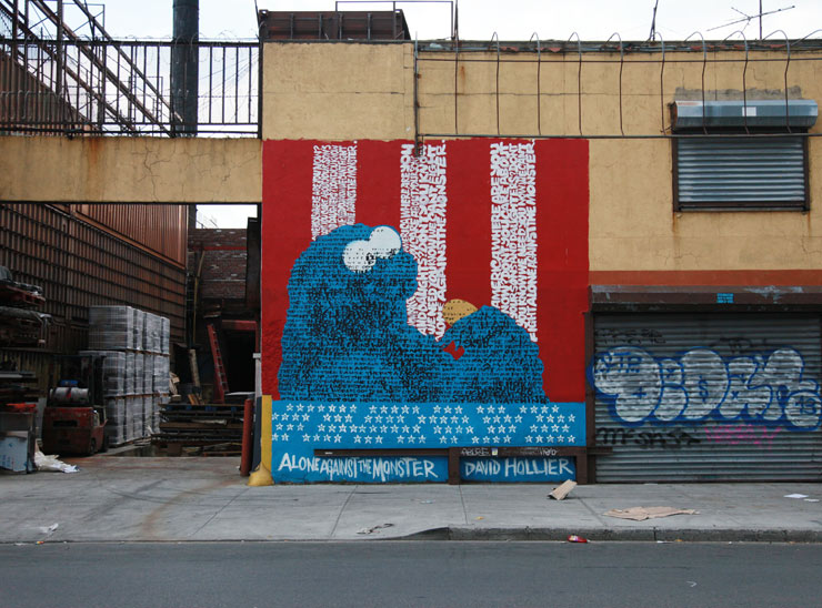
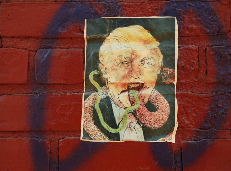
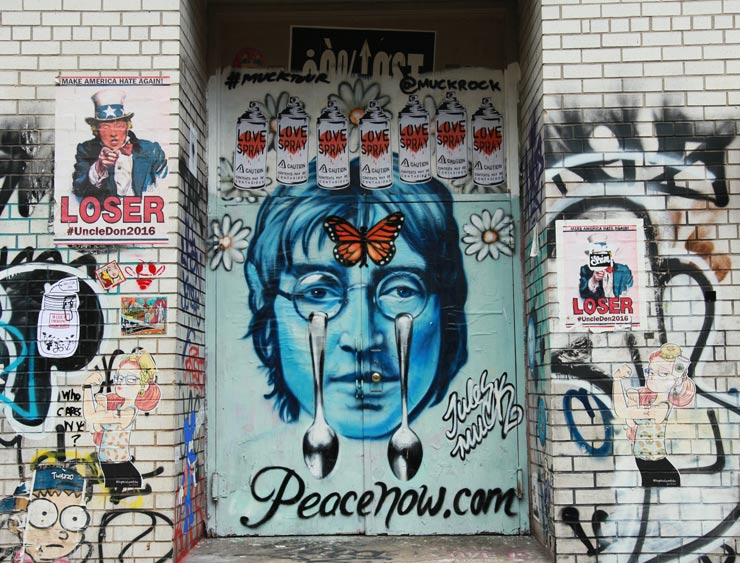
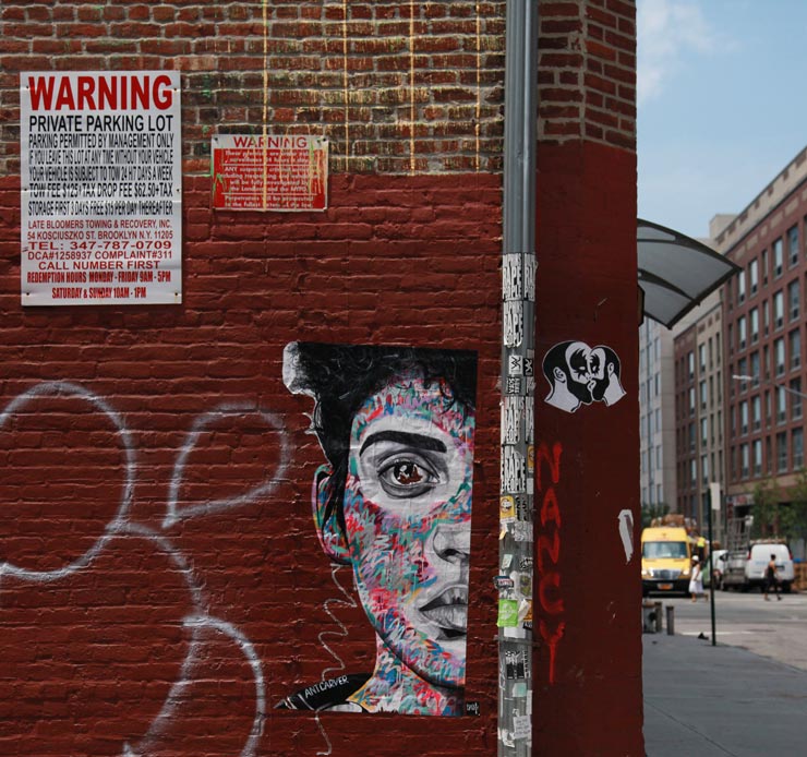
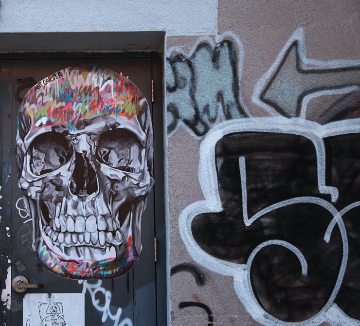
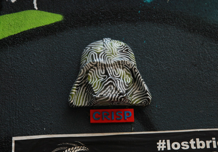
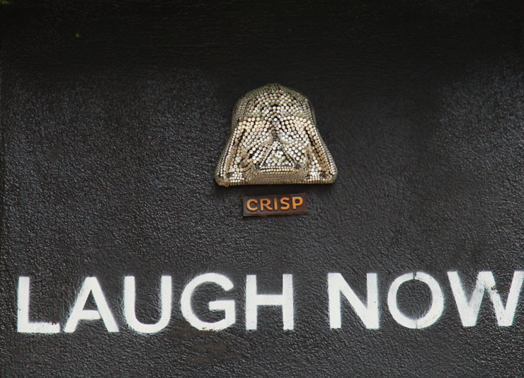
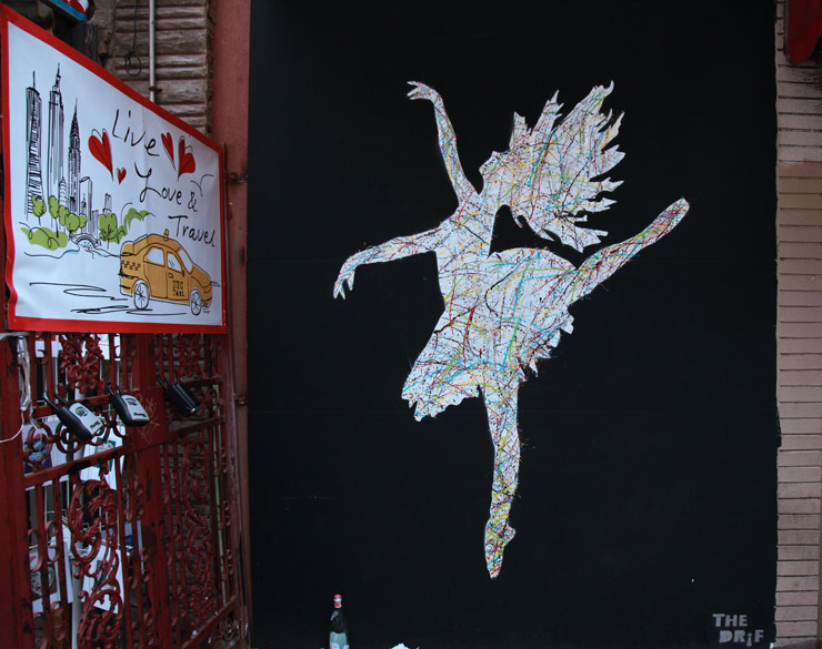
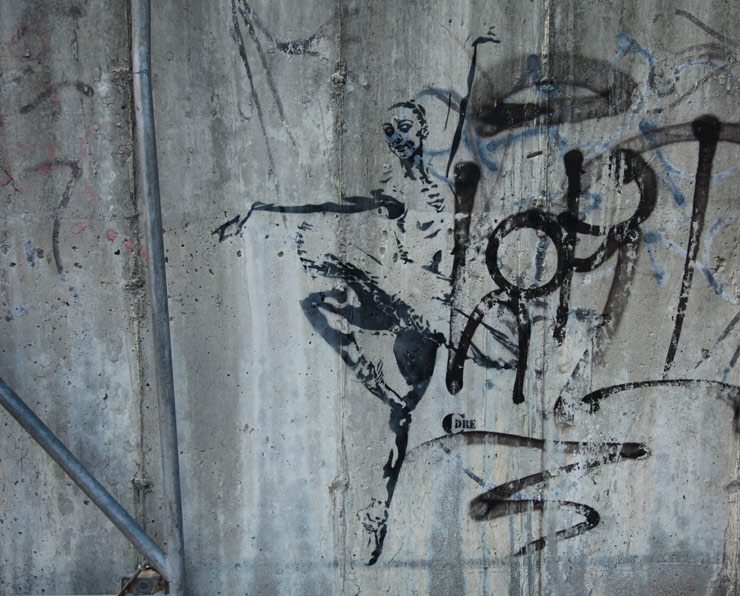
Here’s our weekly interview with the street, this week featuring American Puppet, Ant Carver, CDRE, Consumer Art, Crisp, Dain, David Hollier, Dee Dee, El Sol 25, Jules Muck, Myth, Ron English, The DRIF, and VJZ .
And let’s pay tribute to all the ballerinas out there who train so hard for years and years and days and days and hours and hours and go on the stages big and small all over the world who rapture us with their grace and artistry. We salute you!
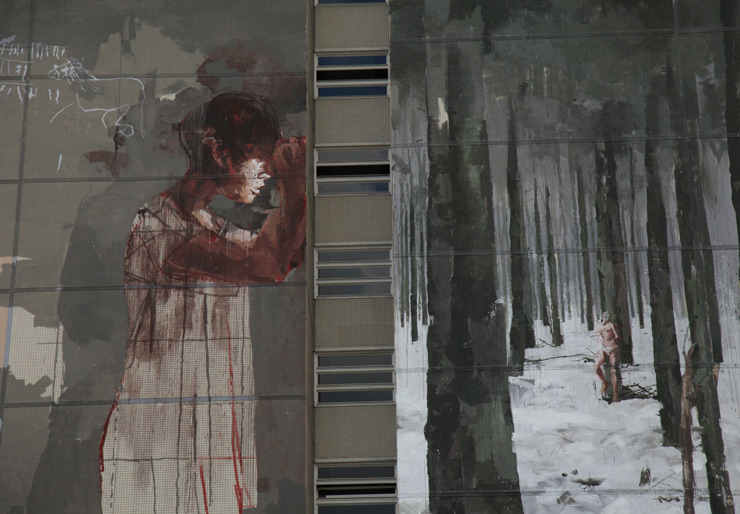
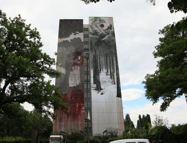
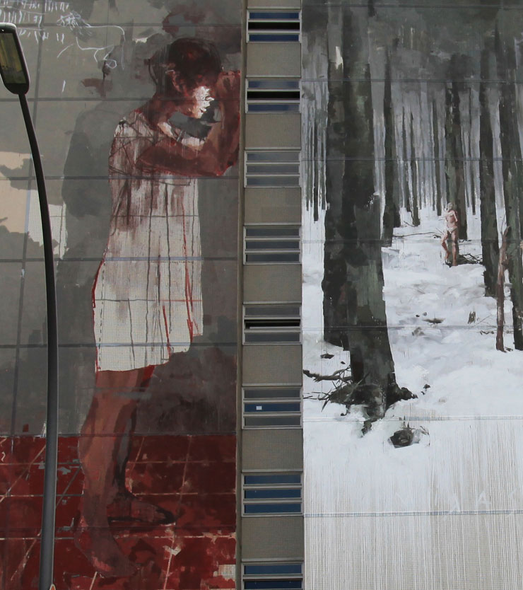
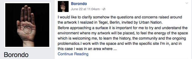
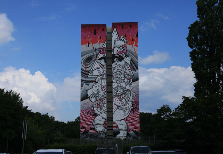
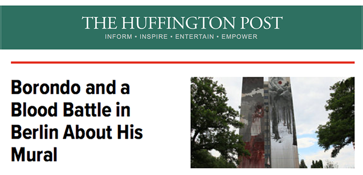
A recent mural by Street Artist and fine artist Borondo in the neighborhood of Tegel in Berlin has drawn some attention because of its potentially uncomfortable associations and imagery. Sponsored by Urban Nation as part of their “One Wall” initiative of bringing many large murals to neighborhoods across the city, this one has engaged the ire of at least a portion of the community it appears in.
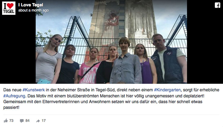
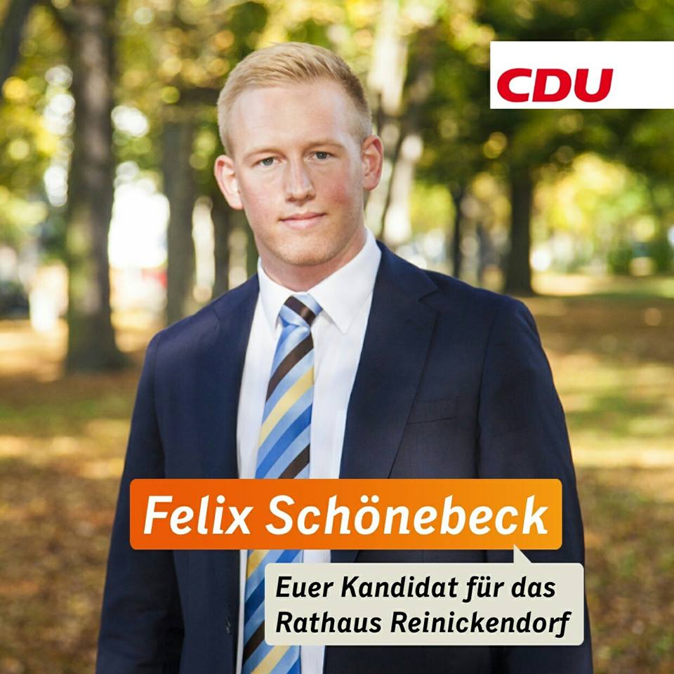
A so-called “controversy” is on media (print, online, and social) radar thanks largely in part to the efforts of one aspiring community leader and candidate for town hall on the center-right CDU ticket, who has rallied neighbors and reached out to the press to protest imagery they say is depressing and frightening because there is red paint that appears to be blood coming from the figure of the girl. The second figure tied to a tree also is a big concern. A new campaign to gather signatures on a petition has begun and accounts in the press say the group would like to find an alternate solution to this mural.
Works of art, of course, will have fans and enemies – as well as people in the middle who have no interest or opinion. This may be a similar situation with the many advertisements on the streets of Berlin featuring images of bare bottoms and breasts that are exalted salaciously from every angle, bearded leather men in carnal embraces, and various action-warriors and criminals and brandishing bloody swords and weaponry.
Berlin, by and large, appears to withstand the thousands of advertising images that undoubtedly challenge the various tastes of its populace. Last year, for example, 200 large Berlin billboards even featured a sex toy by Amorelie with the text “Multiple Orgasmen”, which for you kids and English speakers is translated as “multiple orgasms”. Naturally some racy or violent images, messages, or themes will possibly offend older folks, children, conservative Christians, Jews, Muslims, atheists and immigrants arriving from new countries.
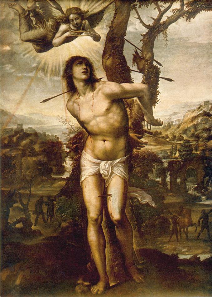
In his personal Facebook page the artist Borondo wrote a lengthy description of his surreal and metaphorical mural called, “Willkommen Refugees” (Welcome Refugees), which he created as Urban Nation’s program PM/9 this spring, curated by Justkids and StreetArtNews. In it he appears to describe the piece as a cautionary tale of looking before leaping, something we always encourage children to do. One of the figures is based on the iconic figure of Saint Sebastian, an early Christian saint and martyr venerated by both Catholic and Orthodox Churches; an interesting figure who is said to have been persecuted for his religious beliefs in Rome in 288 AD and who was comforted by Irene of Rome.
Martyrdom of Saint Sebastian, by Il Sodoma, c. 1525
Saint Sebastian has been depicted in paintings, sculpture, icons, and tattoos as tied to a tree or column, shot full of arrows.
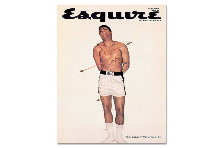
The same image has proven powerful to hundreds of artists through the centuries and has been seen publicly by varied audiences of adults and children in churches, museums, galleries, – and reprised as an archetype for fashion and editorial features in magazines and websites – including a famous one of the boxer Muhammed Ali as a martyr figure similar to Saint Sebastian on the cover of Esquire magazine, which was sold publicly on newsstands.
Borondo says he doesn’t like to impose his own interpretation on his work, which he clarifies is not meant to be just a decoration, and he indicates that he did a fair amount of research into the community, its history, even its weather, when choosing the images and the color palette. But for the sake of continued dialogue, he does break it down for viewers.
“If I explain the work my meaning seems to suggest that there is only one interpretation that is right and all others would be wrong. But sometimes the viewer’s interpretations are more interesting and completely different from the ones I had and I don’t want to close this discourse or exchange.
For me it is a poem composed by images and colors instead of words. I believe that in an art piece it is important to get not an immediate reaction but to promote critical thinking, a research of meanings and different levels of communication.
In this case I wanted to flow on the surface using different image and references to create a sort of big collage realized directly on the 14th floors high wall.
The wall is divided in two sides with a gap of windows in the centre so I used this gap to represent a wall that creates a double dimension. On the left side there’s a figure looking through a hole, while the right side depicts St. Sebastian inspired by Renaissance paintings inserted in a snow forest with a cloud accumulation on top. The “wall” represents a division, a frontier and in this case creates a distance: outside the drama and inside an empty room with a small hole from which one can see the reality. A reality that we may pretend to not see but we need to be curious about – as the child depicted here – to know and understand.”
Not everyone is convinced by Borondo’s description of his work, and some are particularly sure that children and emotionally scarred adults who go to a nearby therapy center will be very negatively impacted. Additionally there is a sentiment that the artwork is an imposition on daily life. A user on Facebook named Katrin Balcou responds on Borondo’s posting,
“You forgot to mention, that there is a daycare for children between 1 to 6 years old next to this building and on the other side a house, which is known as the suicidehouse.
I understand what you want to tell us, but it won’t help me or other parents to explain this to our little children every day, we have to walk there. And for the Refugees, who will come there to the end of the year … I don’t know, but if I would have seen what they have seen, I would want to see something different at a place, which will be my new home in safety … no reminder every day of a horrible past.
The real Problem I see here, even if I know the picture by now, I have no chance, not to look at it every morning and evening, when I cross the Street there. Art is good and needed, but I want to decide by myself, if I want to see it or not and here you force me to look at it and that is — for me — no art anymore.”
Online and on TV, Felix Schönebeck has been at the front of the protest against the mural and he is also running as one of the youngest candidates for the CDU this September. Mr. Schönebeck is not quoted mentioning Saint Sebastian or Borondo much when he is standing before the cameras of various news stations that come to Tegel to see him and the mural. Similarly, many of the media reports don’t mention the artist or his explanation of his work. It does appear that Schönebeck has analyzed the art and has concluded that the artist has created an affront to the community.
This Borondo wall is 4th in a series of murals begun last year for the residents by some pretty famous Street Art names that include a duo named The London Police, the German twin brothers How & Nosm, and a collaboration with Collin Van Der Sluijs and Super A. Until this new Borondo mural went up this spring, Schönebeck and the community have given the other murals good marks. What is a little unclear is why these other murals have escaped criticism and threats of public petitions and media campaigns. That is perhaps one of the ironies of art – it can be very subjective.
The English Art critic Clive Bell was an advocate of formalism but his intellect also clearly recognized that our experience of art is often skewed through that other less measured and quantified quality, our emotions. In an essay from his book entitled “Art” just over a hundred years ago, Bell wrote, “The starting-point for all systems of aesthetics must be the personal experience of a peculiar emotion. The objects that provoke this emotion we call works of art. All sensitive people agree that there is a peculiar emotion provoked by works of art.”
With this in mind, it may be that the emotional response to these artists painting styles has revealed how different audiences are affected by them, because at least two of the three other murals here contain elements, that is “content” in modern Internet parlance, that could prove equally objectionable to certain viewers. However political candidates and community residents have given some paintings high marks possibly because of the artist’s particular aesthetics.
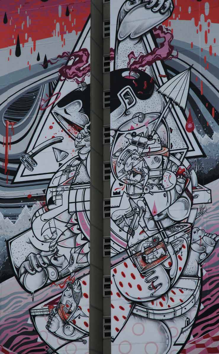
Installed for a year, the How & Nosm piece “On Tip Toes” has gone without negative comment from politicians or community members, despite what may appear to some as a composition showing a figure cut in half, bisected. There is a heavy use of the color red in their work that also could be seen as dripping or gushing blood in the various symbolic scenes that play out across the wall. Perhaps it is a matter of personal taste that this wall has been embraced to some degree – as the brother’s work contains more clearly defined, energetic geometric shapes and rhythms, emulating styles more often associated with comics, cartoons, or graphic novels.
The themes inside the illustrative forms and figures are less obvious than Borondo’s mural but How & Nosm’s work has been described in the past as including complex motifs that often address topics such as drug abuse, fraud or oppression and they personally have described many dark themes that draw from their own challenging biography in interviews.
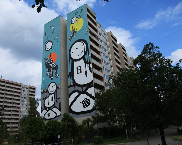
There has also been a surprising lack of commentary regarding the otherworldly scenario depicted 42 meters high by The London Police in the housing complex – at the exact end of the building that Borondo’s mural is on. Enormous sperm-like smiley faces float in the toxic green sky, gently delivering dead or nearly unconscious robot figures down on top of a Berlin cityscape. This imagery also could prove nightmarishly scary to children who can see it very clearly from the nearby playground, yet, no public campaign has arisen to protest it.
We exaggerated the description of that mural, but for illustrative purposes. One can see, as most people do, that art is purely subjective and has always been. Contemplating the inexact and sometimes murky quality of an artists’ expression may be frightening to some viewers, reassuring and encouraging to others.
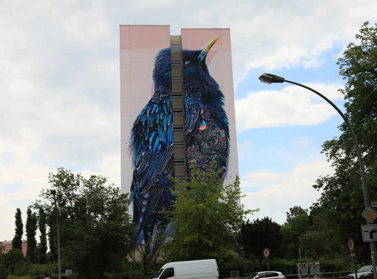
On the day we went to see this contested mural we saw perhaps of handful of people on a typical weekday walking by it, including an older couple who stopped to snap a photo of the mural as well as the Collin Van Der Sluijs and Super A collaboration next to it of a multi-hued bird. Neither seemed particularly unnerved but were pleasantly pointing to areas of it and discussing it – which rather seems to be to point of public art. They walked further up the sidewalk, albeit slowly. We also saw a few kids riding bicycles past, and a family of father, mother and two kids get into a car parked across the street from it. It was not evident superficially that the mural had impacted them, but of course we are not social scientists. We did notice that the sky was grey and cloudy, and the atmospheric quality of Borondo’s piece rather blended directly into it.
Full disclosure, we have worked with Urban Nation as curators of art and artists, most recently for our “Persons of Interest” show in the nascent UN museum space for a show the Spring of 2015, so we are familiar with at least that part of the organization and it’s director, Yasha Young. From an intellectual perspective on how our show was handled by UN, we can say that our 12 Brooklyn-based artists delved deeply into the cultural and social history of Berlin as well as Brooklyn, and UN stood behind some of the more challenging themes addressed directly or indirectly by artists such as religious freedom, the wearing of headscarves, feminist empowerment, immigration, African-German identity, GLBT issues, racism, corruption, the damaging effect of drugs and alcohol, celebrity culture, and depression.
As ever, one can also see the value of seeking and finding a balance with art and the community. Naturally, dialogue can be intrinsic to the success of large-scale mural projects. It will be interesting to see how the future of Borondo’s “Willkommen Refugees” plays out but we’re guessing that more discussion about the piece, its authors intentions, and the community’s opinion will be better than less.
Our weekly focus on the moving image and art in the streets. And other oddities.
Now screening :
1. In Memory: Giulio Vesprini
2. “The Yarn” Trailer.
3. Michael De Feo: Crosstown Traffic
BSA Special Feature: In Memory: Giulio Vesprini
Murals have an entirely different function in the urban environment than Street Art and graffiti, although some folks use the terms interchangeably. One of the time-honored functions of a public mural in many cities has been the “memorial mural,” the one that recalls a person or people or a significant event that has impacted a neighborhood, even a nation. Because it is artwork mounted publicly, it can be used as a meeting point for people in a community to gather and talk about it, trading stories and impressions and gaining understanding. At its’ worst, a memorial mural can be superficial or overwrought, moralizing, even stunningly unartful.
Sometimes however, it can provide to a community a sense of pride or history, and it can be empowering. Other times there is a mental, emotional catharsis that takes place with the artwork providing a forum, a safe space to discuss the undiscussible in a public forum or simply to share in a common sense of loss, or experience some sense of healing.
“It’s not mere decoration, but deals with ethics,” says Giulio Vesprini as he paints this mural remembering Camp No.70 Monte Urano, a WWII prison camp a mile or two from the sea and Porto San Georgio, in Italy. “So it has been very important to me that I could give my contribution.”
“The Yarn” Trailer.
“Meet the artists who are redefining the tradition of knit and crochet, bringing yarn out of the house and into the world. Reinventing our relationship with this colorful tradition, YARN weaves together wool graffiti artists, circus performers, and structural designers into a visually-striking look at the women who are making a creative stance while building one of modern art’s hottest trends.”
Also, OLEK is in it!
Michael De Feo: Crosstown Traffic
The Flower Guy has found a way to parlay his decorative style further, coupling advertising imagery with his simple organic abstract shapes and patterns. Here he tells you how he rather stumbled upon this new direction, an approach that looks like it has taken off! Couldn’t happen to a nicer guy.
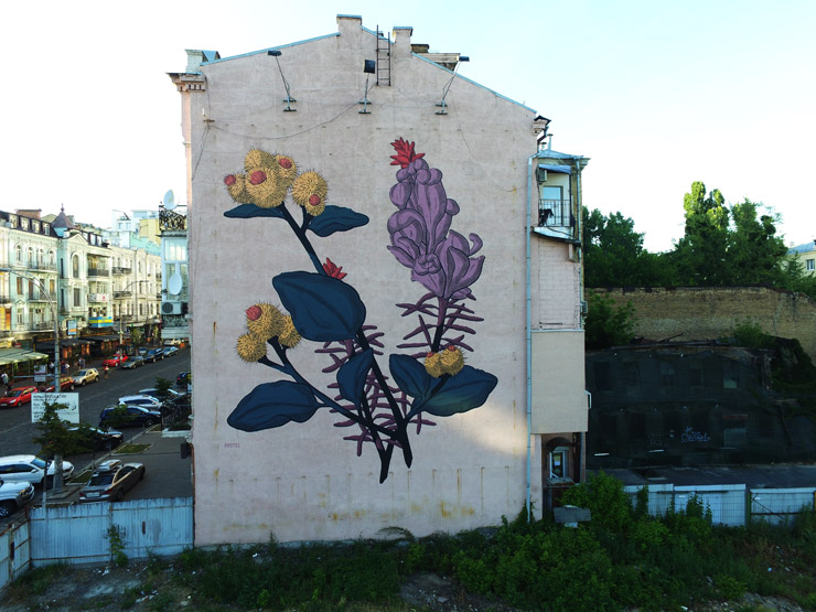
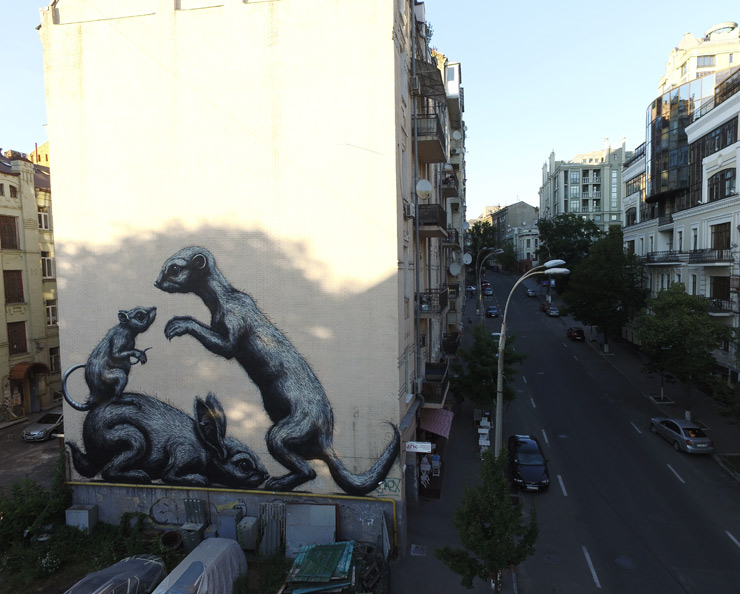
Two new pieces in Kiev from Belgian Street Artist ROA and Argentian Street Artist Pastel, both for the ArtUnitedUs project.
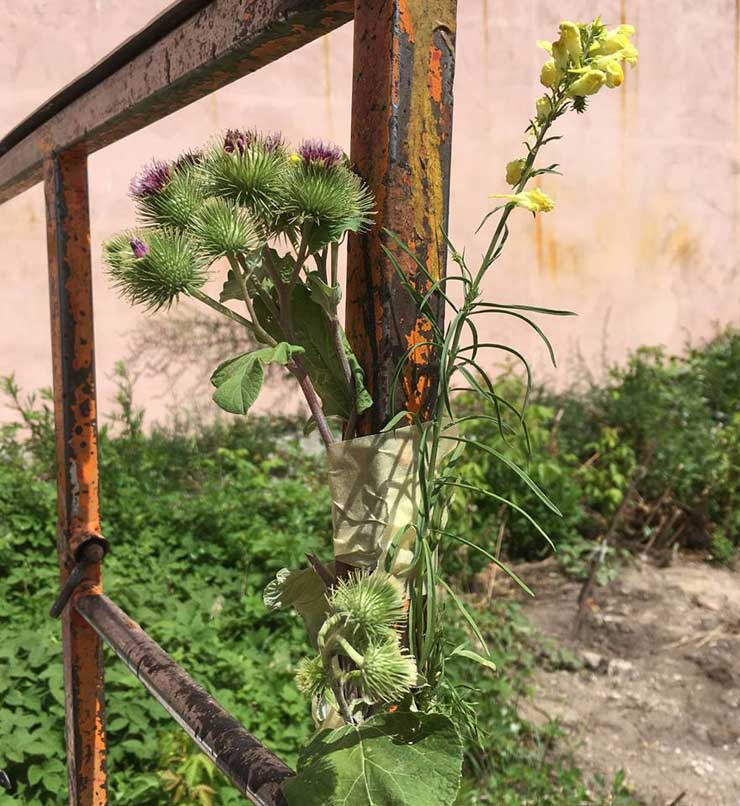
Pastel took some time to study history of the Makhnovist movement during the 1917 Russian Revolution, he says, as well as the libertarian revolution in the Ukraine. Naturally, botany was his chosen method of communicating such complex events.
He also studied local plants for inspiration, and posted this quote on his Facebook page.
“We have all flirted with freedom and, deep inside all of us have the urge to make it a serious relationship. The Anarchist values of individual freedom, grass roots democracy, and the decentralisation of all forms of power are, if anything, more pertinent today then over. See you on the barricades.” -Tony Allen, Kiev
See here a photo he used for a sketch of his new wall during his preparation.
In his familiar monochromatic aerosol hand rendering below ROA depicts local marginalized friends from the animal world. His practice is to study his host city and find the local animals that are not commonly celebrated or thought of very often, in effect giving them a visual voice in the cityscape. His painting took five days and was slowed by a painful foot problem, but ultimately he powered through.
Rafael Schacter Takes a More Nuanced Approach to the Migration Crisis
Commerce and technology have been eroding traditional constructs of the borders and boundaries, especially in the age of the Internet, satellites, transnational banking and trade agreements that create governing bodies that openly dismiss national sovereignty, integrity, identity, aspirations. Borders and boundaries are contested, guarded, or disregarded at will; open to international capital, porous to immigration, hardened by armies.
Daily they are in the headlines: Trump’s plans to build a wall along the US-Mexican border, Syrian war refugees immigrating across European borders, Israel and Palestine’s ongoing land and settlement disputes, even maritime territorial claims of China and the Phillipines in the South China Sea that were ruled upon yesterday – all reveal clues to our historically complicated relationships and geo-political perspectives.
Art to the rescue!
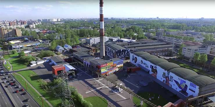
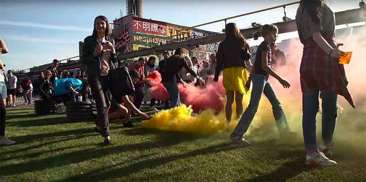
A current show mounted by primarily urban artists under the direction and curatorial vision of Rafael Schacter in Saint Petersburg, Russia takes on a thin, rich slice of this story; a conceptual examination of borders and boundaries from the perspective of migration. With global forced displacement breaking all records in 2015 at 60 million people according to the UN we clearly need to re-examine these constructs and decide what purpose/ which people borders are serving.
Sorry, we’re using terms interchangeably, which Schacter will correct us on. Toward that end, we are pleased today to present Mr. Schacter, an anthropologist, researcher of street art, author, and lecturer, here on BSA to share observations and experiences from his most recent project, a fascinating show at the Street Art Museum (SAM) called Crossing Borders /Crossing Boundaries. Our thanks to the artists, only a small number of whom we are able to present here, as well as to the museum for sharing their talent and resources. A full list of the participating artists is at the end of the article.
——————————–
~ from Rafael Schacter
In May of this year, I spent nearly four weeks in Saint Petersburg curating a large scale exhibition at the Street Art Museum (SAM). The Museum, set in a functioning factory on the edge of the city, is a mammoth site. The first plastics factory in the Soviet Union, the site became partially abandoned in the 1990s after the collapse of communism, and has since been taken over and partly given over to this new museum. Containing huge outdoor and indoor spaces, the museum is truly a dream location to work.
For the summer exhibition this year, we decided to focus on what has been termed the Migration Crisis. Rather than tackling this head on, however, something that I feel can often be crass and exploitative, something that I feel can often be seen to be utilizing peoples’ hardships for artistic ‘gain’, I sought to provide a concept that could explore the theme from a more nuanced angle.
The title of the exhibition, Crossing Borders / Crossing Boundaries, thus attempted to explore the differences between these two terms; words which are often used interchangeably, but are in fact quite distinct.
Utilizing the work of renowned sociologist Richard Sennett, borders were hence posited as zones of high organic interactivity and development, engaged, permeable spaces such as the zones between the land and the sea in which different species thrive, intermix and exchange. In contrast however, boundaries were understood as guarded, impenetrable locations, locations, for example, like the territorial perimeters of creatures such as lions or wolves.
Focusing on these differences, on the fertility and vibrancy of the border compared to the sterility and aridity of the boundary, we then commissioned 20 artists from around the world to produce works on this theme.
Working with artists from a background of street art as well as contemporary art, with video artists and photographers, muralists and artivists, the exhibition is thus truly multi-media and multidisciplinary. I was beyond impressed with the results, all the artists bringing an amazing set of ideas to the table and delivering them in the most fantastic of ways.
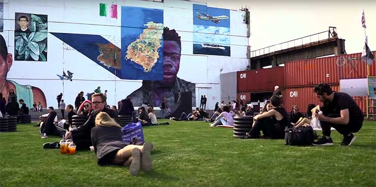
We had over 5,000 people come to our launch on May 14th, as well as a huge international conference on the topic of migration taking place in the museum on the same day. Living, working, eating and sleeping in the factory with all of the artists over the entire period of production was tough, to say the least. However the energy was unrelenting, with the artists and the whole team at SAM working without rest to deliver this incredible project.
I’m super proud of what we achieved, to both sensitively and critically explore this theme, to not just provide the traditional liberal consensus positionality but rather to challenge people’s thoughts and ideas on this topic. Who knows what effect it will have, if any. But I hope that the project can push people to think about the topic in a more nuanced rather than binary way.
Following the video are a few of the artists and their work for Crossing Borders / Crossing Boundaries
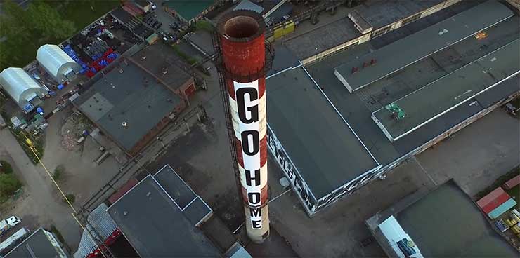
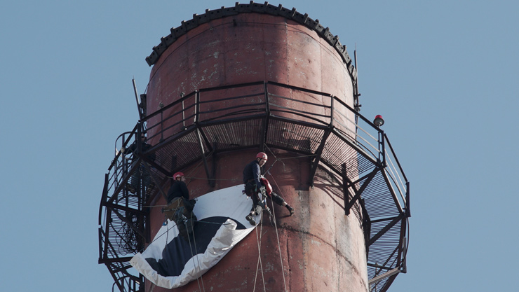
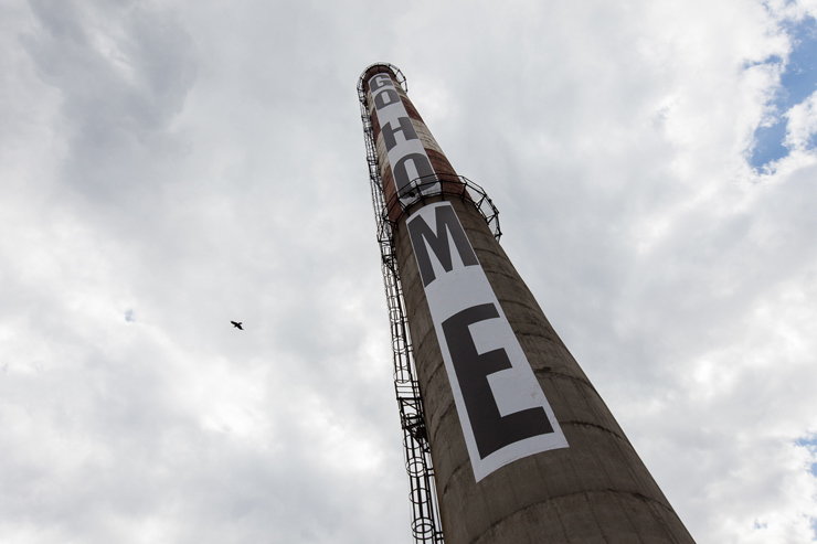
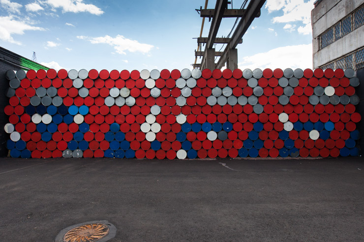
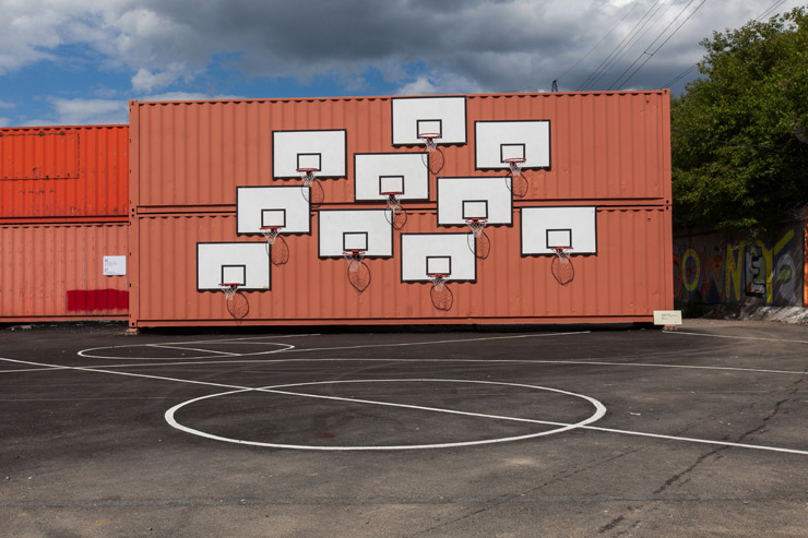
Printed banner on chimney / Acrylic paint on oil barrels / Basketball hoop and backboard on containers, acrylic paint on asphalt
SpY’s deceptively simple yet conceptually ingenious interventions focus on the upturning of spatial and societal norms. Using irony and humour to create a dialogue with the viewer, SpY attempts to impress multiple readings onto a space, re-presenting it as a “frame of endless possibilities”.
His set of works here follow this method precisely. In particular, his giant work Go Home, at first an apparently aggressive, deeply antagonistic phrase (to put it mildly), plays with the variety of meanings that this expression can contain: the very ability to go home, for example, to return back to the place of one’s family, one’s birth, one’s life, is the very thing that most immigrants desire but simply cannot undertake (whether due to war or famine, economic or ecological pressures). To be able to go home is thus a privilege that not all of us have.
As with his famous method of renegotiating the set rules of sporting activities, provoking, as he says “disorder and chaos through context and content”, SpY’s works do not simply invert or subvert their spaces but playfully distort them. They “misuse” their environments to show the latent possibilities that lie within.
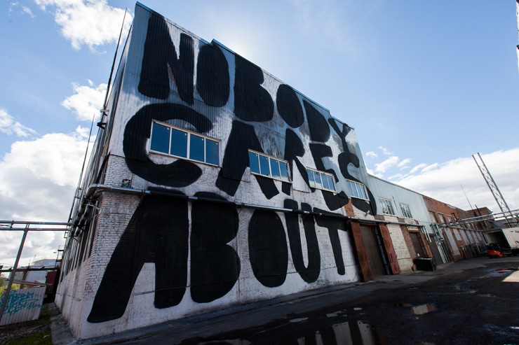
Scaffold, laminate photographic prints, flags, and spray paint and acrylic on containers / Acrylic paint on wall
Fillipo’s installation for Crossing Borders / Crossing Boundaries explores different border zones throughout the globe. From the sea border of North and South Korea to that of Mexico and California; from Morocco and Mauritania to Cambodia and Vietnam; from the invisible border between Northern Mali and the disputed territories of the Azawad; to abandoned NATO bunkers at the Belgian Dutch border, these images present us with some of the most politically fraught locations on the planet which, somehow, contain a strangely alluring beauty. Alongside this, Filippo presents a series of Whatsapp conversations documenting his personal struggle to gain entry into Russia for this exhibition: a series of Kafkaesque scenarios in which he was sent from location to location in a seeming test of his resistance. The installation as a whole can be seen to bring together Filippo’s joint obsession with political, industrial and internet aesthetics.
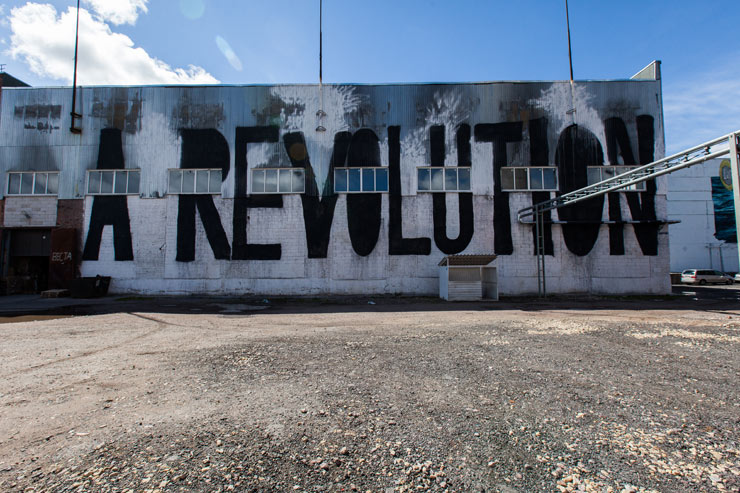
His mural, A Revolution Nobody Cares About / Nobody Cares About a Revolution speaks, quite loudly, for itself.
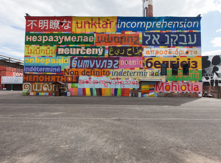
Kirill’s work for Crossing Borders / Crossing Boundaries arose through his correspondence with curator Rafael Schacter. Focusing on the barrier of language and the complexity of translation, the work is about the impossibility of understanding and the unwillingness to understand. As KIRILL says “I understood only a small percentage of what we discussed and so decided to make this the heart of the work”. It is thus the borders and boundaries of language that KIRILL takes aim. As he continues “there are two borders of misunderstanding: you see unfamiliar letters and you do not understand everything completely. Signifier and signified become equally incomprehensible. Or even it’s a familiar language, but still it is not clear”. Kirill’s work, although colourful and bright, is in fact the image of alienation. The image of the migratory and the incomprehensible.
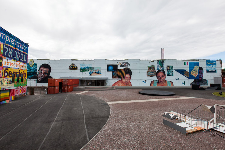
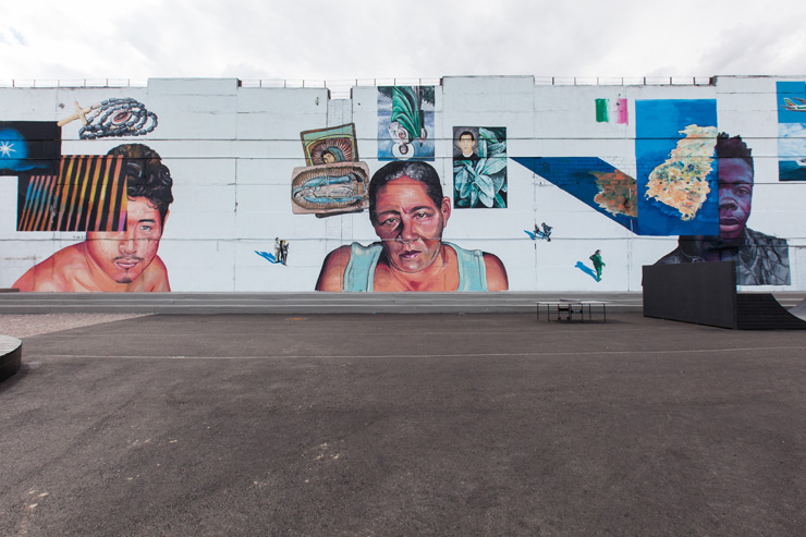
Gaia and Mata Ruda have produced a monumental work for Crossing Borders / Crossing Boundaries, a work which functions in the classical tradition of political muralism. Using imagery from the filmmaker Marc Silver and photographers Jonathan Hollingsworth and Alex Kurunis (both of whom show other work within the exhibition itself), Gaia and Ruda present us with an assemblage of figures and artefacts which together convey a dense narrative about contemporary migration. Including individuals and stories from the borders of the USA and Latin America as well as Africa and Europe, the artists also produced a group portrait of three Uzbekistani employees at the factory who work and live in the very site where the mural exists.
The story Gaia and Mata tell is one of inequality and injustice, a story of the imbalance of our contemporary global system. Yet within this it contains hope and strength, the strength of the individuals who strive to fight these inequities on a daily basis.
Nano4814’s half-abstract, half-figurative mural for Crossing Borders / Crossing Boundaries demonstrates the strangely discomforting yet visually arresting style which we can now instantly recognize as his own. Frequently focusing upon the apprehension he has with his own work, Nano’s characters can often be seen to be in states of tension or strain (both literally and metaphorically), an angst reinforced by their compressed captivity within their sites. Moreover, his use of brick-walls, barriers, and wooden shards, symbols that act as leitmotifs throughout his work, play with the idea of boundaries as objects that encourage intrusion and trespass: Like masks, these borders both suggest and occlude a veiled truth, hinting whilst hiding, implying yet escaping. It is thus the very limitation that enables us to venture beyond.
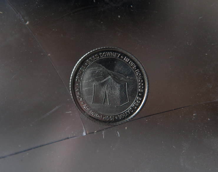
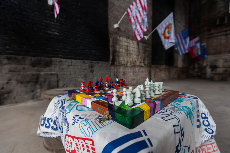
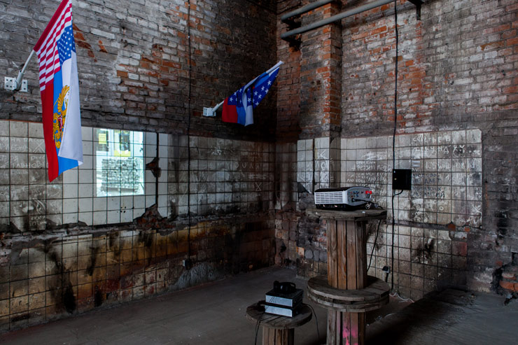
Slides, DIA projector, flags, photographs, socks, coins, drawings in collaboration with Clemens Behr, SPY, Paco, and Fillipo Minelli, computer guts, digital prints, plastic, wood, plexi-glass, mounting hardware, sound installation, radio, headphones, cables, paint, chess set, soviet fabric, and industrial spools.
Double Yippie Hollow Super Power is a joint project between artists Brad Downey from the USA and Igor Ponosov from Russia. Taking inspiration from the parlor game “cadavre exquis” or “exquisite corpse” (a method by which a collection of words or images is collaboratively assembled), the pair have sought to combine the varying national symbols of their home nations into a new, exquisite set of iconic forms. The “unity of the opposites” that they have created – utilizing objects such as flags, coins, and anthems – plays with the sacrality of these national symbols, the almost divine status that they contain. Moreover, it alludes to the strangely intimate relationship that the two countries are entwined in. Whilst apparent opposites, common enemies, both locations create their identity through their connection with the other: the objects Downey and Ponosov have thus created contain both a critical and playful edge. They ridicule the stereotypes of both themselves and each other in the same moment.
2016, Korean ink on wall / Found objects, cement, and acrylic paint on wooden palletes
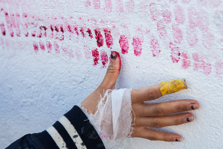
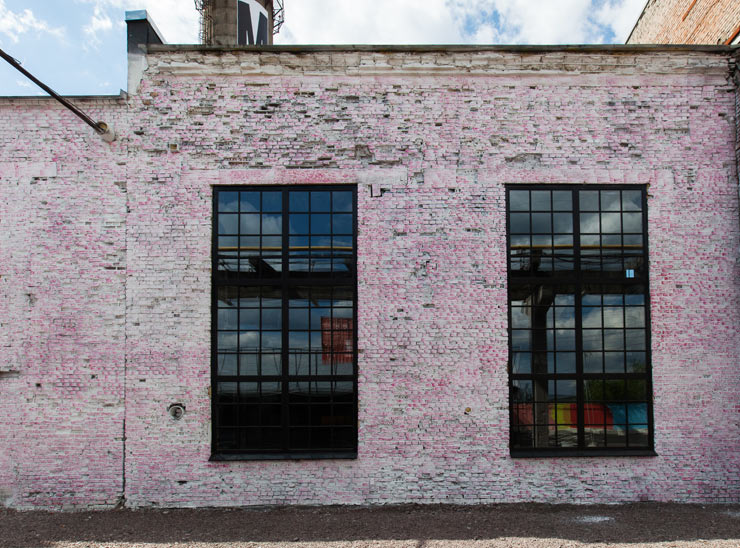
Jazoo Yang’s Dots series originates from her work in her native Korea, in particular within areas of the city going through the process of redevelopment. Using traditional Korean ink, and solely using her thumbprint (a marking used as a signature on important documents), Yang’s work sought to bring focus on the increasing amount of “redevelopment refugees” in the city
For Crossing Borders / Crossing Boundaries, Yang has expanded her Dots Series to incorporate the issue of refugees and migrants in Europe and further beyond. Working mainly on her own but also with immigrant workers from the factory itself, Yang discusses their stories, their histories, their existence with these individuals as they mark the wall together. These imprints act as a record of this moment whilst remaining entirely silent.
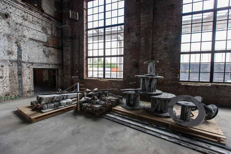
In Yang’s Painting Block Works, this theme of memory and regeneration continues. Exploring the violent so central to the contemporary city, Yang wants to ask how much we perceive our lives and make independent decisions within these oppressive environments. She aims to bring these problems to the surface through rebuilding them with the materials we so readily abandon, in Korea using objects from deserted houses and buildings, here in Russia using the detritus and ephemera of the factory itself.
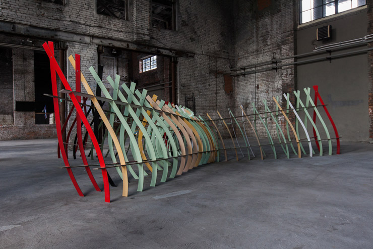
The Final Frontier (Space) / Our House (In the Middle of the Street)
Laminate doors, wooden pallets, wooden battons, hinges, and acrylic paint / Acrylic and spray paint on wall
Mimicking and playing with their settings through a process of transformative deconstruction, Clemens Behr’s geometric shapes and abstract forms come to distort the viewers’ perspective, merging two and three dimensional spaces in a single plane.
His installation for Crossing Borders / Crossing Boundaries acts as what he terms a “social maze”. Utilising one of the most classic example of borders/boundaries, the common doorway, the work explores the potentially empowering or inhibiting abilities of these structures: as one door opens, another closes, enabling some and disabling others in the same moment. As a participatory sculpture, its visual possibilities become endless. However conceptually it demonstrates how every decision we take effects those around us. Like many of Behr’s installations, this work was produced with what was at hand, in this case the products and detritus of the factory site itself.
Behr’s mural tackles another question however. Playing with the shadows and design of the adjacent fence, with the actuality of space (and time) versus the potentiality of painting, he questions the boundaries of art itself: Can it go beyond reflection to truly generate the new?
Acrylic paint on wall / Barbed wire, steel poles, metal fence, laminate warning signs
Eltono’s mural is a reaction to the absurd rationality of national boundaries. As opposed to the natural flow of borders (as can be seen in perhaps the world’s only natural country, Chile), the carving up of the planet’s boundaries happens at right angles: diagonal, horizontal, and vertical lines cutting up the planet into a perfectly linear patchwork.
As such, Eltono has created his own world map using a generative art technique; using a basic randomizer to choose a digit between 1 and 7, the numbers which emerge then come to define both the color of the country and its borders, indicating the direction that each color, and each boundary will thus take.
Unlike his mural, for his fence installation, Eltono presents us with the opposite of the rationality as seen within maps. Rather, he displays a perfectly irrational object, an upside-down fence. For Eltono, however, the inversion of the fence makes it something lighter, not an object that prevents our movement, but a compact object that can be upended “as if the wind had blown it upside down”. As he continues, “it’s not a massive obstacle anymore. A fence that can be flipped is a territory that can be freed.”
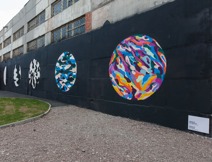
Merijn’s mural has a simple, yet vitally important message. His five globes show us the development from a basic binary of black and white to a densely colored, intricate, heterogeneous space. The final image thus shows us a planet in which, as Merijn says, “everything harmonizes. All the colors are there together and they all work and flow seamlessly with each other. Of course borders exist in many ways, but if we take it a step further and forget about the rules and just go with our feeling this is what I think can be understood as the ideal. That we should not be limited by the rationality of borders. Probably a bit of a cliché. But that’s how I see it and feel it”.
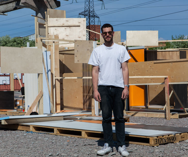
SUPERPROJECT, a two-man design operation spearheaded by visual artist Jasper Niens and industrial designer Thijs Ewalts, focus on computational design and digital fabrication, embracing art, architecture, engineering and technology. For Crossing Borders / Crossing Boundaries, they have created Four Zero, a space within a space, a location only accessible through four, tunnel-like entrances. Due to the curvature of the entrances, the visitor is not immediately sure where they will end up. As such, the work is about revealing and concealing, possibility and difficulty; once people enter the space they can either feel locked up and exposed or protected and safe within its embrace.
1001th Island: The Most Sustainable Island in Archipelago
2015/2016. Video, trash, fishing net and wood
Tita Salina’s 1001st Island is a work exploring the changing borders and boundaries of Jakarta. A city which is currently sinking between 2.9 and 6.7 inches per year, and which exists mainly below sea level, Jakarta is currently undertaking a huge land reclamation and producing a 32 kilometer sea wall to try and protect its boundaries, a project that will construct 17 new islands and take an estimated 30 years to complete. The installation presented here, a reproduction of an artificial island built by Salina and local fisherman using marine debris and litter, aims to highlight the negative impacts of the project, in particular the fact that the city refuses to fix the causes of its problems — namely, excessive groundwater extraction and inefficient waste management. Salina thus connects the reclamation and land issue with the human waste that plagues the ocean and the future of the traditional fishermen who live and work within this now perilous space.
———————————-
ARTISTS Crossing Borders / Crossing Boundaries.
Alex Kurunis, Brad Downey, Igor Posonov, Clemens Behr, El Tono, Filippo Minelli, Gaia, Mata Ruda, James Bridle, Superproject ( Jasper Niens & Thijs Ewalts, Jazoo Yang, Jonathan Hollingworth, Kirill KTO, Martha Atienza, Merijn Hos, Nano4814, Rob Pinney, SpY, Tita Salina
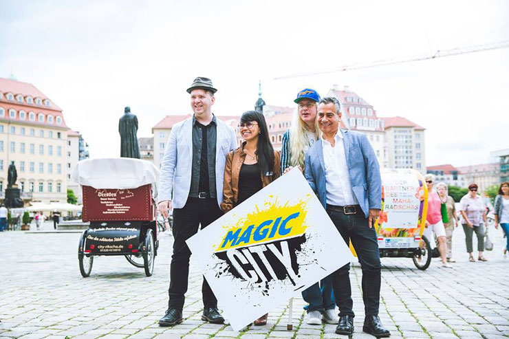
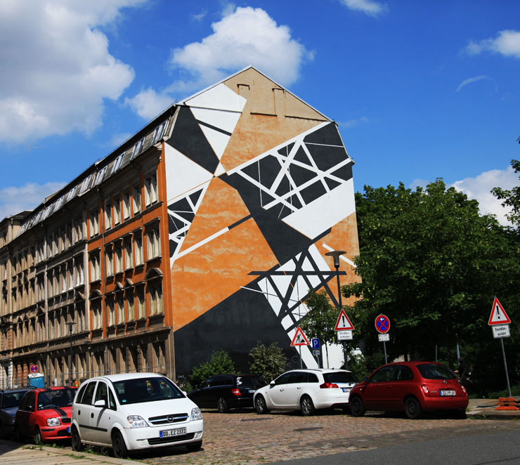
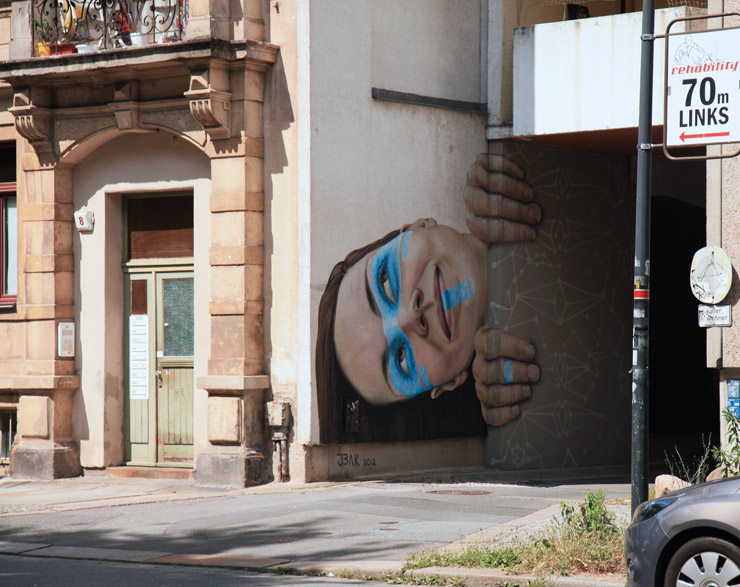
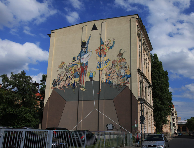
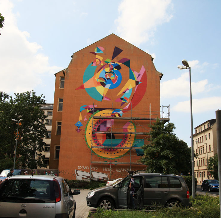
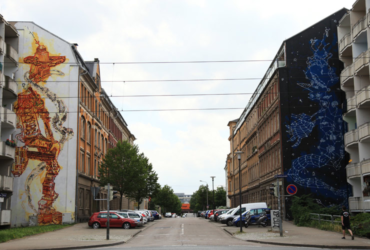
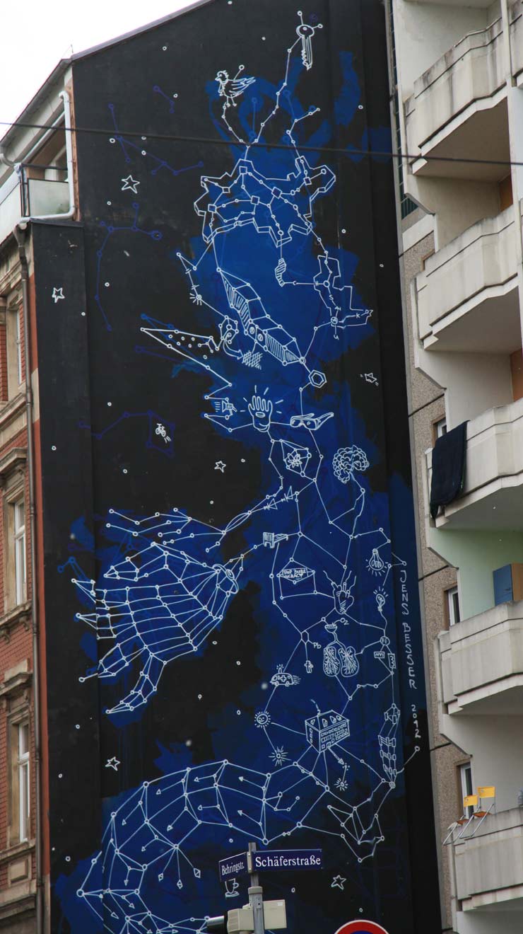
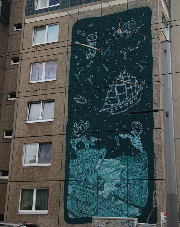
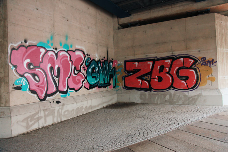
A couple of weeks ago BSA was in Dresden, Germany to help lay plans for a new Street Art show opening there this fall called “Magic City” and naturally we hit the streets with bicycles three days in a row to see the city’s graffiti, Street Art, and murals whenever time would permit. The first day we had the honor of getting a tour from Jens Besser, an artist, author, lecturer, and producer of mural festivals in the city who sped ahead of us through a labyrinth of streets to show us a number of the impressive murals he and partners have brought to the city in the last decade or so.
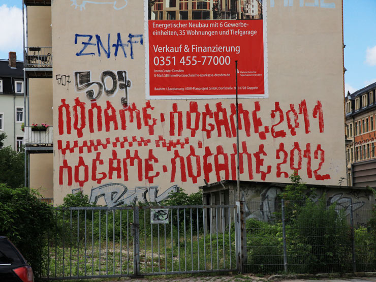
We did some investigating on our own later through Dresden’s more bohemian/neglected gritty neighborhoods but that first tour clued us in to some of the magic that can be found in this city that lies only two hours south of Berlin. The multitude of skills and voices on the street added additional color to the rich conversations we were invited to contribute to by sage and storied writer, critic and chief curator Carlo McCormick. Carlo generously asked us to be a part of his vision of a “Magic City”, a constructed simulacrum and somewhat surreal streetscape with 30+ artists creating new works of many disciplines and mediums inside a former plane engine factory here, and for years we have provided a platform for this form of storytelling on BSA so it’s fantastic to bring to a theater setting here.
McCormick has an intense affinity for the artists and the creative spirit that rivals how extensively he is versed in the antecedents, undercurrents, and greater intellectual and cultural implications of this world that is loosely described as Street Art or Urban art. We’re honored that Carlo tapped us to create a BSA Film Program to work within this newly designed city and to expand the definitions and perceptions of freewill art in the public sphere. Likewise we are grateful to the incredibly talented and ingenious Magic City team under the leadership of Christoph Scholz for inviting us on board for this project – all of which we’ll tell you more about soon.
Street art welcomes all manner of materials and methods, typically deployed without permission and without apology. This hand-formed wire piece …Read More »


