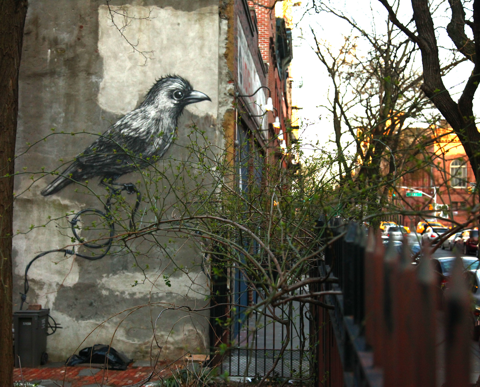
When graffiti and street art lace up hiking boots and head into rural or fully natural settings, some feel conflicted about the potential harm to plants, soil, and water. Naturalists argue that human hands should leave no trace—certainly not one out of harmony with the site. In the built environment, on the other hand—cities, towns, suburbs, strip malls, fast-food restaurants, roller rinks, bowling alleys, factories, condos, lawyers’ offices, hospitals, laundromats—the conversation around street artists and graffiti writers tends to focus on property and real-estate value, less on our impact on the Earth.
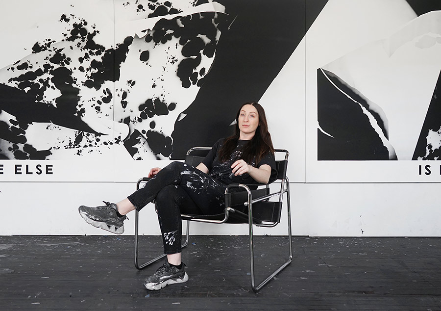
Sea162 (Alonso Murillo) is a Spanish graffiti/mural artist from the Madrid region, long associated with Collado Villalba north of the city. He began writing graffiti in the 1990s, later moving from classic graffiti into large-scale murals; his current approach merges graffiti know-how with site-responsive painting in natural or semi-natural settings.
He is known for a kind of “nature street art”: fauna and flora rendered on quarry faces, walls, and outdoor structures, frequently using earth-based pigments he gathered and developed from sites across Spain (including the Canary Islands). His compositions often integrate the rock’s relief to create volume, capitalizing on the site’s natural features.
Sea162’s approach has led him down paths street-art fans don’t typically associate with the culture, yet his evolution feels organic—especially as he has developed a practice with natural pigments. He has competed in Spain’s Liga Nacional de Graffiti in multiple editions (2021–2024). This year the Museo Nacional de Ciencias Naturales (MNCN-CSIC, Madrid) presented his 90×7 m mural “Evolución,” made with natural pigments and accompanied by a museum display about its materials and process.
He has participated in Spanish and European street-art initiatives, including painting a wolf at an outdoor rock-art event in France and multiple municipal or regional projects in Spain. His 2023 mural “El Tritón Miguelón” on the circular La Palla irrigation pond in Garcibuey (Salamanca) was selected “Best Mural of the World – April 2023” by Street Art Cities.
We asked Sea162 about his practice and this new installation:
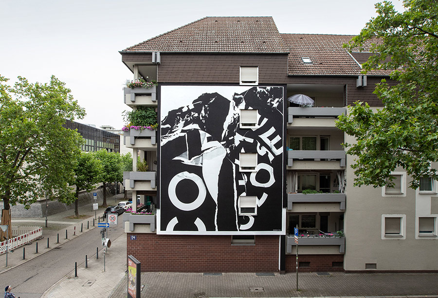
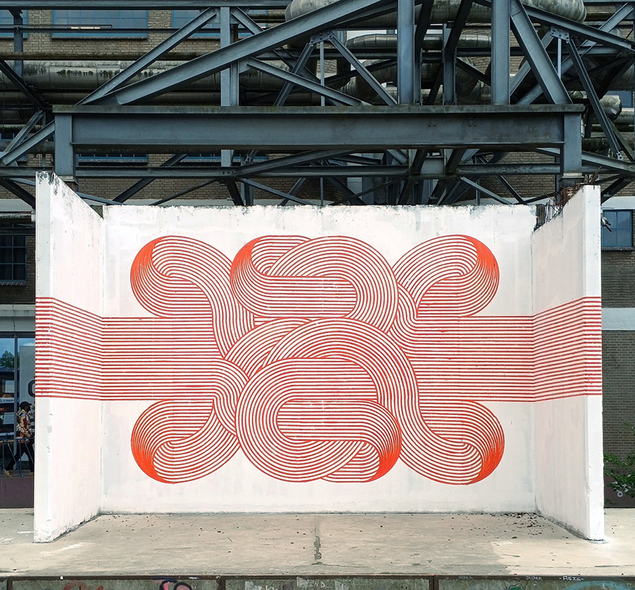
Brooklyn Street Art:Can you tell us about the setting, the placement of the art? Is it a natural swimming “pool” somewhere in a forest? SEA162: It’s an old stone quarry in the village where I live northwest of Madrid. It is inside the mountains.
BSA: The objects depicted on the mural appear to be seashells. What can you tell us about the different species of shells you painted on the rocks? SEA162: It does look like seashells, but these are organic forms that connect with the forms of the rock in a free manner of expression.
BSA:You mentioned you used natural pigments collected from different places in Spain. What can you tell us about your process of collecting and making the pigments? Do you use plants, flowers, soil, and rocks? SEA162: I usually use rocks and pigments made from minerals.
BSA:Can you describe your process of planning and selection when you paint in a natural environment? SEA162: At the beginning, I try to find a way to connect with the place and the environment. After I select the location, I begin to work on the idea and its design
BSA:By using natural pigments, is it your intention for the artwork to be washed by rain and other natural elements? SEA162: I find it essential to take care, to protect the environment and the work for the future, by natural, yet resistant materials.
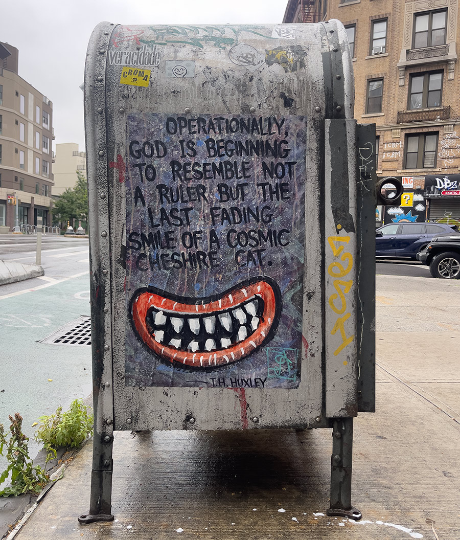
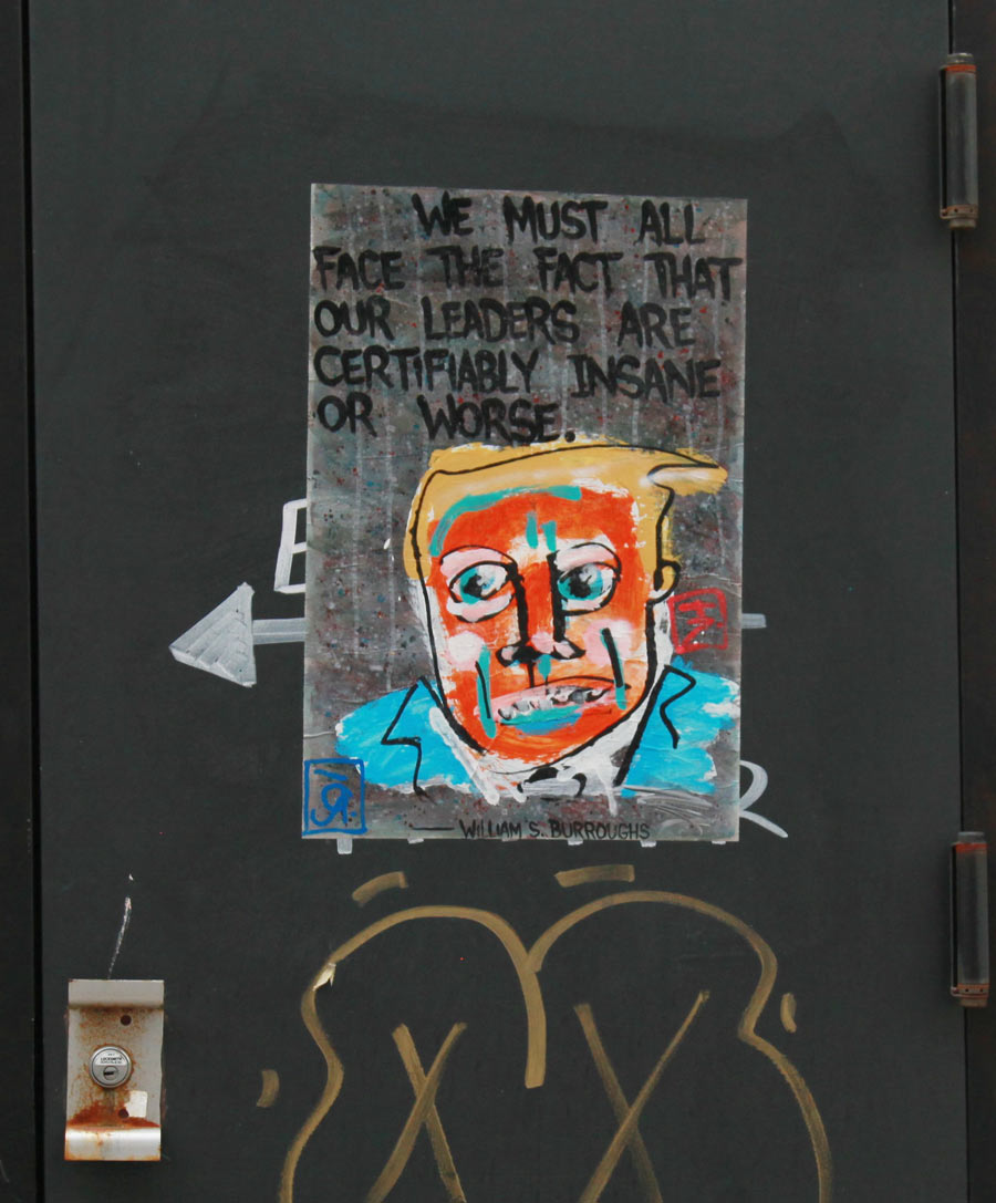
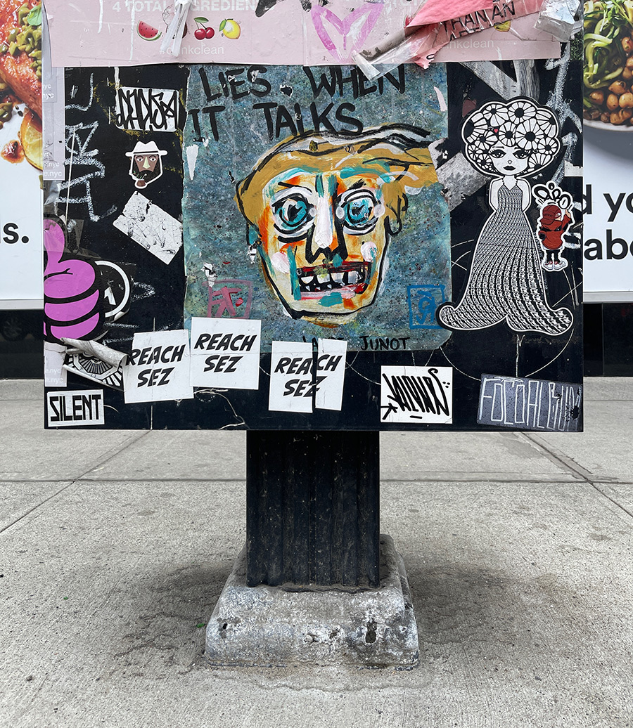
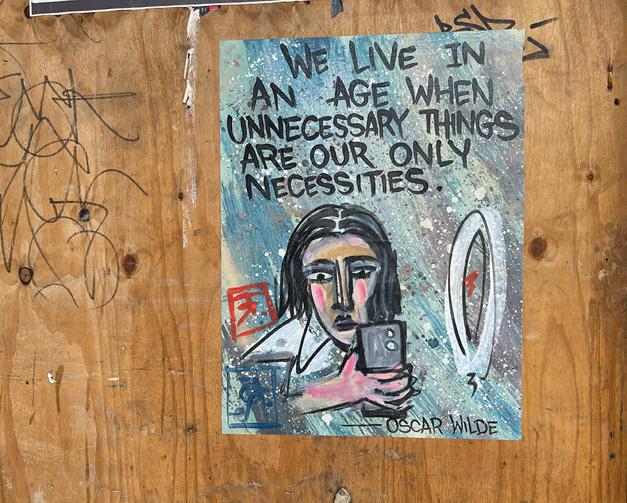
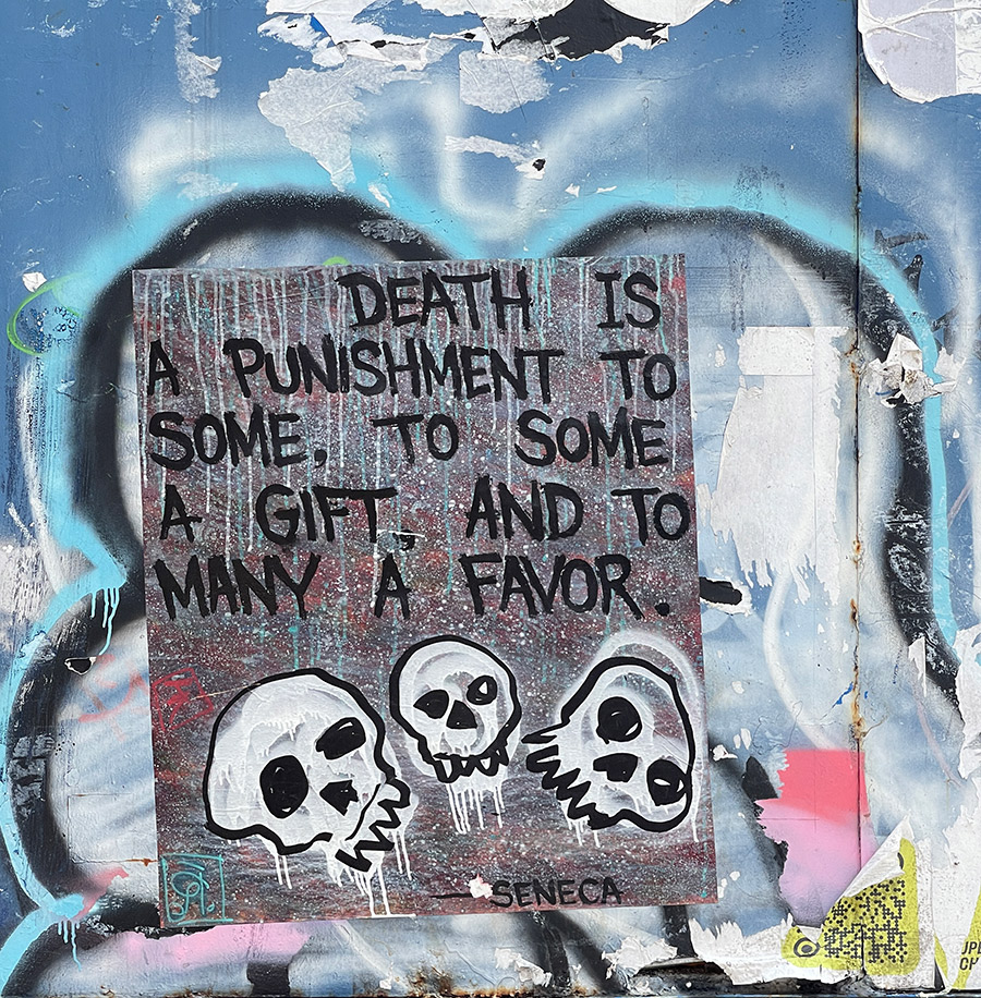
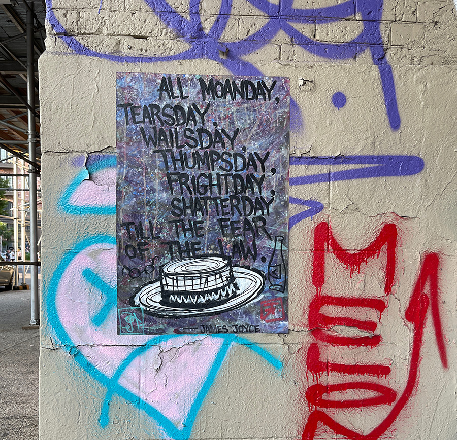
Rene Lerude & Alex Itin aren’t populists chasing the lowest common denominator with their hand-rendered one-off posters and stickers. As street artists, you might call them intellectual pranksters: observers who like their wisdom salted with cynicism, their philosophy dressed in humor, and their politics wrapped in that oily fish paper called irony. Look at the company they keep — literary heavyweights, satirists, philosophers, and contrarians. Instead of quoting hip-hop pioneers, political activists, or contemporary street philosophers, they platform Wilde, Bierce, Carlin, Vidal, and Burroughs onto that empty boarded-up lot you just trudged past.
Their words are colorfully tinted weapons, cutting through hypocrisy and mocking social pretensions. Their figures are caricature, maudlin, murky, and nearly masterfully messy. The style and understatement are of the moment, yet it carries a timeless skepticism — a stoic philosophy rooted in reason, rationality, and inquiry.
Popping up on the street often enough to grab your attention, the bards and seers they quote give you a good sense of where their heads are at: Oscar Wilde, Seneca, James Joyce, Junot Díaz, Laurence J. Peter, William S. Burroughs, T.H. Huxley, Francis Bacon, Ambrose Bierce, Gore Vidal, and George Carlin. It’s a crew of contrarians, cynics, and truth-tellers — a reminder that Rene & Alex are carrying these voices into the street not as decoration, but as conversation starters, provocations, and the occasional punchline.
Naturally, we had to talk with them, to see how they plug into the current street art scene and the fiercely independent energy of the artist-directed 17 Frost Gallery in Brooklyn that has been mounting shows by various curators over the last decade or more. That space has had more lives than a stray cat — raw, investigatory, and, when you least expect it, collaborative in a magpie sort of way. Are all the real artists today disillusioned, disgusted and absurdly darkly funny? Maybe. Or maybe every generation of free-thinkers has simply been awake, willing to poke at sore spots, willing to question conventional wisdom. With language that performs as much as it provokes, Rene & Alex show a respect for the long arc of human thought — always filtered through the grin of a trickster.
Brooklyn Street Art:When did you decide to collaborate with your art? RENE: I started making stickers to put up in bars relating to alcohol, amusing insights, quips, etc. This was around 2016. I ran out of good ones fairly quickly, so this just opened up to any topic I found interesting. Originally, these were just markers on the white stickers. I then decided to make backgrounds that looked like surfaces I was working on — paint-splattered and marked from years of use. Essentially, an abstract mess. One late evening at the Frost Gallery, Alex saw a bunch which had room under the text and went to town. That was that.
ALEX: While curating at 17 Frost Gallery, I became inspired by the open-mic Sundays we were running that attracted mostly musicians and stand-up comedians, and the odd poet. I wondered if you could do a similar thing with visual artists, street artists, and graf people. We started doing Tuesday sticker nights. One could work on any media, but the sticker game was the unifying concept: low cost, popular, public, and open for low-stakes creative collaboration… but mostly it was an excuse to hang out and meet lots of like-minded artists.
One of the things I always like to talk with artists about is money — how to make it, keep it, shake it out of trees, etc. It’s an interesting thing as a bill is about the size of a sticker. Surviving as an artist is brutal stuff, so educating yourself and your community about legal and financial questions is just good practice.
“One of the things I always like to talk with artists about is money — how to make it, keep it, shake it out of trees, etc. Surviving as an artist is brutal stuff, so educating yourself and your community about legal and financial questions is just good practice.” — Alex
In one such conversation, I was ranting about music, copyright laws, and how people in a band get or don’t get paid. I said something like Miles Davis got paid, the band usually didn’t (unless they brought the song with them). And I think I pretended to be an angry bassist ranting about Miles. A friend walked in the door and announced with great authority that Miles Davis owes him money. That joke sort of stuck and Rene wrote down the quote, and I drew a trumpet. For a while, it was just “Miles Davis owes me money,” signed by any of his many collaborators. Eventually, we started looking for other quotes.
BSA:What’s your collaboration process? Do you pass the artwork back and forth, or do you work on it together in the studio? RENE: I start the process by producing a couple of hundred stickers and posters from newsprint. Then comes the lengthy task of going through one of dozens of aphorism books and writing them all out. I pass this on to Alex and wait. He gives them back to me, I archive them, then we split them amongst ourselves.
“I see the country in a dangerous place, and positive bromides are not as important as anger and cogent analysis of our present state. So I wanted a bit of salt and burn… while still being funny.” — Alex
ALEX: The first collaborations were done together at 17 Frost, but eventually we were passing them back and forth in envelopes, often between London and New York.
BSA:How do you choose the spots in the street to place the final work? RENE: If it’s a sticker, somewhere in the cut where it won’t get taken over, but still in decent reading distance. Posters just anywhere that might rock a while.
ALEX: Placement is for me just part of putting up stickers. It’s usually a walk and improvised art installation. I try to hug up to artists I like or to try and interact with text or image. Rene hangs most of the posters, so I’m not sure how he chooses spots for those.
BSA:Alex, do you draw the characters before or after the words are given to you by Words on the Street? ALEX: Rene usually does the background and text, and I work into that.
BSA:Are the characters based on real humans? Are they portraits of people you know or see in public space? ALEX: Some of the drawings are just cartoons with broad archetypes, but also there are a lot of portraits of the various quoted people. These are drawn from photos — a thing I never do in my own studio practice. There are also a lot of Trump portraits.
BSA:Rene, you use quotes from famous people, politicians, and literature. Do you sometimes write your own thoughts and use them in collaboration with Alex? RENE: I have done a few myself, though I’ll check to make sure it hasn’t been said before — in as much as you can. Alex does more frequently than me, so we have done quite a few of those over the years.
ALEX: I have written a few quotes attributed to -itin. “Branding is for cattle” is a favorite.
BSA:Many times the messages and drawings are funny, salty, biting, and poignant. Is it hard to keep a balance when doing the art? Do you even think about keeping a balance? ALEX: One of the things I was playing with was the overly positive, banal affirmation-type quotes you see in a lot of street art. I see the country in a dangerous place, and positive bromides are not as important as anger and cogent analysis of our present state. So I wanted a bit of salt and burn… while still being funny.
BSA:The current political atmosphere must be a bonanza for your creativity and productivity in your art. Do you feel overwhelmed by the dangerous path the country is going? If you feel angry at the current administration’s actions and policies, do you use your art to channel the anger? RENE: Oddly enough I haven’t made any new posters or stickers in a couple years. Most quotes worth their salt are in some way timeless — vernacular can be different, but the sentiments always come to relevancy as time passes. That said, it’s come to a point where more of them are becoming relentlessly applicable as the weeks and months pass.
ALEX: The second term has created a quandary. I got okay at doing Trump, but I just don’t want to see his face or give any more attention to that narcissist. So it’s a quandary.
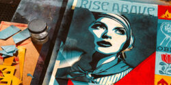
If you know Shepard Fairey, then you already know: he’s never been one to sit back and let the powers that be go unchecked, from his own plugged-in and purposeful wiseguy perspective. From Andre the Giant Has a Posse wheatpastes in the ’90s to “Hope” posters on campaign walls, his work straddles the intersections of street art, punk defiance, political critique, and populist propaganda with a purpose. He’s a true lifer—rooted in skate culture, DIY ethos, anti-authoritarian graphics, and a conviction that art can and should speak truth to power.
In this new poster campaign, DEI-TY, Shepard zeroes in on a cultural moment when long-standing efforts to make society more inclusive are being flipped upside down by those seeking to divide and conquer. Always direct, yet heavy with symbolism and art/design history, the new poster artwork pulls from Orwellian surveillance aesthetics and throws an unmistakable orange glow over its intended subject. Yes, it’s Trump—but it’s also a larger warning learned from our human history to beware of personality cults, shallow populism, and manufactured outrage.
What follows is a wide-ranging interview that captures Fairey’s frustration, clarity, and urgency—served up with the kind of seasoned insight that comes from decades of navigating art, activism, and political absurdity. Now you’ll see a sharpness in his tone that speaks to the times: an artist who considers the stakes clearly and isn’t mincing words. If you’ve followed his career, you’ll recognize the heat generated by his signature mix of bold graphics and civic fire. If you’re new to it, welcome to the resistance—art’s not dead, and Fairey’s not done.
At the end of the article, you’ll find a selection of previous works that speak to the arc of Shepard’s creative and cultural engagement. Youcan also download the new DEI-TY poster for free, to print, paste, share, and use however you see fit. Once again Fairey demonstrates that in the face of rising intolerance and authoritarian power plays, silence is complicity—and art is one hell of a megaphone.
_____________
BSA: Your poster flips the acronym DEI from a framework for equity into a confrontation with authoritarian ego. In a list of topics to address, what gave you the spark for this specific artwork?
Shepard Fairey: Of course, the verbal assault on the DEI programs at colleges and corporations infuriated me, but it became something more serious when Trump began to rescind funding to colleges and deny contracts to companies with DEI programs. I think Trump attacks DEI because he associates it with “woke” people who don’t support him. The bottom line is that Trump rewards those who stroke his ego and punishes those who don’t. Having someone that shallow and petty influence policies that impact millions is incredibly dangerous. In my original post, I laid out the definitions of Diversity, Equity, and Inclusion because they are concepts that are pretty hard for a rational, fair-minded person to disagree with. Here they are again:
Diversity: the condition of having or being composed of differing elements: variety.
Equity: the quality of being fair and impartial.
Inclusion: the act or practice of including people who have historically been excluded (often because of their race, gender, sexuality, or disability).
BSA: Many times, you have critiqued cults of personality and authoritarianism with your work. In DEI-TY, the term “self-proclaimed deity” seems aimed squarely at that. Is it the figure or the ideology that folks have beef with?
Shepard Fairey: Both. I’ve described Trump, the specific “self-proclaimed deity” referred to in the print, as the festering zit that is the hideous manifestation of the underlying bacteria. The analogy isn’t entirely accurate, though, because in Trump’s case, his influence makes the bacteria even more toxic. It’s a brutal cycle. Trump encourages his followers to scapegoat the vulnerable, vocalize and act on their worst prejudices, and then he feels emboldened to behave like a dictator and double down on the most inflammatory rhetoric and cruel policies. This is a cycle and culture that erodes civility and democracy.
BSA: You’re offering these prints as free downloads, which suggests a sense of urgency and mass mobilization. Do you see DEI-TY as part of a larger visual resistance? How do you hope people will use it?
Shepard Fairey: I always want people to mobilize. I use my art to inspire people to care, because they won’t act if they don’t care. Some of my pieces, such as DEI-TY, can also serve as tools to convey an idea… tools I’d like anyone to be able to use if they are inspired. Visibility for a counter-narrative is essential to mobilizing people and shifting culture.
BSA: How do people navigate the increasing weaponization of terms like “DEI” in political and media discourse? Do you see this poster as an intervention in a culture war? As an aside, how much of this is a genuine concern to average people, and how much is ginned up to get us to fight with each other?
Shepard Fairey: DEI should be unassailable as an idea. Somehow, Trump has turned people against bedrock principles of American philosophy like diversity, equity, and inclusion, which should be universal, while normalizing lying, scapegoating, and undermining democracy, all of which should be universally unacceptable. Yes, the culture war is his aim, and the attacks on DEI don’t impact everyone directly, but I’m a believer in the concept that injustice anywhere threatens justice everywhere.
BSA: This new imagery echoes some of your earlier pieces that blend Orwellian surveillance aesthetics with activist messaging. What’s different about DEI-TY?
Shepard Fairey: You’re right about the Orwellian aesthetic. Trump is a fascist and a menace. He doesn’t genuinely believe in freedom, except for the freedom to be a dictator. He is very Big Brother-esque in his approach to purging dissenters from government and education. The main difference is that this print uses orange (for obvious reasons) and this print addresses general principles AND specific villains. I’d love for 1984 to be irrelevant, but unfortunately, it might be more relevant in this moment than ever before in U.S. history.
SHEPARD IS OFFERING THESE TWO NEW POSTERS ABOVE FOR FREE. CLICK HERE FOR A FREE DOWNLOAD
Following are a few from the vault from Fairey that run parallel in political, social, and stylistic spirit.
Statement from Shepard Fairey for the release of the new poster:
“Please read the words DIVERSITY, EQUITY, and INCLUSION and think deeply about their meaning – individually and collectively.
Diversity: the condition of having or being composed of differing elements: variety.
Equity: the quality of being fair and impartial.
Inclusion: the act or practice of including people who have historically been excluded (often because of their race, gender, sexuality, or disability).
DEl is meant only to enhance the priority of our institutions and workplaces to provide equal opportunity to the many groups that make up our beautifully diverse nation.
These formerly unassailable ideas have been aspirationally woven into our nation’s entire history, even if our idea of who is equal has thankfully evolved to include more than just white men.
From the Declaration of Independence to the 14th Amendment granting equal protection for all citizens, to the 15th Amendment granting Black men the right to vote, to the
19th Amendment granting women the right to vote, to the Civil Rights Act outlawing discrimination based on race, color, religion, sex, or national origin, we have moved toward a more fair and less discriminatory society. The symbolism of the Statue of Liberty as a welcoming beacon to those fleeing forms of discrimination to find refuge in the melting pot of the US is a cornerstone of the American story. The current attack on DEl is nothing less than a betrayal of American values and aspirations. The attack on DEl is very literally a Republican policy of discriminating against those who oppose discrimination in their businesses and organizations.
When have racism, sexism, homophobia, or the like been okay in plain sight from our leadership, much less turned into law that punishes those trying to provide equality? I feel like I’m in a dystopian mirror world. Terrifyingly, this is here and now, and catalyzed mainly by one power-hungry narcissist who is a deranged, egomaniacal, insecure, tyrannical, yapster. If you oppose the mean-spirited embrace of discrimination like I do, please use every tool at your disposal to push back, especially by voting in EVERY election, including the midterms. We have power in numbers if we use it!”
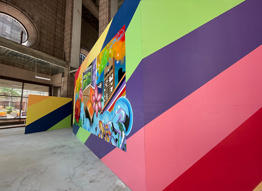
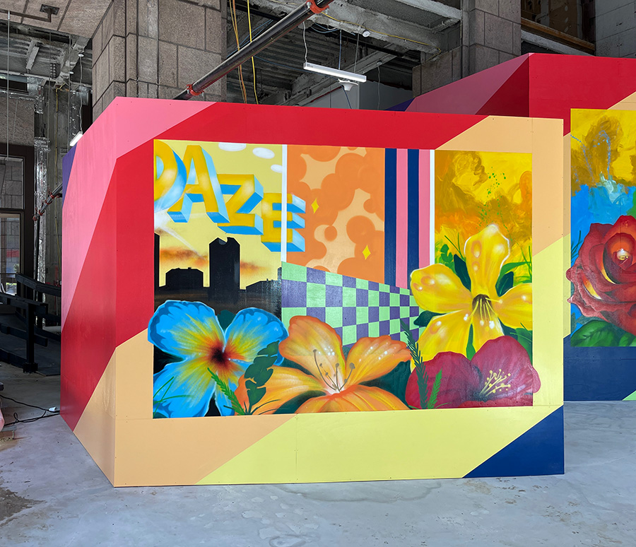
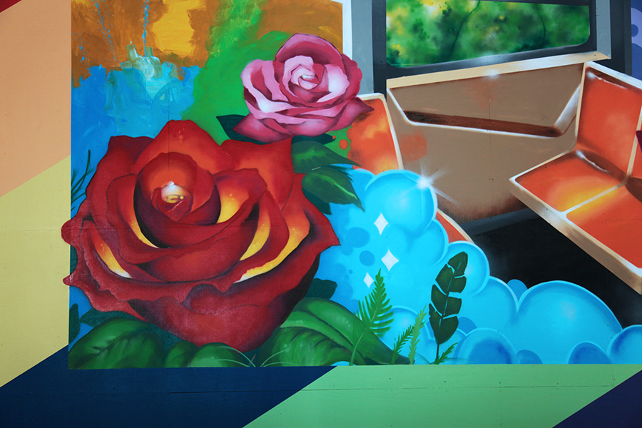
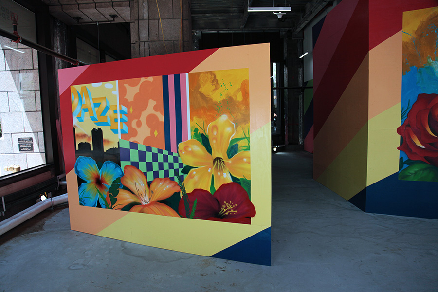
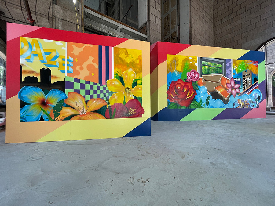
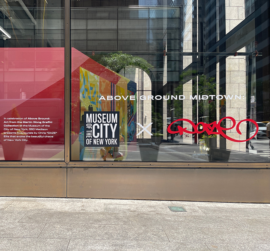
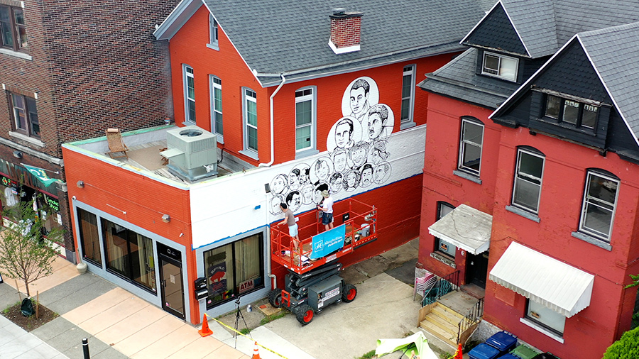
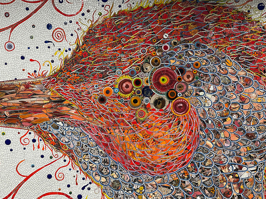
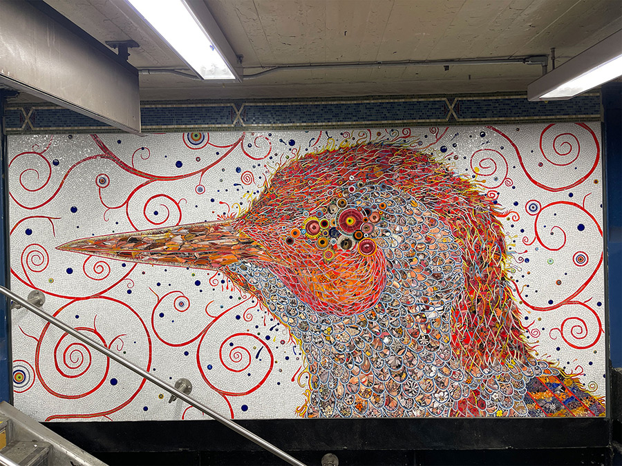
In a decisive nod to the city that shaped him, legendary graffiti artist DAZE (Chris Ellis) has unveiled two new large-scale murals at 550 Madison Avenue, transforming the building’s soaring street-level space into a canvas that bridges worlds. Painted live in public view, these works are part of “Above Ground Midtown: MCNY x DAZE.” With their vibrant forms, layered textures, and intuitive energy, DAZE’s murals draw from the pulse of New York City, the geometry of Philip Johnson’s iconic building design, and the surrounding garden oasis that gently appears in midtown Manhattan.
To fans of New York graffiti and street art, DAZE needs no introduction. A member of the second wave of graffiti writers in the late 1970s and early ’80s, he began painting subway trains as a student at the High School of Art and Design, developing a signature style marked by wildstyle lettering, surreal characters, and a painterly sense of movement. Over the decades, he has nurtured a career, evolving into a fine artist while continuing to honor the raw urban energy of his roots. “I think of these pieces as a continuation of a language I started developing underground,” DAZE tells us. “Only now, we’re bringing it out into the light—quite literally.”
Curator Sean Corcoran of the Museum of the City of New York sees this installation as an extension of the museum’s current exhibition, Above Ground: Art from the Martin Wong Graffiti Collection, which includes early works by DAZE and many of his contemporaries. “This project is about visibility—making sure the public understands graffiti not just as something from the past, but as a living, evolving art form with deep ties to the city’s history,” he says. “Having DAZE create these murals in real time, for anyone to see, reinforces the idea that this movement was always meant to be in dialogue with the street—and with the people of New York.”
BSA asked DAZE and Corcoran a couple of questions about the project:
Brooklyn Street Art (BSA): DAZE, these new canvases feel like they’re in direct conversation with the city itself — its architecture, movement, street energy, and natural elements. How do they reflect your biography as a New Yorker and a writer who came up in the 1970s and ’80s?
DAZE: In creating these two paintings I wanted to capture the feeling of someone somehow say, in a taxi, going uptown and watching how the cityscape changes from one neighborhood to the next. At the same time I wanted to inject certain natural images within the painting. Even though we all live in a city that is noisy and congested, there are still areas where one can find a nice park to sit and have a quiet moment. I felt like that side of the city had to be represented too.
BSA: You created these pieces live, in a high-visibility Midtown space, a far cry from painting trains in the dark. What does it mean to you to create something so public and above-ground in the heart of a city you’ve been documenting and writing a visual diary for over 40+ years?
DAZE: I was very aware of the architecture of the building and its history. One of the unique things about the space is that the ceilings are so high. It’s an interior space, however, you feel as if you’re outside, which is quite unique.
It was amazing to create something large scale in an area of New York City that receives both many tourists and people who are working there. It exposes my work to a new audience.
BSA: Sean, DAZE’s career spans the early days of illegal train writing to significant institutional recognition — how does his presence here at 550 Madison, and possibly in the Martin Wong Collection, help tell a fuller story of graffiti’s evolution in New York?
Sean Corcoran: Daze’s career is an excellent example of the trajectory of a number of the artistically ambitious writers who emerge from the “train writing”’ era movement that developed a long and impactful studio career that helped export the regional subculture to a worldwide phenomenon. Martin Wong, the Lower East Side painter and generous donor of the majority of the Museum’s collection of more than 300 paintings and 60 black books, was interested in telling the story of this a youth culture that largely sprung up in New York City.
He wanted to trace the youthful rebellion of you people painting on subway trains and public spaces, but he was equally interested in the communication and artistic inclinations as well, and he actively encouraged and supported this by not only buying canvases, but by being a friend and sometimes mentor.
BSA: The title Above Ground for the Martin Wong Collection—and this above-ground exhibition by a writer known for his work on underground trains—suggests a subculture being brought into the light. In curating this collection today at the MCNY, what conversations do you hope it sparks about the place of artists like DAZE in both the art world and the cultural history of the city?
Sean Corcoran:Above Ground is intended to loosely trace the early efforts of train writers as they moved out of the tunnels and layups and into the studio. The exhibition notes the importance of several transitional moments in this history – The United Graffiti Artists (founded in 1972), Sam Esses Studio in 1980, the advent of East Village galleries like Fun and 51X soon after in the early 1980s, and then the jump to blue chip galleries, including Sidney Janis, and opportunities in Europe. These are all examples of the long road these artists took in developing their careers. The paintings in the gallery reflect both Martin’s collection and the various paths the artists took, from maintaining a letter-based art to moving into abstraction and figuration. The exhibition ends in the early 1990s just as the “train writing era” ends, but we all know that that was just the end of the beginning of the story…..
Interview with Doug Gillen | Video Feature from Fifth Wall TV
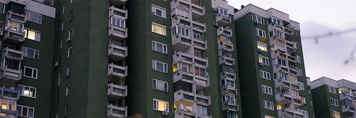
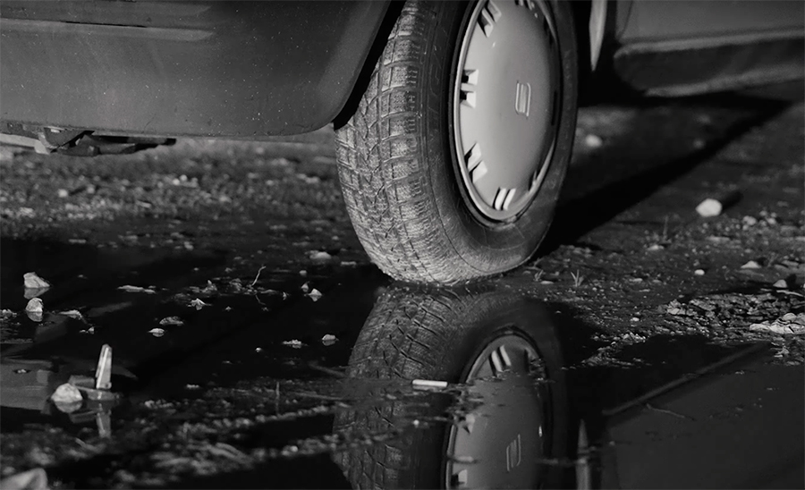
Ghosts of concrete modernism and whispered nostalgia drift through “The Morning Will Change Everything,” the first solo museum exhibition by Spanish artist Sebas Velasco, now on view at the History Museum of Bosnia and Herzegovina in Sarajevo. In this new video interview, filmmaker and art observer Doug Gillen sits down with Velasco to unpack the layers of emotional and political weight carried in these oil-painted nocturnes—each a meditation on memory, architecture, and the complex afterglow of Yugoslavia’s post-socialist present.
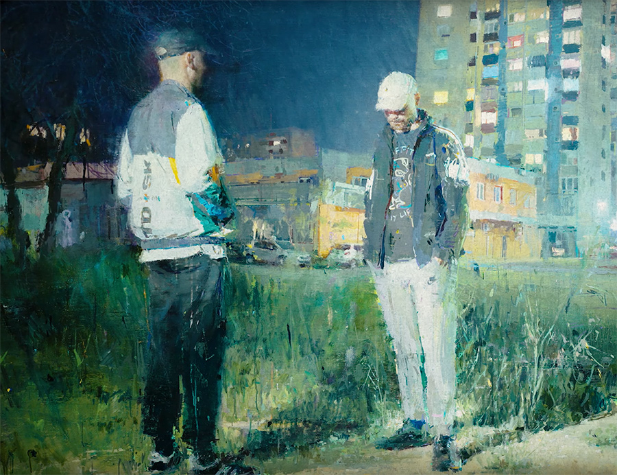
Sebas Velasco. The Morning Will Change Everything. (image still from the video by Doug Gillen for Fifth Wall TV)
The conversation reflects Velasco’s realism, influenced by photography – reinterpreted by hand and heart. “It’s a love story with the region, for sure,” he tells Gillen, reflecting on years of travel and a growing personal bond with Sarajevo and its surrounding cities. His works hum, layering light, concrete, shadow, and silence to capture what it feels like. “Maybe the nostalgia I paint is for something I’ve never really known,” he says.
Sebas Velasco. The Morning Will Change Everything. (image still from the video by Doug Gillen for Fifth Wall TV)
Set inside the former Museum of the Revolution—a hulking modernist edifice now asserting its cultural relevance—the exhibition includes Velasco’s paintings alongside films, photographs, and collaborations that stretch across borders and disciplines. It’s an act of giving back to a city that continues to inspire. “We wanted this to be more than paintings on a wall,” he explains. “To feel like home—for other artists too.”
Watch the full interview below to hear from Velasco in his own words, and to feel the atmosphere of a show that makes the past present—and personal.
Sebas Velasco. The Morning Will Change Everything. (image still from the video by Doug Gillen for Fifth Wall TV)Sebas Velasco. The Morning Will Change Everything. (image still from the video by Doug Gillen for Fifth Wall TV)
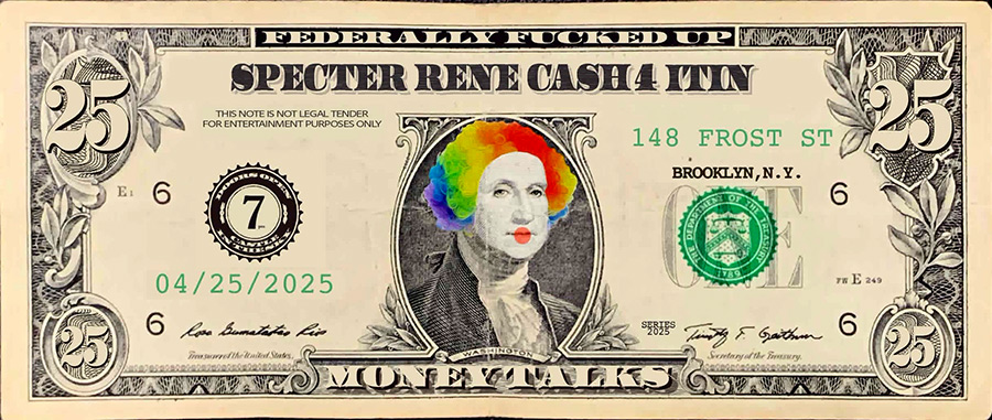
If you’ve ever wandered down Frost Street and caught a whiff of turpentine, weed, and burned toast, you may have walked right past the unmarked doorway where Williamsburg still quietly seethes and happily bubbles with creative resistance.
A community center, performance space, art gallery, flea market hybrid, the space welcomes you to the latest show, “Money Talks,” which doesn’t need an opening reception flier. It has its gravity and pull — the kind that draws a packed audience into a labyrinth of rooms, exhibition spaces, and performances. A sign of success, it spills onto the spring Friday night sidewalk, where smokers and sharp talkers hold court between sets by a shaggy 70s rock band that might or might not be ironic.
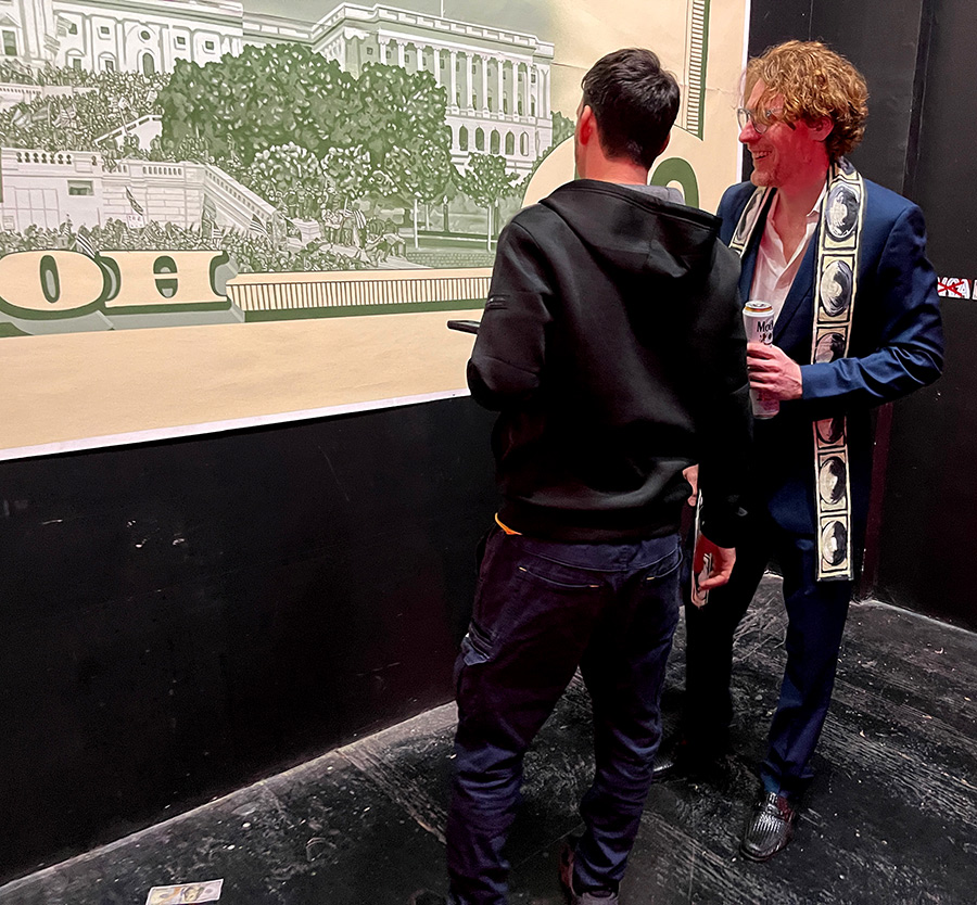
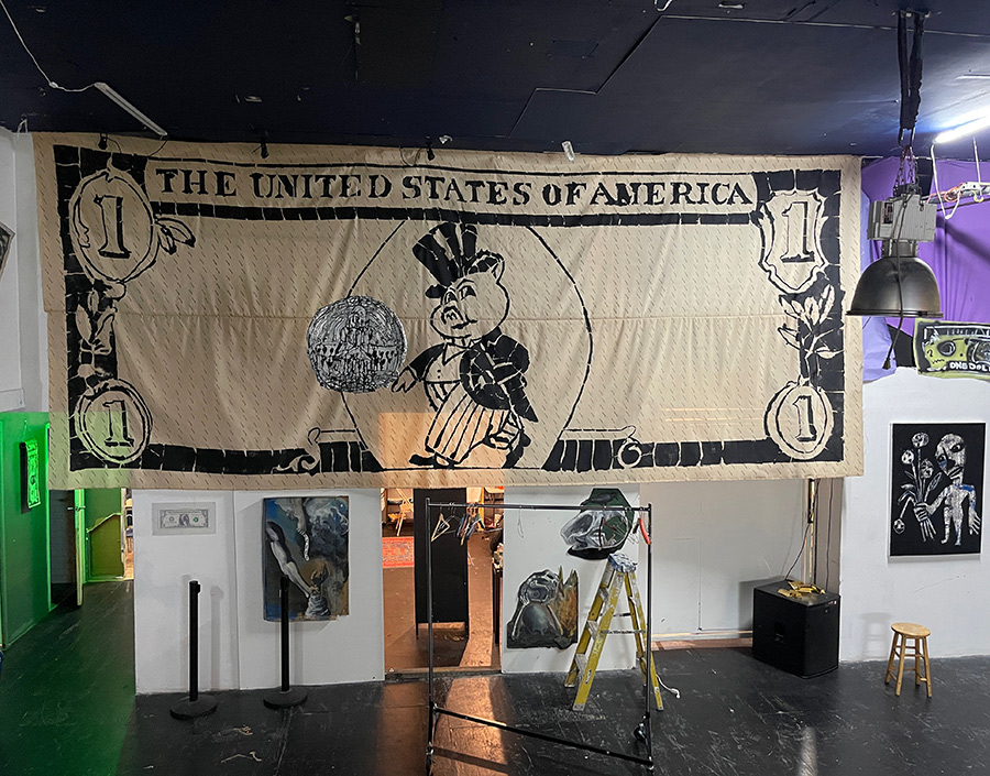
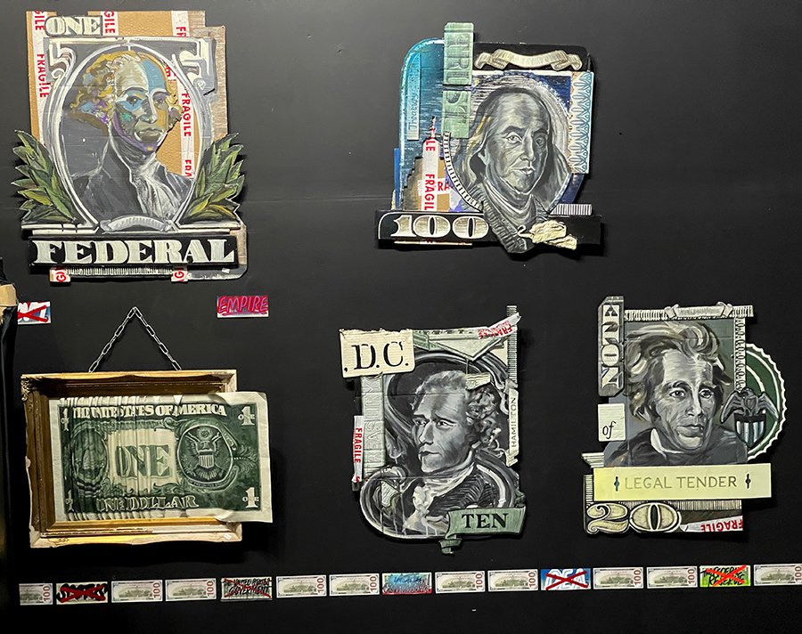
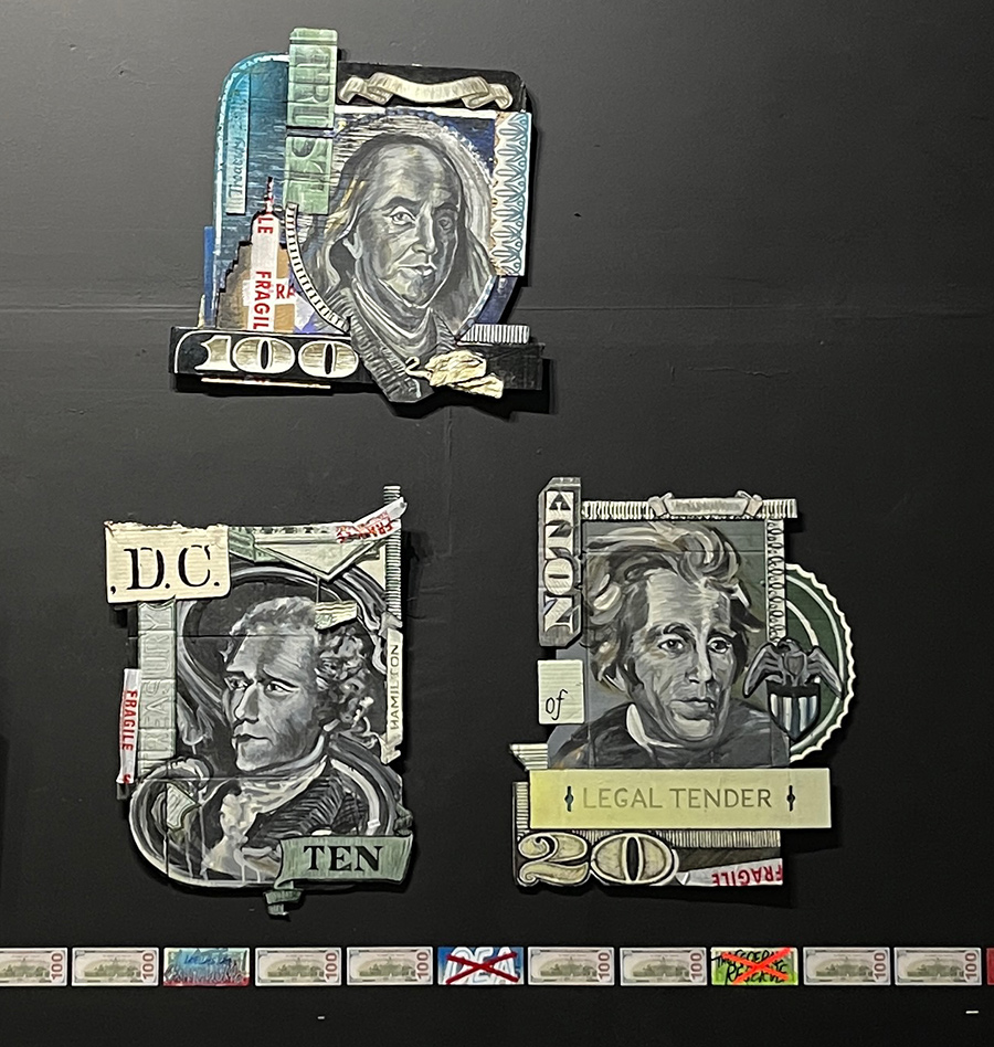
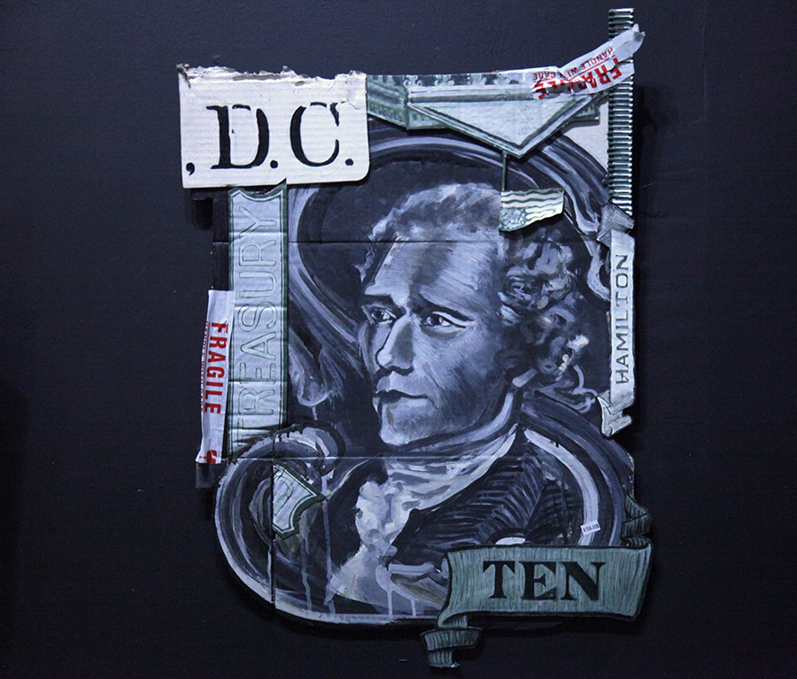
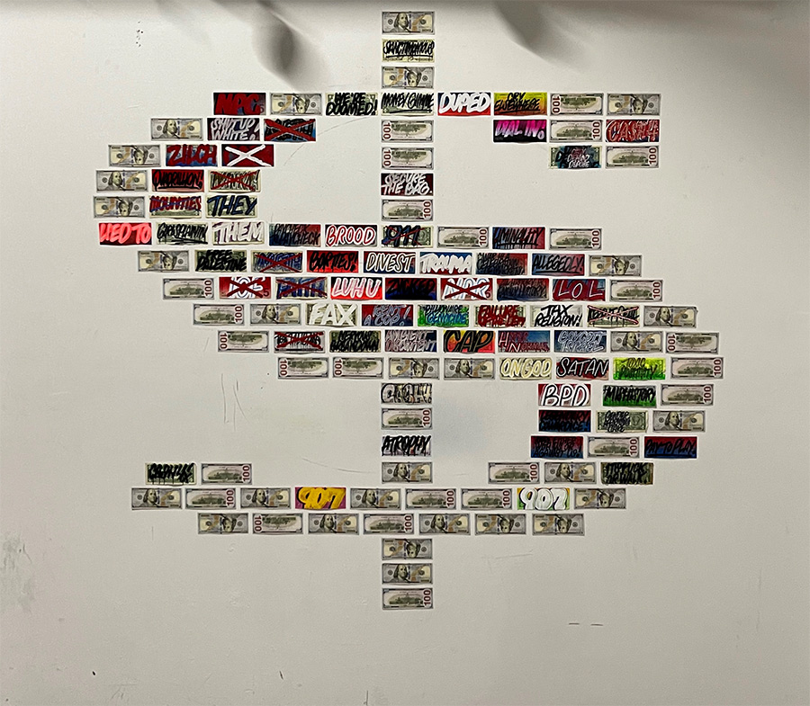
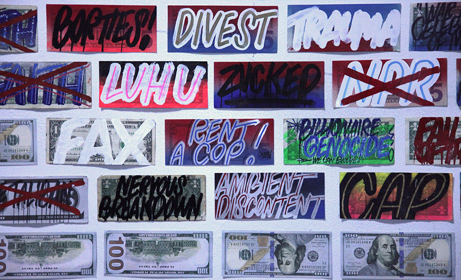
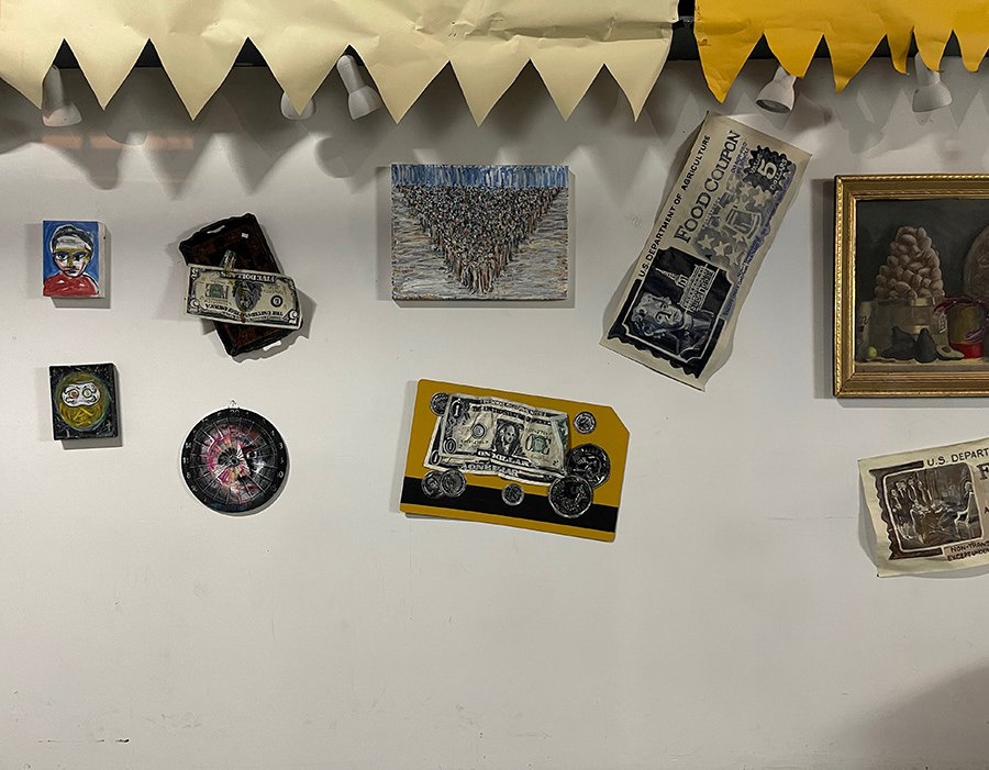
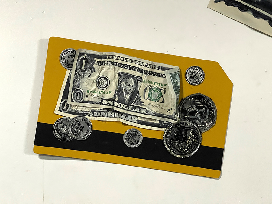
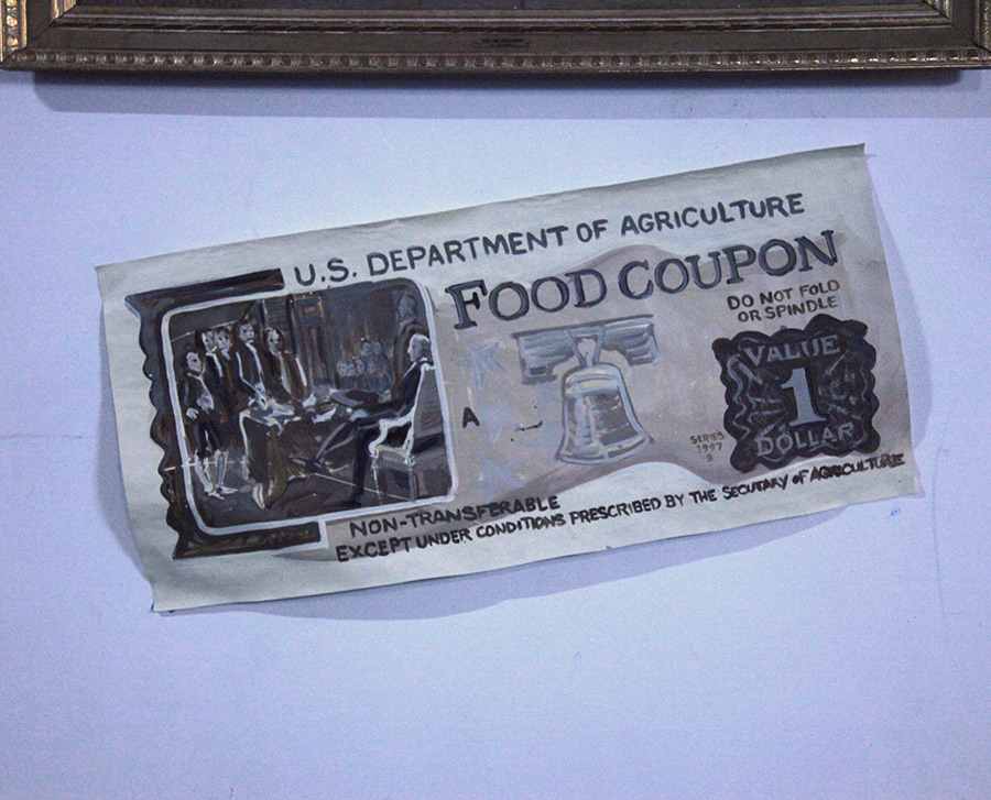
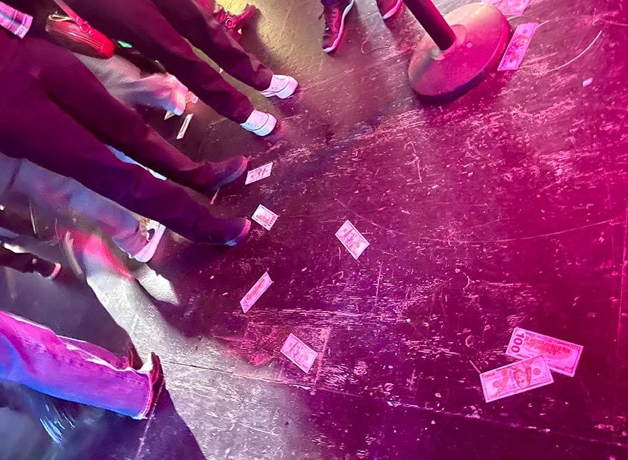
Inside, four artists — Specter, Rene, CASH4, and ITIN — served up a visual demolition of American currency and its cultural metaphors. It wasn’t bitter, but it wasn’t sweet. Like the Williamsburg of old, before the glass condos, this was salty, smart, funny, blunt. No manifestos on the wall, just wry, sharp-tongued critique told in paper pulp, paint, and political memory.
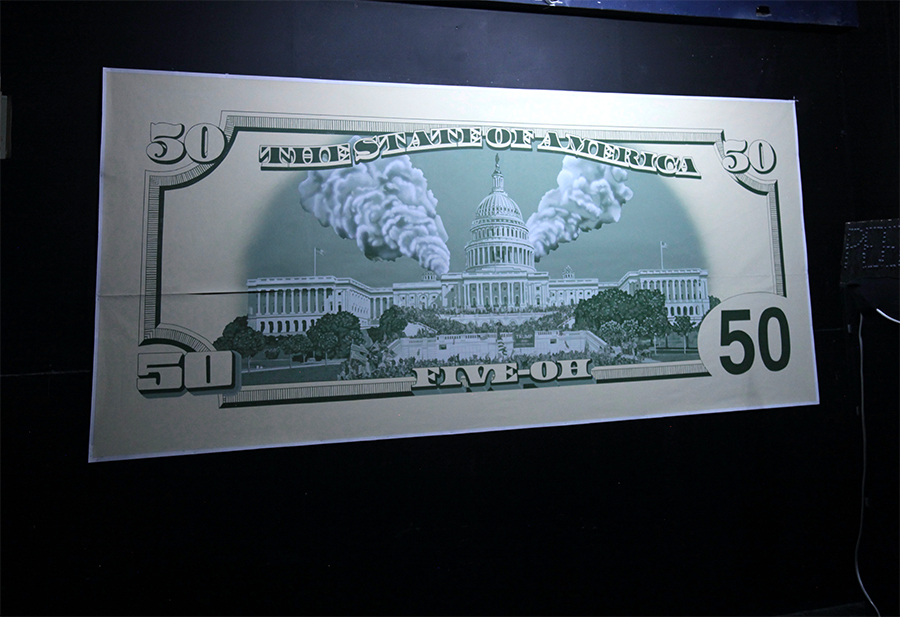
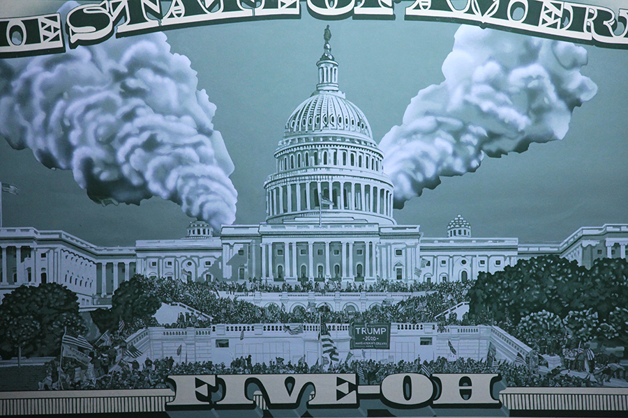
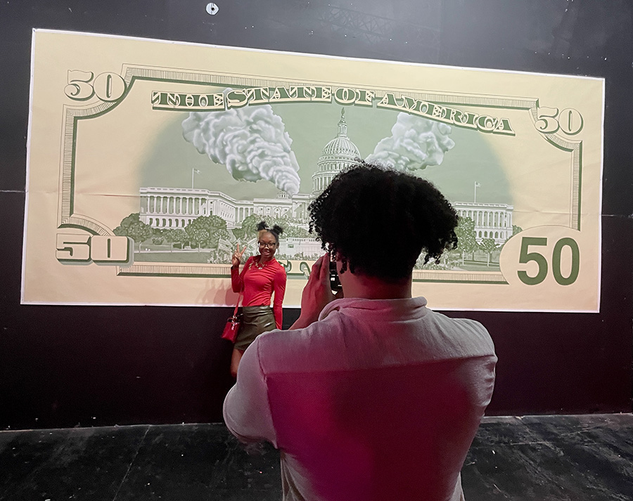
The anchor piece? Gabriel Specter’s massive currency-redesigned The State of America. A redux of the reverse of a dollar bill — if it had lived through January 6. The Capitol dome smokes like a symbol under siege, while foregrounded rioters pose in shades of government green. It’s beautifully executed, deeply personal, and visibly furious — a portrait of patriotism cracked in half. The loft is loud, the floor sticky, the ideas sharp. Money Talks doesn’t have a social media campaign, instead you feel like it has conviction. It doesn’t need a QR code. The rent may be high, but the spirit here is still gloriously low-rent — and unbought.
Specter, a visual bard of the 2000s and 2010s Brooklyn scene, known for work that didn’t just decorate the streets but spoke to social realities, talked to us about this piece — and about the spirit of a space that still knows how to host shows that mean something.
BSA: How would you characterize the space where “Money Talks” took place — not just physically, but in terms of its function as a creative platform? Is it more of a cultural incubator, a performance venue, or a kind of underground laboratory for dissent?
GS: The best way to describe the space is talking about the people who occupy it. Each person coming in and out of the studio, the workshop, performance and gallery space shapes it into a one-of-a-kind arts venue. To answer whether it is a cultural incubator, performance venue, or underground laboratory of dissent, I would say all three apply. We’re inclusive of all forms of expression but we have an anti-establishment edge. Respect and kindness overrides difference of opinion.
BSA: Your painting The State of America, featuring figures from the January 6th Capitol riot, was a powerful centerpiece. What emotional or psychological space were you in while creating it, and how did the act of painting become a way to process or confront that moment in history?
GS: Because of the amount of detail required to execute the work, I had to focus on the rendering of each figure in the painting. I was physically trying to individualize them, an accurate representation of what was happening. My brain was not focused on anything other than the actual painting of it. It put me in a meditative state creating it.
As I would take breaks from the laborious rendering, I would take a step and look at what I’d completed so far. Because I was trying to be so accurate about representing each individual, the stepping back and seeing them altogether, it honestly brought up a lot of hatred. For what they represented, and what they did on that day. In doing this painting, I was painting a lot of patriotic things and my version of patriotism is a lot different than what the scene depicts.
BSA: The exhibition seems to grapple with money not just as currency, but as a symbol of power, manipulation, and social fracture. Was the show intended as a direct critique of American capitalism, or are you also exploring more personal or ambiguous relationships to money and value?
GS: Each artist in the exhibition has their own take and I can only speak to my own. So yes, my work was a critique of money as a tool for manipulation, and how this has seeped into societal values. But as I said, every artist contributing took Money Talks as a way to take back power with money.
BSA: You’ve been making work since the 2000s, including street pieces that captured daily city life and the people who live here. How has your perspective — and your medium — evolved in response to the widening economic divide and the political climate of recent years?
GS: I think my work has evolved to the times we are living in. I feel more than ever that my work needs to draw a line in the sand and represent my values as a human. I don’t try to take sides but I express what I think is right and I feel there is a sickness in our society at the moment.
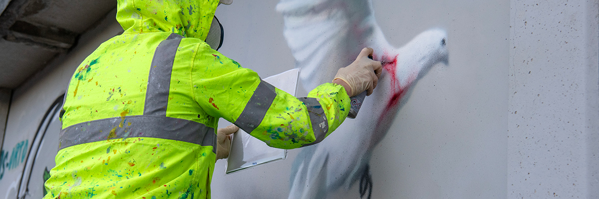
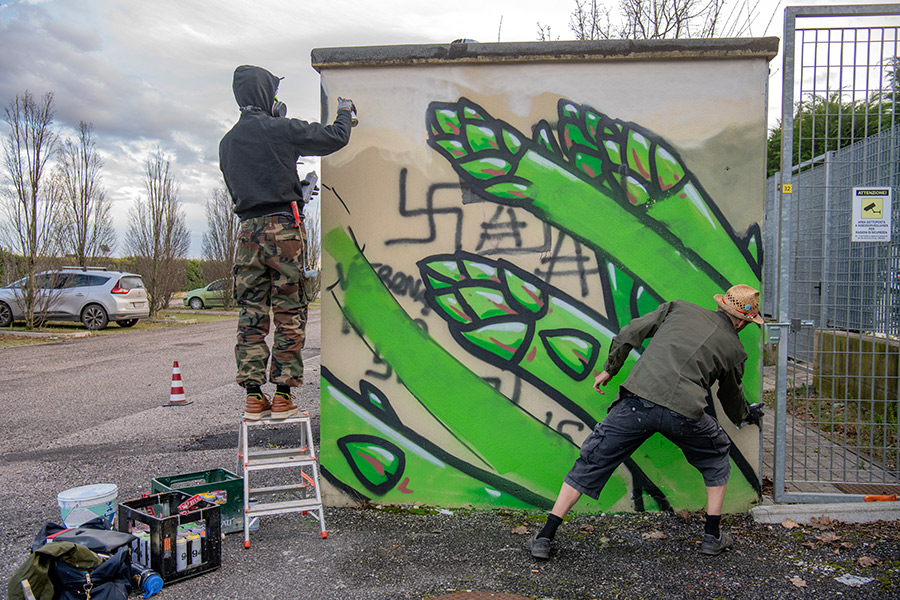
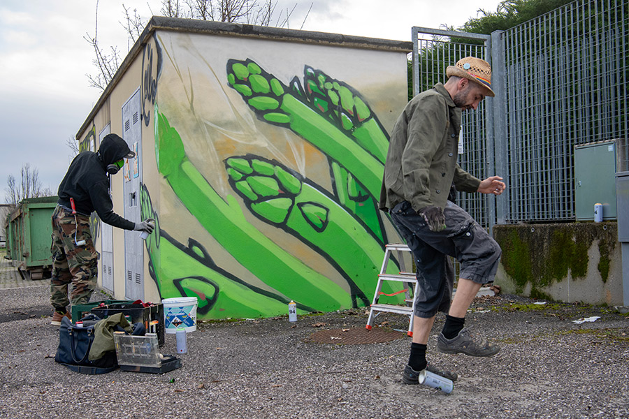
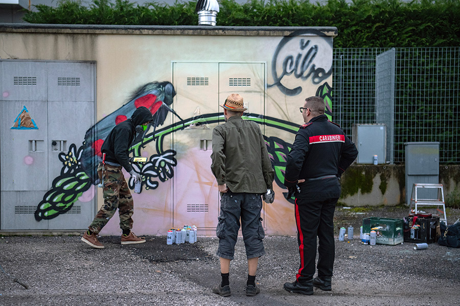
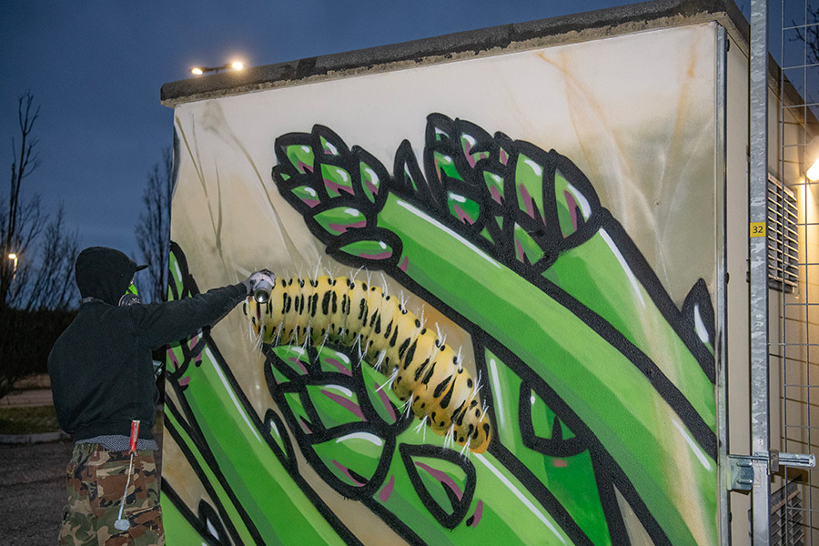
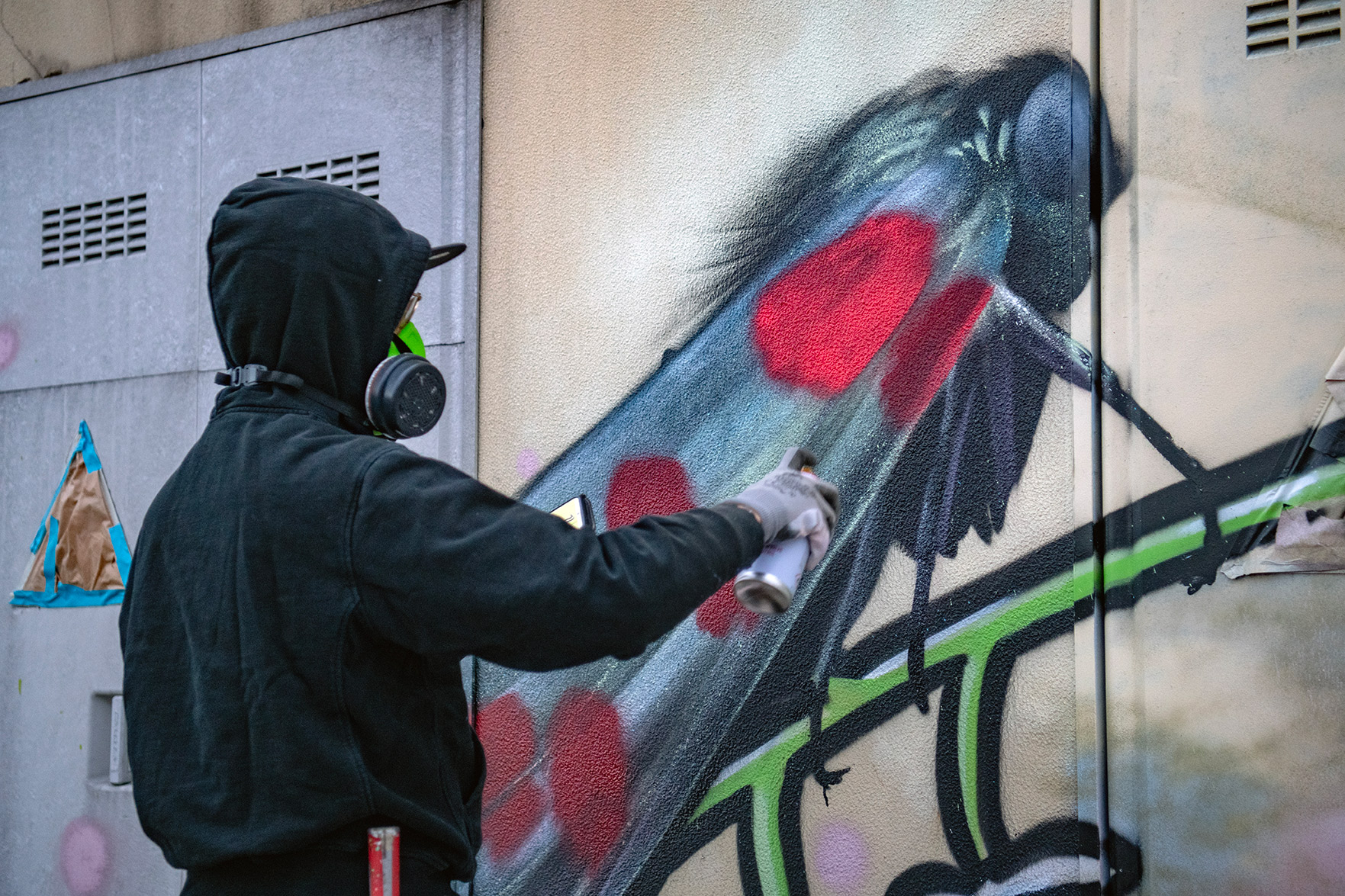
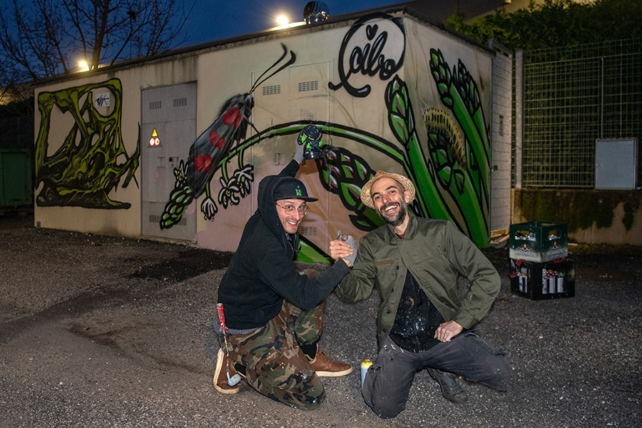
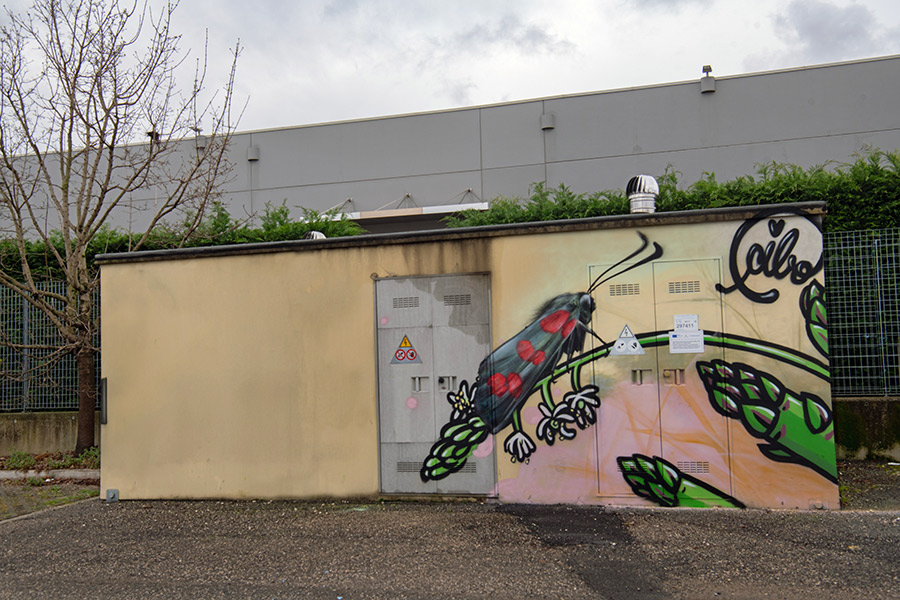
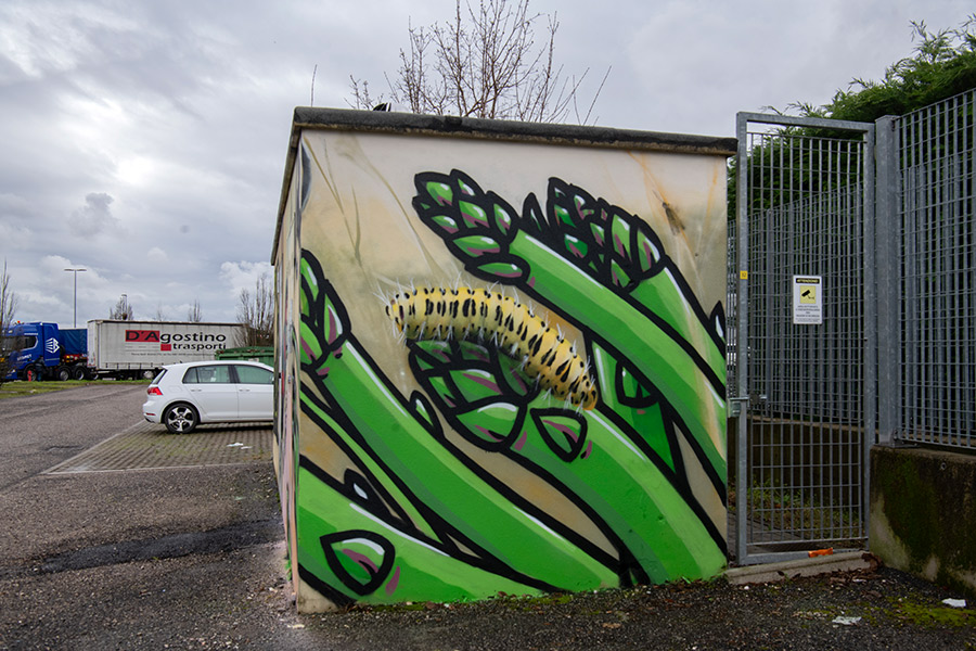
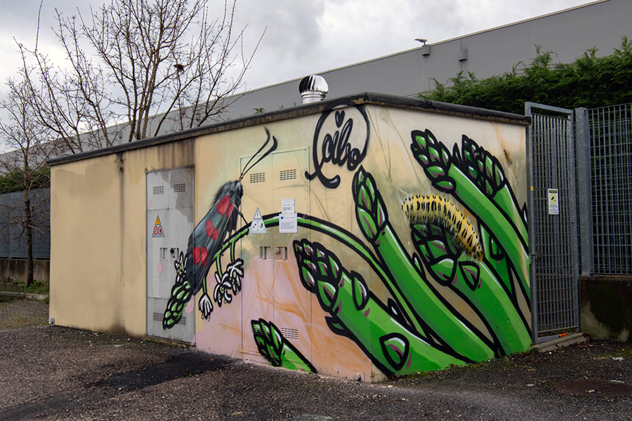
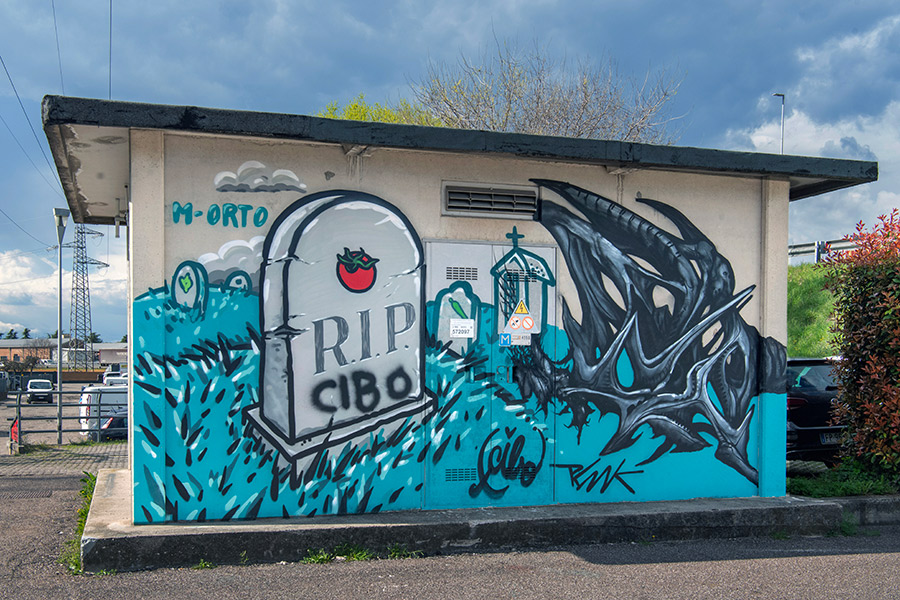
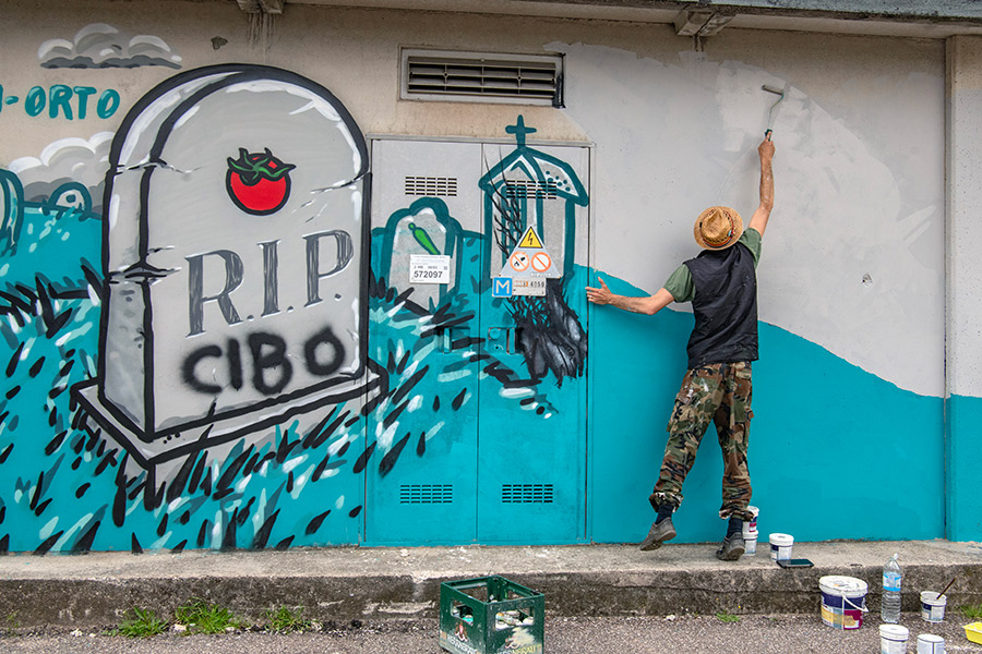
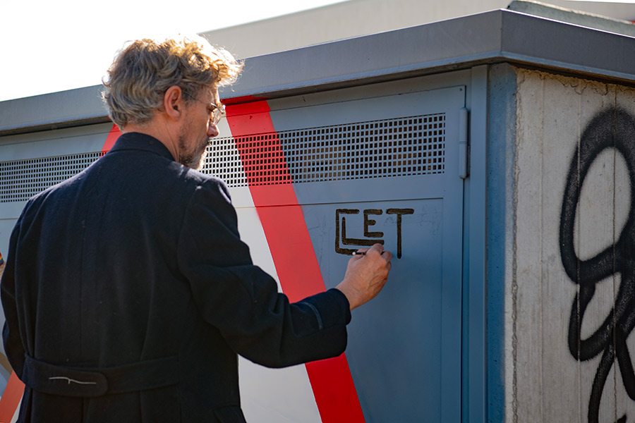
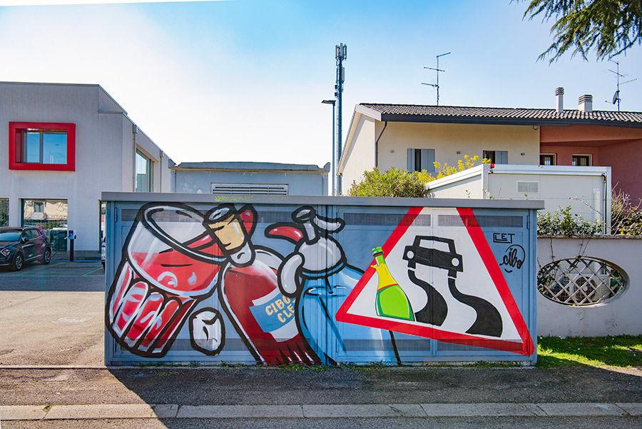
Verona, Italy—known for Romeo and Juliet—is now also home to a very different kind of love story: one between food, public space, and antifascist resistance. At the center is CIBO, a street artist whose name literally means “food,” and who has made a career of turning hate speech into visual comfort food. His murals cover neo-fascist graffiti with pizza slices, cheesecakes, and bundles of asparagus, using humor and everyday symbols to defuse toxic ideology.
CIBO’s approach is clever—and disarmingly effective. Since he began his “recipe of resistance” over a decade ago, he’s been turning Verona’s walls into a living, evolving archive of antifascist art. Where others argue or censor, he paints tortellini. When fascist slogans reappear, he adds another layer—often building his murals like dishes, one ingredient at a time. It’s personal too, he will tell you: after neo-Nazis murdered a friend, CIBO says he doubled down, embracing public art as a peaceful yet persistent form of defiance.
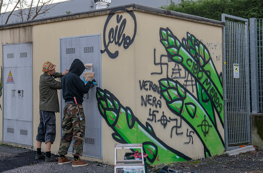
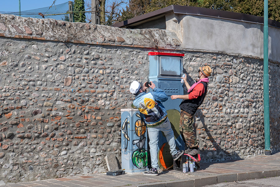
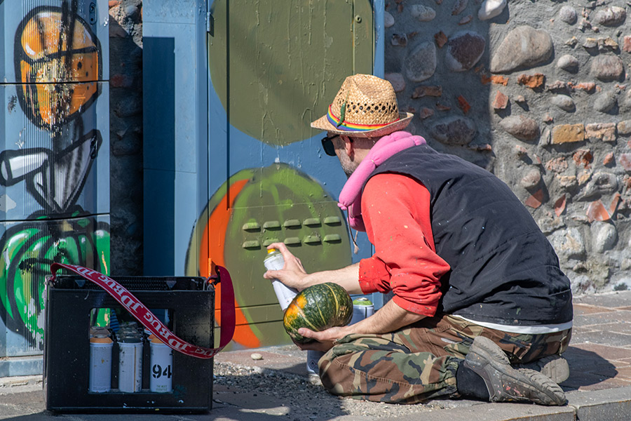
This March, that individual mission became collective action. In an unsanctioned street art festival titled “Best Before. Street Art Against a Rancid Future,” CIBO invited 11 fellow artists—Claudiano.jpeg, Clet, Eron, Mantra, Millo, Ozmo, Pablos, Pao, Pixel Pancho, Plank, and Zed1—to collaborate on murals that replaced hate with imagination. The name? A cheeky reference to food expiration dates—reminding us that our tolerance for racism, nationalism, and repression should’ve expired long ago.
The result: a high-energy, low-profile intervention across San Giovanni Lupatoto and other Verona suburbs. These weren’t “art walks”—they were tactical takeovers. Artists painted four-handed pieces over vandalized walls: CIBO’s flying pizzas alongside Zed1’s surreal characters; asparagus stalks layered with Mantra’s naturalist flourishes. This wasn’t nostalgia—it was public protest, humor, and heart in action.
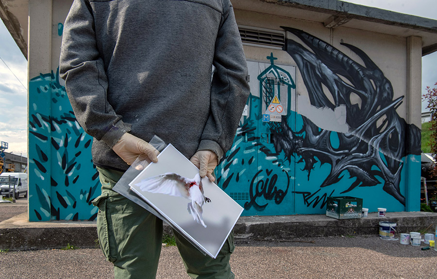
To ensure the work wouldn’t disappear unnoticed, Martha Cooper—the well-known NYC photographer who helped canonize graffiti with Subway Art—flew in to document it all. Her lens captured not just murals, but the camaraderie, tension, and resilience behind them. Now, over 50 of those photographs are on view at Forte Sofia, Verona, through June 29. Curated by Sara Maira—art strategist and activist—the exhibition is a powerful retelling of a grassroots moment turned collective memory.
We spoke with curator Sara Maira about the festival and the work of CIBO.
BSA: Please tell us about the name of the festival where CIBO collaborated with other artists in Verona?
Sara Maira: The festival and its current exhibition in Verona is called “BEST BEFORE. Street art against a rancid future.” It’s a call to action for the public—an act of artivism initiated by CIBO with the goal of inspiring people to stand up against closed-minded politics, nationalism, and obscurantism before it’s too late.
This is an artivist performance made possible through donations CIBO received over the years from patrons who supported his social commitment against fascism, racism, and hate.
BSA: What attracted CIBO to paint food on public walls? Why choose food as a subject instead of something else?
SM: “CIBO” in Italian is also a nickname for food, so it started as both a joke and a necessity. When he was young, he didn’t have much money to buy paint, so he used leftover colors that other artists didn’t want. Since food comes in almost every color, it became a practical solution. That’s how it began.
As he matured, so did his message. Food evolved into a metaphor—his way of talking about some of the most urgent problems we face today: the rise of neo-fascism and neo-Nazism, nationalism, discrimination, environmental collapse, short-sighted politics, and the widespread social regression we’re seeing worldwide.
He often uses this example: the Caprese salad has the colors of the Italian flag and is considered a traditional Italian dish. But if you examine the ingredients, none are originally Italian. Tomatoes come from Western South America and were first cultivated by the Aztecs. Spanish explorers brought them to Europe in the 1500s. Basil comes from India, and if you add olive oil—as Italians do—it’s originally from Syria. So what we now call “tradition” is actually a product of cultural exchange, migration, and cooperation. If we close our borders and minds, we risk losing that richness.
Every mural CIBO paints contains hidden messages like this. On the surface, it may look like a simple plate of food, but often it’s layered over a swastika or other hate symbol—visually erased but symbolically challenged. What looks colorful and inviting at first glance reveals itself to be part of a much deeper conversation.
BSA: What’s the significance of CIBO painting over hateful or racist messages on public walls?
SM: For him, it’s both an act of resistance and a form of public service. Covering up hate is just one part of his practice, but he sees it as one of the most essential—especially if you consider street art to be public art. This is where public art can make an immediate difference.
CIBO lives in Verona, a city in northern Italy that has long struggled with fascist ideology. That ideology never completely disappeared after WWII, and in recent years it has made a disturbing comeback—not just in Verona, but around the world. At first, CIBO simply responded to what he saw. He had spray cans in hand, he saw hateful messages on walls, and he began covering them up.
Then it became personal. Fifteen years ago, one of his friends was murdered by neo-Nazis. Since then, his work has become a mission—a colorful and peaceful revolution. It’s voluntary activism: an artist giving back to his community, trying to change the world one spray can at a time.
These people are violent; their language is violence. But CIBO’s language is beauty and art—and they’re not prepared for that. Usually, swastikas are covered with opposing political symbols, and the fascists are ready for that. They expect confrontation. But when they’re met with a painted piece of cheese or a slice of pizza, they don’t know how to react. They still come back and vandalize the murals, but CIBO has learned to use their hate as part of his art. He now plans his murals like recipes—every time they come back, he adds an ingredient. Over time, his walls become layered “recipes of resistance,” evolving performances in public space.
In the beginning, people walking by didn’t even notice the hidden messages—there was a sort of visual blindness. But after a few years, people caught on. They realized there was a problem and started sending him photos, asking him to restore or repaint walls. Eventually, some of them started taking action themselves.
BSA: Does CIBO get threatened by the people whose graffiti he covers with food murals?
SM: Yes, he receives threats often. People have sent him death messages. Once, a small bomb was placed on his car. He’s found swastikas painted on his door, and he’s no longer able to move around freely. That’s why he chooses to paint during the day, in public, with people around him. Visibility is his protection. Showing his face is part of his defense strategy.
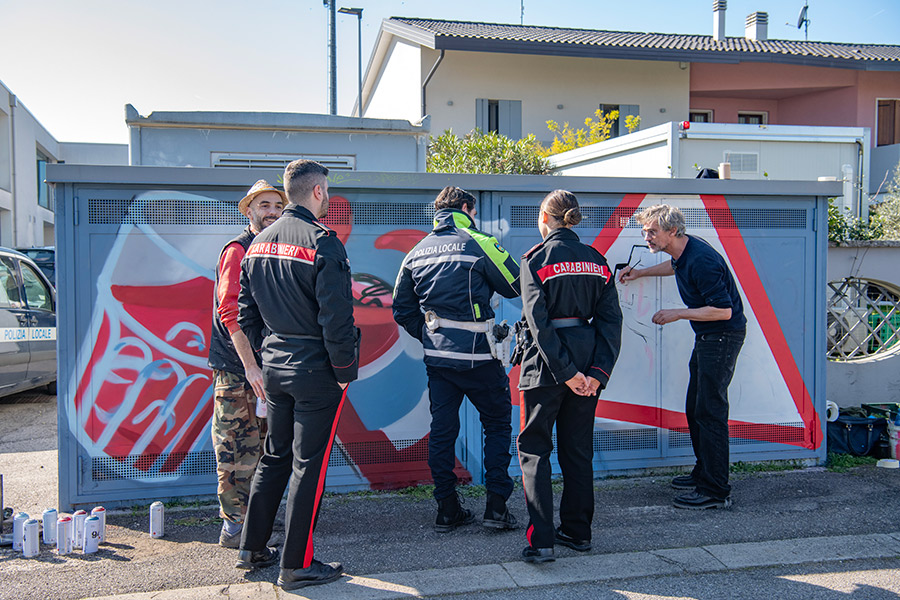
BSA: Has CIBO gotten into trouble with the police for painting on illegal walls?
SM: Yes, that’s why he works with a lawyer. He’s been reported many times by politicians and law enforcement. But because he’s a recognized artist—and because he’s covering hate symbols—he has never been arrested or convicted.
While going through your CIBO/Verona photos, we noticed that the police showed up a couple of times while he was painting with Mantra, and again while he was painting with Clet. Were the police officers hostile to him? Did the officers show up as a routine or were they responding to a complaint from a citizen?
MC: Not sure if the cops showed up because of a complaint or if they were passing by or what. They questioned the artists but allowed them to continue. They weren’t particularly hostile but not exactly friendly. I tried not to let them see I was taking their picture because I wasn’t sure if I was allowed. Cibo is well-known in Verona but he is mostly painting illegally. As I remember, only one of the walls was a permission wall but I don’t remember which one. Almost all of the walls were ones that Cibo had previously painted which had been gone over. One wall says something like “Thank you Fascists” painted by Cibo but I’ve forgotten what the story was. Sometimes the fascists leave Cibo notes. Attached are photos of him peeling off a note which reads “Tu aisegni noi roviniamo!” which, according to Google Translate means “You draw, we ruin”.
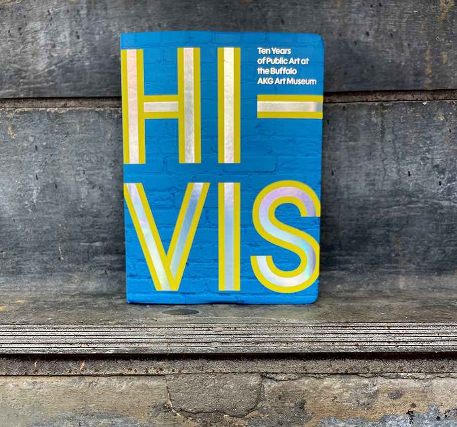
In the ever-evolving public and street art equation where boundaries between genres blur and definitions remain in flux, a notable regional museum has taken a decisive step toward institutionalizing a decade-long experiment in civic art-making. With the opening of Hi-Vis at the Buffalo AKG Art Museum, the first ten years of its public art initiative are given a platform inside the museum walls—not just in the form of an expansive exhibition but also through a new book and documentary that trace the evolution of their unique and sustained commitment to public art.
HI-VIS: Ten Years of Public Art at the Buffalo AKG Art Museum. GILES / D Giles LTD, UK.
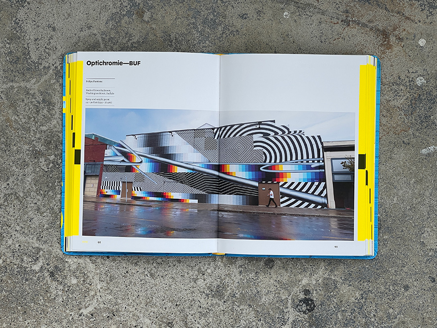
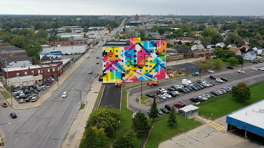
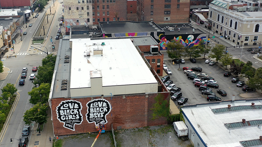
Running through June 9, 2025, Hi-Vis celebrates over 80 artists who have participated in creating more than 60 public works across Buffalo and it’s surrounding county. Names familiar to fans of street art and contemporary muralism appear alongside local heroes of various styles and disciplines, forming a compelling mix that includes FUTURA 2000, Shantell Martin, Felipe Pantone, Maya Hayuk, Louise Jones, Jun Kaneko, Julia Bottoms, Monet Kifner, Pat Perry, Edreys Wajed, and many others. These artists—some creating their largest or first-ever public works—are altering and shaping Buffalo’s new visual identity by emphasizing community collaboration and civic visibility.
HI-VIS: Ten Years of Public Art at the Buffalo AKG Art Museum. GILES / D Giles LTD, UK. Artist. Felipe Pantone.
The exhibition, presented on the third floor of the new Jeffrey E. Gundlach Building, is co-curated by Aaron Ott (Curator of Public Art), Eric Jones (Public Art Projects Manager), and Zack Boehler (Assistant Curator, Special Projects). It invites audiences to consider muralism and street aesthetics as entry points into the broader range of practices these artists engage in—highlighting the connections between creative expression, community engagement, and the on-the-ground perspective of those who live here. As the accompanying book Hi-Vis: Ten Years of Public Art at the Buffalo AKG Art Museum makes clear, this program is not about surface decoration or branding neighborhoods; it is about forging durable, meaningful relationships between artists, institutions, and the communities they work with.
Directed by Jeff Mace, the companion video documentary Hi-Vis: Ten Years of Public Art (below) further contextualizes this effort with interviews, installation footage, and insights from those who brought these projects to life—many clad, as the name suggests, in high-visibility orange or yellow vests, straddling cranes and scaffolding as they worked.
HI-VIS: Ten Years of Public Art at the Buffalo AKG Art Museum. GILES / D Giles LTD, UK. Artist. Futura 2000.
Spearheaded by museum director Dr. Janne Sirén and supported by both the City of Buffalo and the surrounding Erie County, the Public Art Initiative stands as a first dedicated department of its kind at an American museum. It’s proponents say that in doing so, it marks a new model—one that recognizes public art not as an outreach program but as core practice. Certainly museums like the STRAAT in Amsterdam, UN in Berlin, MUJAM in Mexico City, and the Museum of Graffiti in Miami have active and engaged programs with art and community in the public sphere. Similarly, as this retrospective shows, public art at Buffalo AKG is neither an afterthought nor a trend but a sustained cultural investment.
In a global street art landscape marked by public and private interests, sanctioned and unsanctioned practices, grassroots efforts, and institutional frameworks, where mural festivals, community art, graffiti heritage, and critique frequently converge and collide, Hi-Vis offers a chance to reflect on how a museum can meaningfully participate in the public realm while allowing artists to remain true to their diverse methods and voices.
HI-VIS: Ten Years of Public Art at the Buffalo AKG Art Museum. GILES / D Giles LTD, UK.
BSA spoke with curator Aaron Ott about the Buffalo AKG Art Museum’s Public Art Initiative, exploring how the museum balances global and local artist engagement, fosters long-term public collaborations, and rethinks the role of museums beyond their walls. Ott reflects on lessons from other mural and street art models, the importance of sustainability, and the potential for institutional partnerships in shaping the future of public art.
BSA: Reflecting on a decade of the Public Art Initiative, how do you balance the inclusion of local voices with internationally recognized artists? What does that balance bring to the communities you serve?
Aaron Ott: As a global arts institution, the Buffalo AKG Art Museum is uniquely positioned to collaborate with and commission talent from all over the world. Our foundational sponsor for the Public Art Initiative at the AKG was the Erie County Legislature, joined shortly thereafter by the City of Buffalo. Erie County is over 1,200 square miles with dozens of municipalities and nearly one million citizens. These factors, our global reach, our rich geographic opportunities, and our diverse audiences, along with our position as a collecting and exhibiting institution of modern and contemporary art offers us a unique scope and latitude when considering international, national, and regional talent. Over the last ten years of production, roughly 20% of our projects have been with international artists. The remaining projects have been evenly split between national and local talent.
The result is a program that answers a variety of questions that is as diverse as our audiences. We are fundamentally collaborative, working entirely on property and in landscapes that the museum does not own. As a result, we support our artists alongside the concerns and desires of our various publics.
HI-VIS: Ten Years of Public Art at the Buffalo AKG Art Museum. GILES / D Giles LTD, UK. Artist. Tavar Zawcki. (photo courtesy of AKG Museum).
BSA:In shaping this program, how much influence did the global rise of street art festivals and mural programs in the last two decades—like WALL\THERAPY in Rochester, Nuart in Norway, or Urban Nation in Berlin—have on your thinking? Did you engage with any of those models directly?
Aaron Ott: In addition to the models you name above, we looked at numerous others dedicated to street art (MURAL in Montreal, Wynwood Walls in Miami, the Philadelphia Mural Arts Program) and continue to share ideas with public art producers around the United States and abroad. At the beginning of our initiative, I was particularly interested in models led by Art Centers, specifically the Hyde Park Art Center in Chicago and the Kohler Art Center in Wisconsin, since I was most familiar with their programs and formats. The Art Center model, at the risk of oversimplification, is one that is centered on audience, dialogue, and openness. At times, museums can feel more “closed” to people and we really want to act in a way that honors our long legacy in contemporary art here at the AKG while presenting ourselves as available to collaborate.
As we grow in scope, we continue to evolve our thinking of what kind of work is available for us to produce collaboratively and cooperatively with our publics. We also look at other institutions and organizations (like the North Carolina Museum of Art, the Nasher in Dallas, Madison Square Park in NY) to consider how elements of their models, while fundamentally different, might lead us to similar successes and outcomes.
HI-VIS: Ten Years of Public Art at the Buffalo AKG Art Museum. GILES / D Giles LTD, UK. Artist. Kobra. (photo courtesy of AKG Museum).
BSA: As one of the few curators of public art embedded within a major museum, what responsibilities do you see attached to that role? Should more institutions formalize this position?
Aaron Ott: I’m not sure I could overstate how important I find being attached to and imbedded into a museum. Buffalo is a relatively small city (population 250,000) but one with a broad impact regionally (Erie County population just under 1M). While I would certainly argue for large American cities and their corresponding institutions to embrace models similar to ours, I strongly believe that pretty much every mid-to-small size American city should consider our model.
My personal opinion is that if you take cities of less than one million, starting with, say Jacksonville, FL, or Austin, TX, all the way to cities just over 200,000, Little Rock, AR, or Sioux Falls, SD, for example, you’ve got over 100 American cities with various collecting institutions with a breadth of local and national knowledge and expertise on the arts.
What sets museums apart from other models is our inherent connectivity to history, collection, and stewardship. As cities themselves grow, shrink, and evolve, it is often the civically oriented arts intuitions that serve as a central and foundational element of identity.
Our own organization was founded in 1862. While most of our peer intuitions have not been around that long, what sets museums apart from many organizations is their year-after-year, ongoing commitment to creative culture. But while plenty of museums participate in public art sporadically, nearly none of them are currently developed with long-term annual commitments to such a program.
Usually, museums activate their commitment primarily on their own walls in their own spaces, but with a little bit of support and ingenuity, they could easily participate in the public as we do. It is both simple to say and hard to do, but sustainability is the key for an institution that wants to participate in the public realm.
HI-VIS: Ten Years of Public Art at the Buffalo AKG Art Museum. GILES / D Giles LTD, UK. Artists. Edreys Wajerd and James “Yames’ Moffitt. (photo courtesy of AKG Museum).
BSA:What role does community input play when a mural is planned? Are there specific guidelines or processes that ensure artists engage meaningfully with the neighborhoods their work enters?
Aaron Ott: The Buffalo AKG Public Art Initiative produces projects through a variety of public/private partnerships that allow for and foster cooperation to achieve the highest quality of work for the broadest possible audiences throughout Western New York. We seek to address the critical questions projects by considering core questions of funding, site, artist, community, capacity, and collaboration. Each of these elemental matters must coalesce in order for success to be secured.
Community conversation is essential at the earliest stages, as detailed exchanges will clarify instances where different constituents in the community have diverse interests or specific pressures dictating their particular viewpoint. By parsing and articulating these diverse perspectives, we establish baseline principles to identify find consensus through a multi-dimensional look at public art practices and community interests. Our policies and actions are specifically developed with discourse in mind.
HI-VIS: Ten Years of Public Art at the Buffalo AKG Art Museum. GILES / D Giles LTD, UK. Artist. Muhammad Zaman. (photo courtesy of AKG Museum)
BSA:The book and exhibition feature artists with roots in graffiti, street art, muralism, conceptual public art, and activist-based practices. How do you view these differing traditions and practices intersecting under the umbrella of public art at AKG?
Aaron Ott: Our museum has always been dedicated to, as we say, the art of our time. As an institution, we are committed to exploring and supporting the work that contemporary artists are engaged with. Perhaps no mode of presentation captures audiences as broadly and deeply as displays of public works of art, which positions our initiative as aligned with one of the most consequential methods of production today.
BSA:Have there been discussions or potential partnerships with other museums—like STRAAT in Amsterdam, MUCA in Munich, UN in Berlin, or LA MOCA—that also have maintained public art programs? What might a collaborative model across institutions look like?
Aaron Ott: Collaboration is all we have ever done. Because that acts as a center of gravity for our initiative, I have great confidence that we’ll be expanding what that means for our partnerships. Institutional, organizational, civic, or independent, we are consistently testing and exploring what collaborations will yield equitable and mutually beneficial outcomes. We’ll never be short on good artists with good ideas. It’s just a matter of finding the right partners at the right time.
HI-VIS: Ten Years of Public Art at the Buffalo AKG Art Museum. GILES / D Giles LTD, UK. Artist. Josef Kristofoletti.HI-VIS: Ten Years of Public Art at the Buffalo AKG Art Museum. GILES / D Giles LTD, UK.HI-VIS: Ten Years of Public Art at the Buffalo AKG Art Museum. GILES / D Giles LTD, UK. Artist. Hillary Waters Fayle. (photo courtesy of AKG Museum).HI-VIS: Ten Years of Public Art at the Buffalo AKG Art Museum. GILES / D Giles LTD, UK. Artists. Mickey Harmon and Ari Moore. (photo courtesy of AKG Museum)HI-VIS: Ten Years of Public Art at the Buffalo AKG Art Museum. GILES / D Giles LTD, UK. Artist. Robert Montgomery. (photo courtesy of AKG Museum)
BUFFALO AKG ART MUSEUM.
Hi-Vis
Friday, February 21, 2025–Monday, June 9, 2025
For directions, schedules and opening hours click HERE
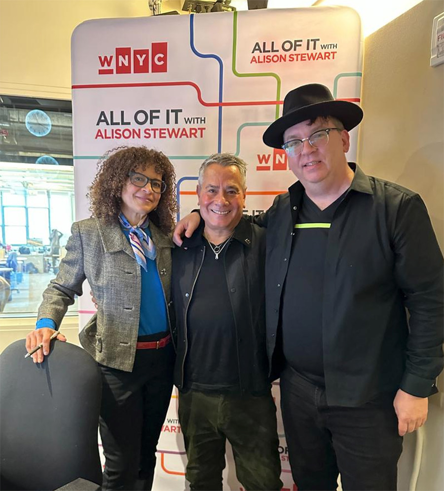
In honor of the radio station WNYC’s 100th birthday, Alison Stewart’s “All Of It” program is celebrating 100 pieces of art in New York City. Each month, Alison speaks with an expert in the art world about their 10 favorites. This month, Alison talked to Jaime Rojo and Steven P. Harrington, co-founders of Brooklyn Street Art, about 10 pieces of art in the streets that they think all New Yorkers would like to know about.
Since it was a radio show, it was impossible to show, only to tell. BSA fans have written to ask us for pictures of the pieces discussed, so here they are!
The list is unscientific and offers a wide selection of art styles and disciplines in New York’s public sphere. Please don’t take it as an indicator of importance or value; rather, take it as a casual survey of things you may see around town.
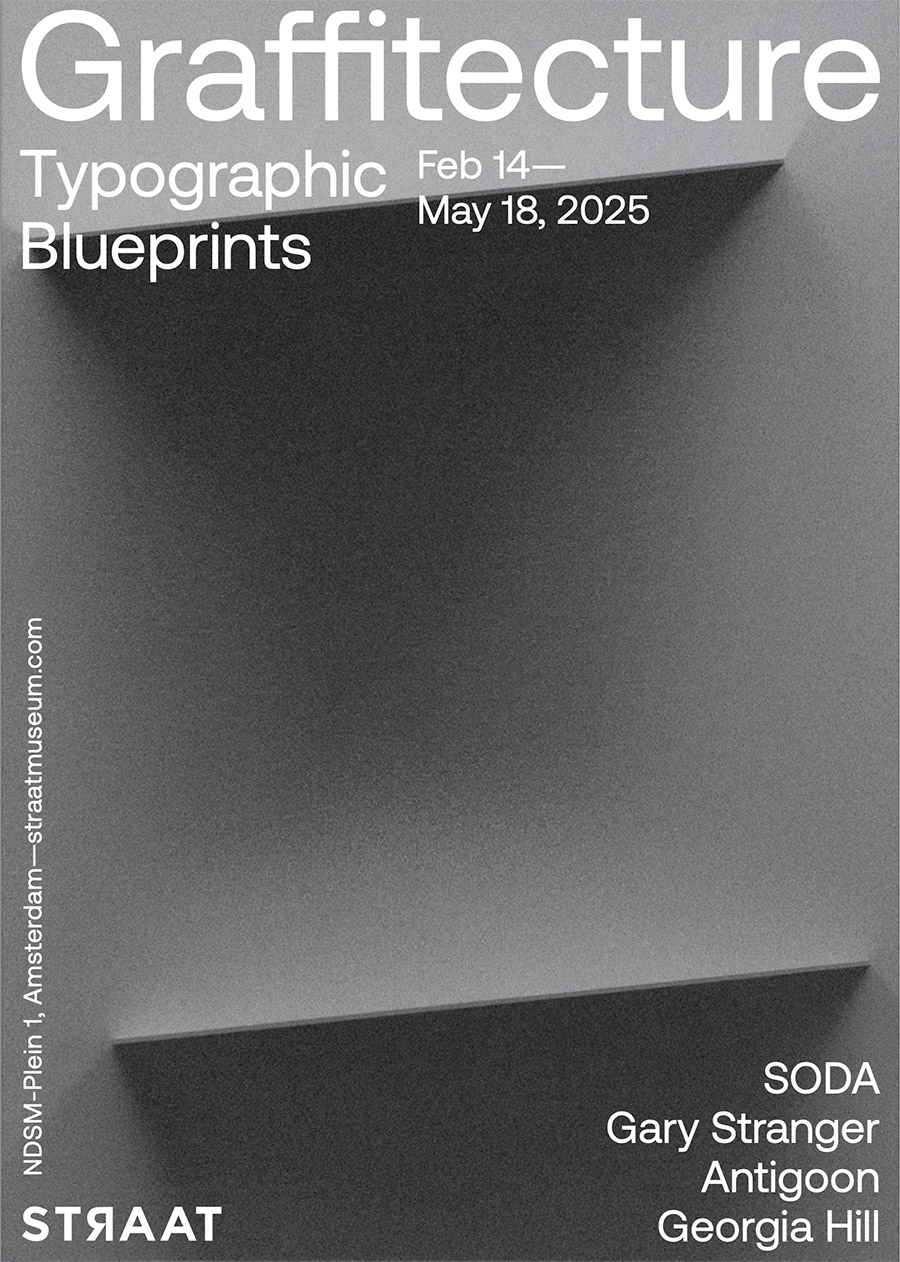
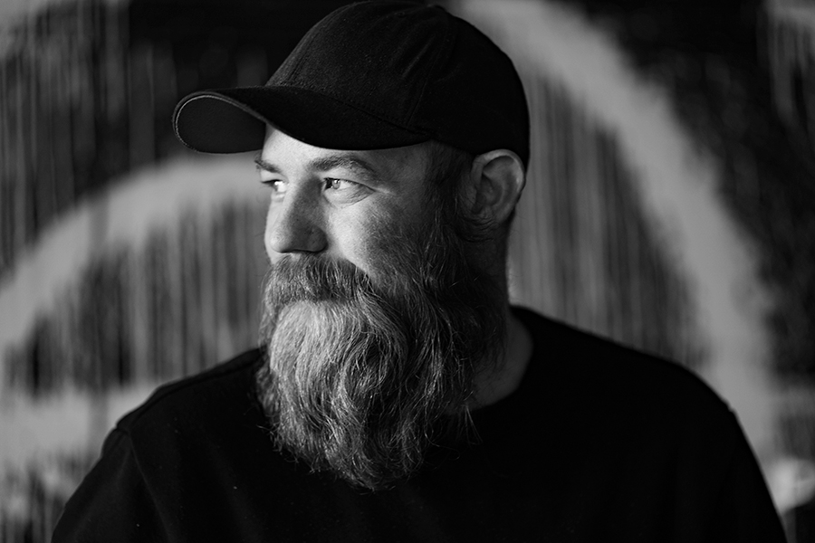
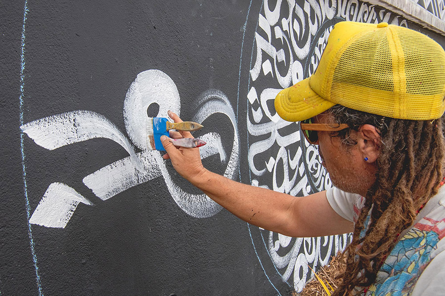
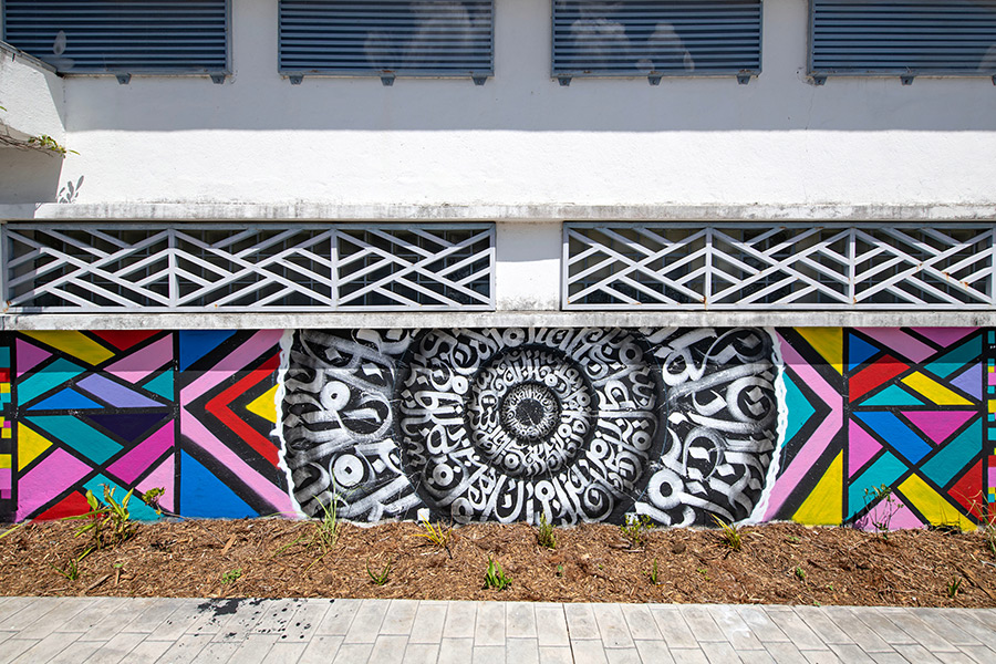
Graffitecture: Typographic Blueprints, on view at STRAAT Museum from February 14 to May 18, 2025, explores the evolving relationship between graffiti, typography, and the built environment. Curated by Hyland Mather, the exhibition brings together four artists—SODA, Gary Stranger, Antigoon, and Georgia Hill—who each push the boundaries of letterforms, blending street-born spontaneity with architectural precision. With around fifty works and several installations, the show underscores how graffiti’s evolution extends beyond its rebellious origins, shaping contemporary urban aesthetics through language and form.
What unites these artists is their ability to challenge traditional notions of typography and its place in public space. SODA’s optical illusions introduce a trompe-l’œil effect, where depth and structure emerge from flat surfaces. Gary Stranger, with his graffiti roots in MSK, refines letterforms into architectural compositions that exude elegance and control. Antigoon’s machine-assisted process introduces an almost industrial approach, evoking the mechanics of urban construction. Meanwhile, Georgia Hill’s poetic monochromatic works harness language as both message and material, inviting reflection through carefully curated phrases. Together, they offer a dialogue between chaos and control, craftsmanship and spontaneity, underscoring how typography continues to redefine urban landscapes.
BSA spoke with Curator Hyland Mather and the four artists about their practice and the show.
BSA:As an artist known for assemblages of ‘lost objects’ and a curator deeply involved in street culture, how do you perceive the intersection of graffiti and architecture influencing contemporary urban aesthetics?
Hyland Mather: Well, to start, graffiti and architecture have always been in conversation…more than that, married. I mean graffiti happens on buildings. That part is as clear as it gets. But, graffiti isn’t just something on the built environment…it’s reacting to it, engaging with it, sometimes even fighting against it, protesting. And also, the rebellious or mischievous practice of graffiti is an ethos and attitude, and that’s a huge part of the allure and charm for the culture for both the viewer and the artists. So, not only does graffiti take place ON the architecture but also IN the cityscape, IN the architecture of the city in ways other artistic movements simply don’t.
In terms of contemporary urban aesthetics…which, we all know, is a moving target…I see the intersection of graffiti and architecture continuing to evolve in ways that go beyond just paint on structures. A lot of artists are playing with depth and layering, in ways that feel ‘in conversation’ with architecture. You’ve got geometric abstraction, precision lettering that mimics architectural lines, and even a kind of ‘graffiti expressionism’ (think NUG, or Revok, or even 108) where the movement and energy of tagging culture gets translated into something that engages with architecture more fluidly, without being so tied to strict letterforms.
More from our interview with the curator after the artists.
SODA
SODA. (photo courtesy of STRAAT)
Brooklyn Street Art:Your work plays with three-dimensional illusions on flat surfaces, blending hyper-realistic and abstract forms. How do you approach the balance between abstraction and realism, and what challenges arise when scaling these concepts to larger works?”
SODA: That’s a great question. I tend to think abstractly when creating both my artworks and music. One of my main goals is to achieve a certain look and feel—something that appears hyperrealistic in detail, despite the limitations of the medium on canvas, certainly not on wall.
SODA. Arrival. Banbury, UK, 2019. (photo courtesy of STRAAT)
I aim to depict something that appears tangible, but within an abstract space—unreal, yet rendered with a sense of realism. However, when working with oil paints, I completely avoid hyperrealism. Instead, I focus on abstraction, using expressive brushstrokes and fluid compositions to create depth and movement. Light and shadow play a crucial role in shaping the geometry, while the mind instinctively fills in the details to form the bigger picture.
To me, abstraction and hyperrealism hold broad meanings. Their significance depends on how we perceive and approach them.
SODA (photo courtesy of STRAAT)
When creating, I use my own sound design as either a starting point for inspiration or as a parallel process. My approach remains abstract, even in music—where notes and rhythms follow a non-conventional, almost random structure. This randomness often leads to unexpected results, which can be more compelling than the initial idea. The same applies to my visual work, whether on canvas or walls—there’s always an intended direction, but the “unintended” elements often become a focal point.
On a larger scale, my work offers different spatial and design possibilities. Every piece presents its own set of challenges, from the initial sketch to the final execution. But to me, that challenge is an essential part of the process—an evolving interplay between control and spontaneity.
GARY STRANGER:
Gary Stranger (photo courtesy of STRAAT)
Brooklyn Street Art: Having started in graffiti in the 1990s, you’ve developed a distinctive freehand typographic style. How has that background influenced your work, and what drives your commitment to precision?
Gary Stranger: The graffiti I painted was heavily influenced by type. The characteristics and some of those letter forms have persisted through to the work I make today. The structure, rigidity, and legibility of my graffiti were important to me. I think a foundational understanding of letter form is vital if you’re going to paint good graffiti. I hope that understanding now informs my studio work in the same way.
Gary Stranger (photo courtesy of STRAAT)
I’m not sure I have a commitment to precision. I like order and I reflect that in my work. I am however trying to embrace the element of jeopardy in my current work. The nuances of the brush stroke and the imperfections of how the paint is picked up by the canvas are part of the joy now. Previously, I would have worked hard to eliminate these details.
I spent 25 years learning how to make spray paint do what I wanted it to, only to realise it was never the correct medium for the art I wanted to make.
Gary Stranger. Word Up. (photo courtesy of STRAAT)
GEORGIA HILL
Georgia Hill (photo courtesy of STRAAT)
Brooklyn Street Art:Specializing in type-based, monochromatic artworks, your pieces may reflect personal and poetic themes. How do you select the phrases you incorporate, and in what ways do you aim for your work to engage viewers on both individual and communal levels?
Georgia Hill: The phrases I feature in my works are collected over time, in a number of ways. Sometimes, I play with collaging words together, noting down misheard lyrics, or simply noting thoughts or phrases that play on my mind. I keep a long list of these and am always waiting for the right place to put them – whether that’s as a painting title, featured in an artwork, or ‘fit’ the facade I’m working with.
Georgia Hill. Come Close To Me. Mannheim, Germany, 2024. (photo courtesy of STRAAT)
I hold onto these phrases because they reflect or stir something in me, but often have an ambiguous nature. I really like that they’re open-ended and a record of a fleeting moment for myself, but that people use their own experiences and contexts to build their own connections to the work, whether that’s on an individual level or reflects a sense of connection and community.
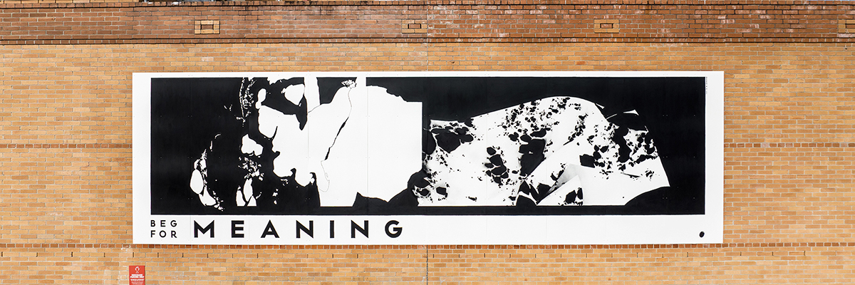
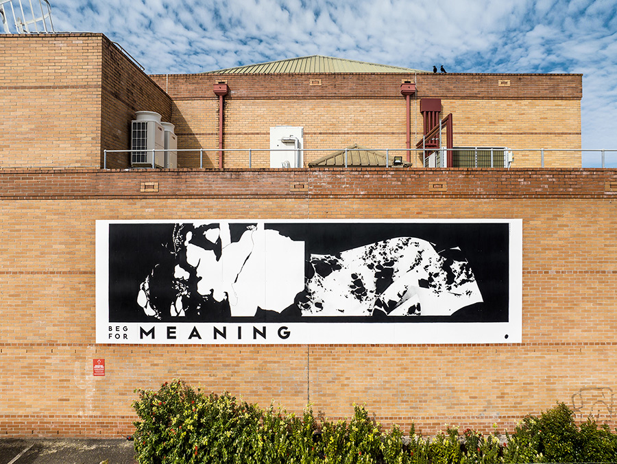
Georgia Hill. Beg For Meaning. Newcastle, Australia, 2022. (photo courtesy of STRAAT)
Brooklyn Street Art: Your work pushes the boundaries of material and process using custom-designed tools. What inspired you to incorporate these unconventional tools, and how do they influence the final aesthetic of your typographic forms?
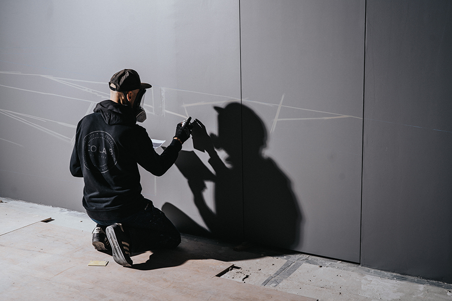
ANTIGOON: I guess it all comes down to the computer-controlled machines I started building out of boredom after years of being a web designer. These were little pen plotters that drew my designs with pen and paper. They’re very neat and precise, which was really nice in the beginning because, apparently, I did a great job building them.
After playing around with this pen plotter for a while, the neatness became quite boring. I started to enjoy the little mistakes it made, like the little blobs of ink here and there, the less-pronounced lines, and the visible vibrations of the motors.
ANTIGOON. Eindhoven, Netherlands. (photo courtesy of STRAAT)
One time, out of curiosity, I started using charcoal instead of the usual pen on paper. For the first time, it became more of a collaboration between me and the machine. I had to change my design because the lines were a lot thicker than before, tape some metal brackets to the Z-axis to add the needed pressure, and babysit the plotter because the charcoal kept running out.
In hindsight, this sparked a new playground: Let’s feed this machine weird things. This collaboration is at times a battle – this is what really triggers me. The boundaries that come with using a certain material and a machine that’s actually not made for this are fascinating.
In the end, it’s all about the question: How can we make this work? Sometimes, I have to alter my drawings; other times, I have to add extensions to the machine, change the material a bit, or completely build a new machine. These challenges are what keep it interesting for me and, hopefully, for the audience as well.
BSA’s interview with curator Hyland Mather continues here:
BSA: In curating Graffitecture: Typographic Blueprints, what criteria guided your selection of artists, and how do their diverse practices contribute to the exhibition’s exploration of typographic transformation in public spaces?
HM: I obviously couldn’t include everyone—that’s always the first limitation, haha. But these four artists I think represent a good glimpse into something much broader that’s been happening globally. With these four artists I can help introduce this story to the visitors of STRAAT.
I wanted artists who manipulate letterform in unexpected ways, basically. Two of them, Gary Stranger (MSK) and SODA, came straight out of graffiti-writing traditions, while someone like Georgia Hill works more conceptually with language…like Barbara Kruger or Jenny Holzer but on the street.
Anyways, it just seemed to me that all four of these artists share a deep understanding of how typography and letterform interact with space.
BSA:Given your experience with found-object art, how do you see the concept of ‘reuse’ manifesting in the practices of the artists featured in this exhibition, particularly in their approach to typography and spatial design?
HM: Thank you for asking this. With these four, ‘reuse’ isn’t happening in quite the same way that I engage with lost physical objects in my own work. But there’s definitely a shared sensibility. I see parallels in how they repurpose visual language, reclaim surfaces, and reinterpret structures.
Graffiti has always been partly about taking what’s available and transforming it…buildings, bridges, train cars, power boxes…, and on and on. These artists are working from that tradition but doing what good artists should do and pushing the traditions. We see great examples from each of these artists in terms of rethinking letterform, reusing language, and reshaping typography.
There’s also a shared discipline in terms of approach. Like in my own work, I see a commitment to geometric abstraction, to working within a precise and often limited palette, and to an almost meditative focus on form. So while the materials are different, the mindset of taking what exists and flipping it into something fresh, I guess I would be speaking for them, but I definitely think we all share that.
BSA:How do you see the dialogue between traditional graffiti practices and contemporary design evolving, and what role do exhibitions like Graffitecture play in this progression?
HM: See, this is a good but tricky question…I mean how many young turks started off as graffiti writers and now work in cushy design industry jobs?…a nearly uncountable number, I think. Of course lines continue to blur … advertising for example, annexes more and more from graffiti and street art culture all the time. But, let’s not forget, traditional in your face name writing graffiti is still super strong and needed…repetition, name recognition, getting up, the whole ruckus…to me this part of the culture is in ‘non-dialogue’ with contemporary design. It can have an influence on the visual language of design, but the ruckus part of the culture will never truly be embraced by contemporary design, and thank fucking god, actually.
But anyway, to go back to how I started to answer this question … a lot of artists are applying design sensibilities and innovations to their street work. So instead of ‘Design always borrowing from Graffiti’, I like to think of it as ‘Graffiti sometimes stealing from Design’
The artists in Graffitecture, I see these artists as thinking about typography and letterform not just as a personal tag but as a system of communication, like a designer or an architect thinks of their work. Something that can be constructed or deconstructed, built or rebuilt. Of course this is not new, artists like DELTA have been exploring themes like this for a very long time, there are just now more examples of artists working like this in our global culture. An Exhibition like Graffitecture helps amplify the ongoing conversations between graffiti, design and architecture for our STRAAT visitors. We are so very proud to provide the venue and forum for such a cool and nuanced topic.
For more information about this exhibition click STRAAT
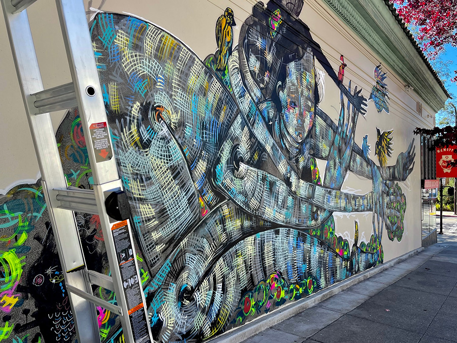
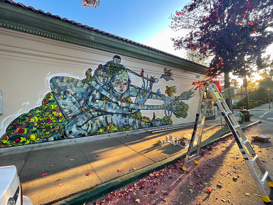
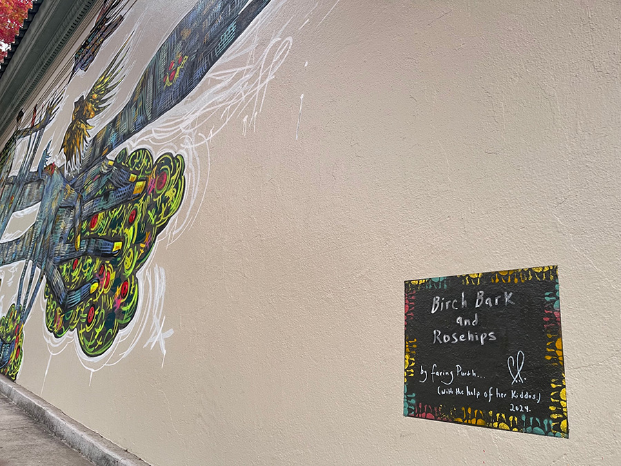
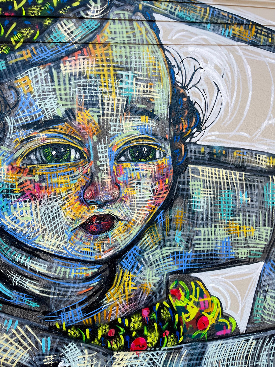
In her latest mural, Faring Purth delivers a powerful reflection on connection, continuity, and the complexity of evolving relationships—a true “Family Affair.” Created in her new home of Berkeley, California, this latest work is a pearl in her artistic journey, reflecting the changing dynamics of her life, which now includes two young children. More than just another mural, it is a living canvas where her personal experiences and creative practice intersect.
The idea of a “Family Affair” goes beyond the imagery to capture the very essence of Purth’s current process. The presence of her children has transformed her approach to painting, shifting from the solitary, all-night sessions of her earlier career to a more fluid, adaptive rhythm. Their involvement, whether by simply being there or adding their own playful touches, informs the work in surprising ways, adding layers of spontaneity and discovery.
With themes of protection, generational trauma, and natural elements like birch bark and rosehips, the mural becomes a metaphor for the unseen bonds of family. In this exchange, Faring Purth discusses her creative process, the influence of motherhood, and the ways in which her children contribute to her evolving artistic expression.
BSA: In the past, when sending dispatches from towns near and afar you’ve brought up your mother in passing, a sweet reference, something sweet and brief. This time you are a mother, and your kids are in situ while you paint, and they also paint. How does it feel to have them with you while doing your craft?
Faring Purth: Well, I’ll be honest and say the formal, strenuous, and hyper-focused work is nearly never accomplished with my son and daughter present. The role of Mothering tiny ones is an all-consuming task, as is painting large-scale murals. Neither want you to divert your gaze. But I’ll also say, that becoming a mother has facilitated a level of adaptation and fluidity I never dreamt possible. It really is like getting your Doctorate degree in organized chaos.
The pressure, for me, lead to surrender and invaluable growth… being able to do all I can when I can, allowing my hours of work to adjust to a thousand variables, including sleepless nights, tiny sniffling noses, and the simple act of being barefooted in the grass with them. All of these countless adjustments impact the work enormously. I miss my all-nighters in the studio but they’ll be back, I’m sure. For now, I love the spontaneous bursts of progress I make with the kids, the “beginner’s mind” they undoubtedly inspire, the many ways of involving them, and the support that allows me the ability to still be alone and painting when I need to be.
BSA: “Birch Bark and Rosehips”: What comes to mind?
Faring Purth: While creating the piece, many experiences unfolded in my own life concerning things like facing generational traumas, coming to terms with past abuse, and protecting myself and the kids in some very literal and some abstract ways.
BSA:This mural seems to be a family portrait. A young mother and her children?
Faring Purth: The reflections are almost never literal. Although I am often surprised at how unintentionally reflective they are. I’d like to believe many artists share that playful relationship with the work.
BSA:Children are often a constant presence in your work. Why?
Faring Purth: Another very honest statement is the work is often a surprise, even to me. I won’t deny that I am inspired by many things but much of it remains like kneading through a mystery, over and over. I will say the oddity and poetry of my own life began early on. I remember the depths of my perceptions at a young age and witness it now in my children. It has my attention often… and reverence.
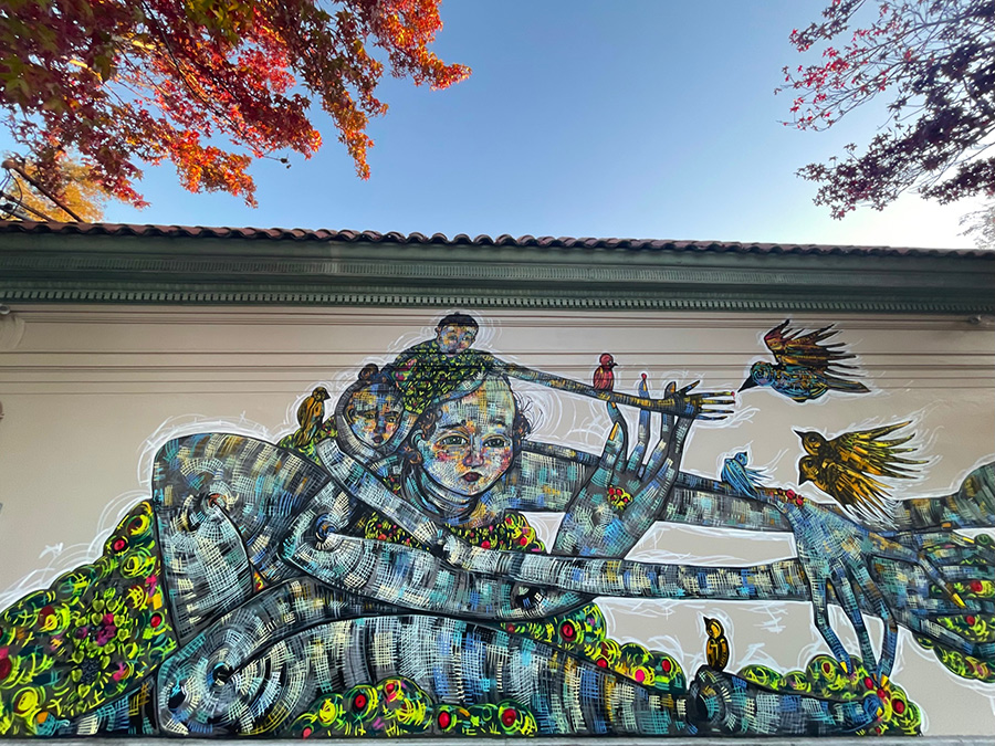
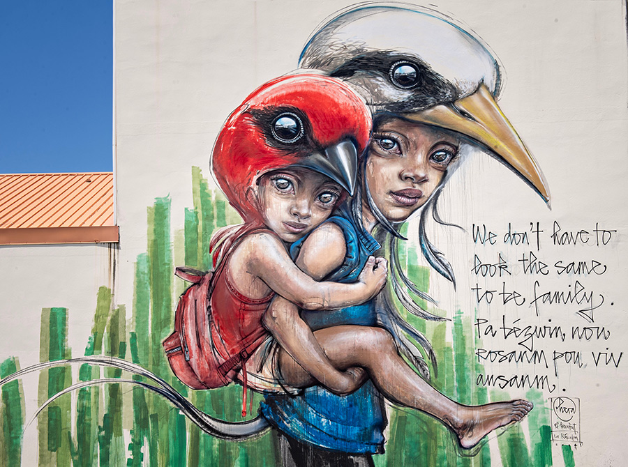
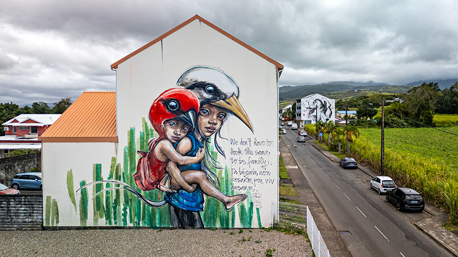
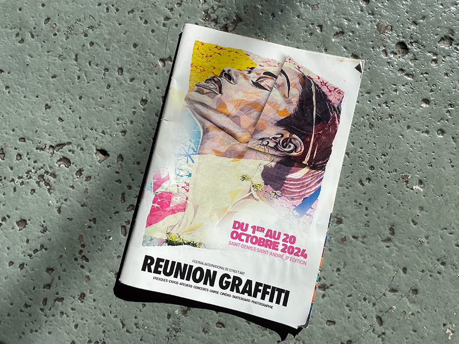
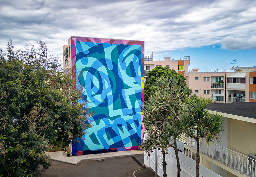
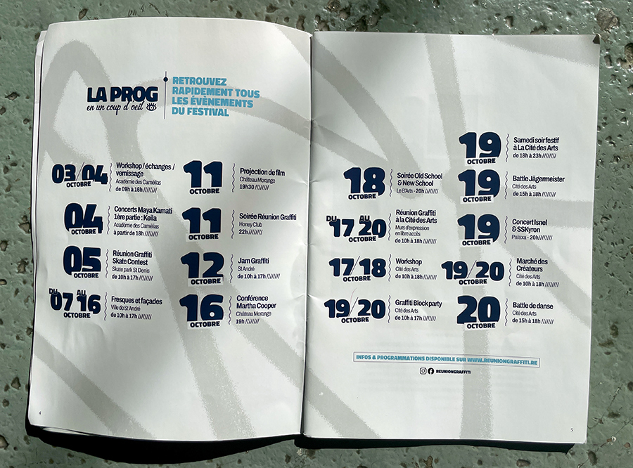
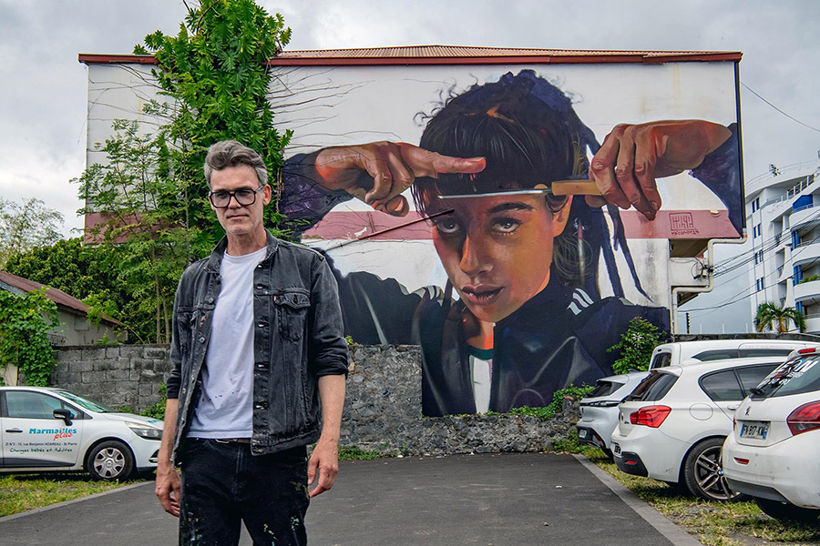
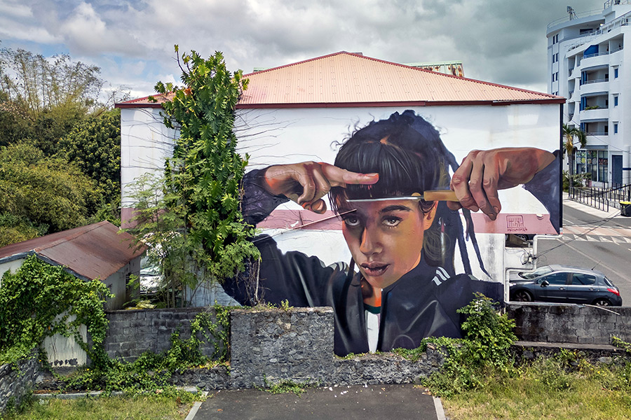
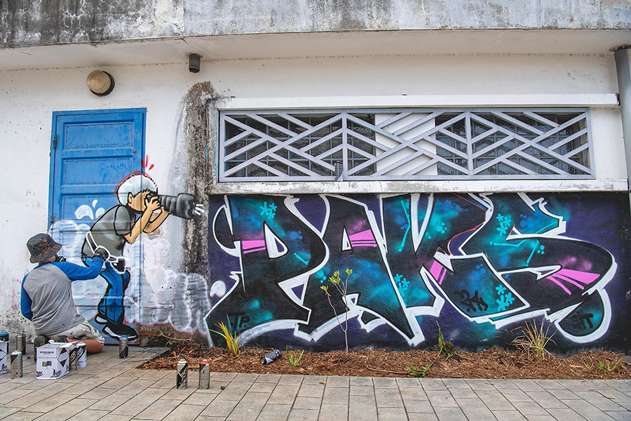
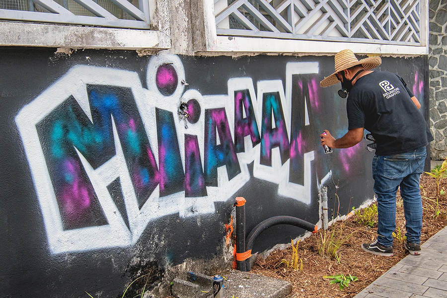
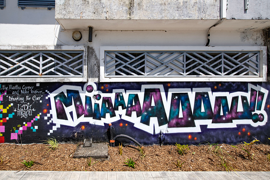
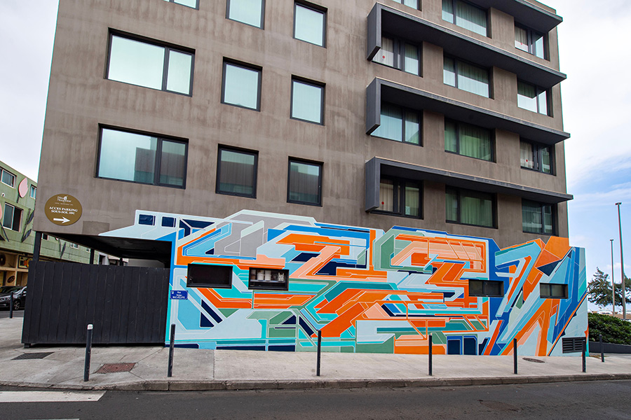
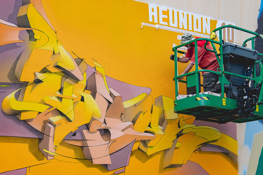
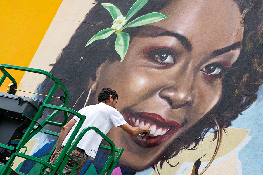
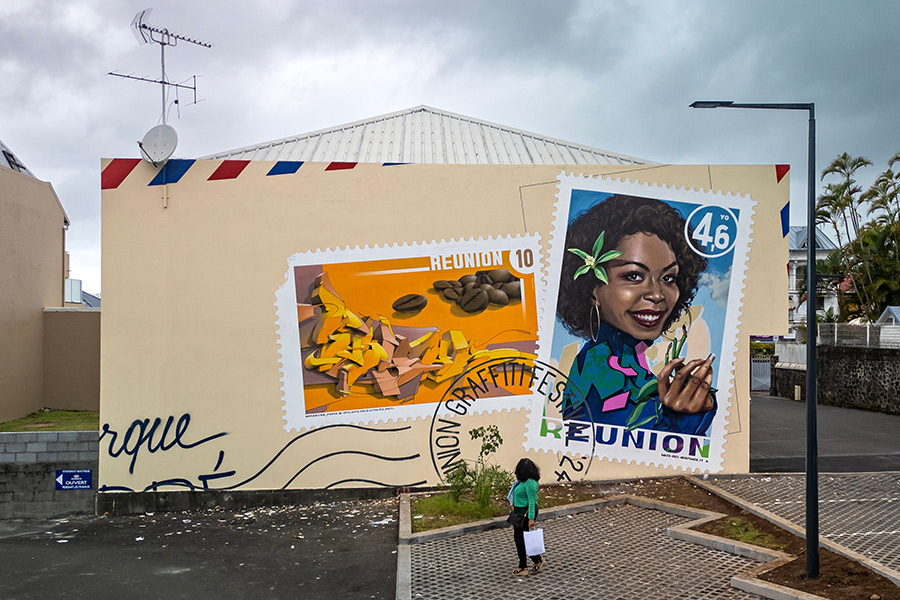
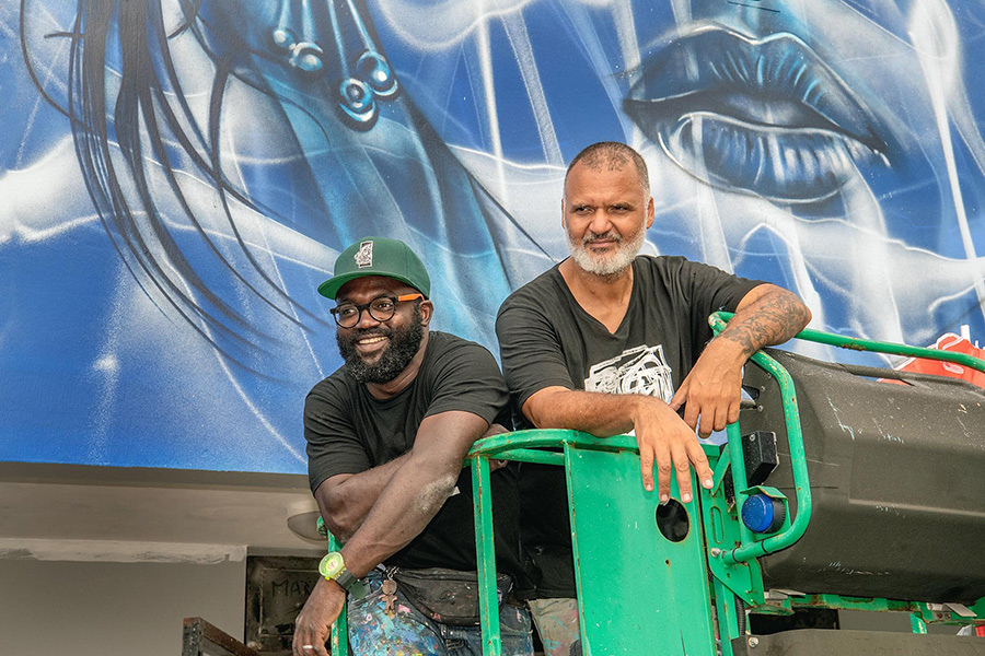
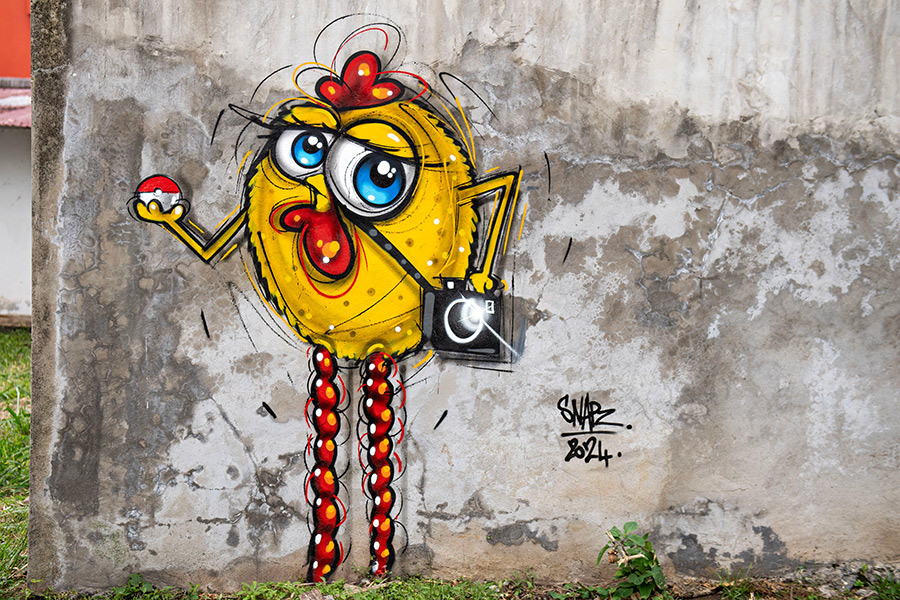
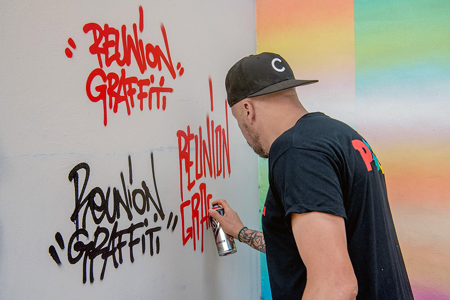
A place you may not have heard of, Réunion Island has quickly become a remarkable hotspot for urban art, largely due to the Réunion Graffiti Festival. This annual gathering showcases a rich range of talent from graffiti and street art communities worldwide, offering something refreshingly unique for this type of festival.
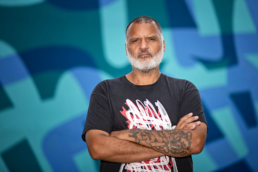
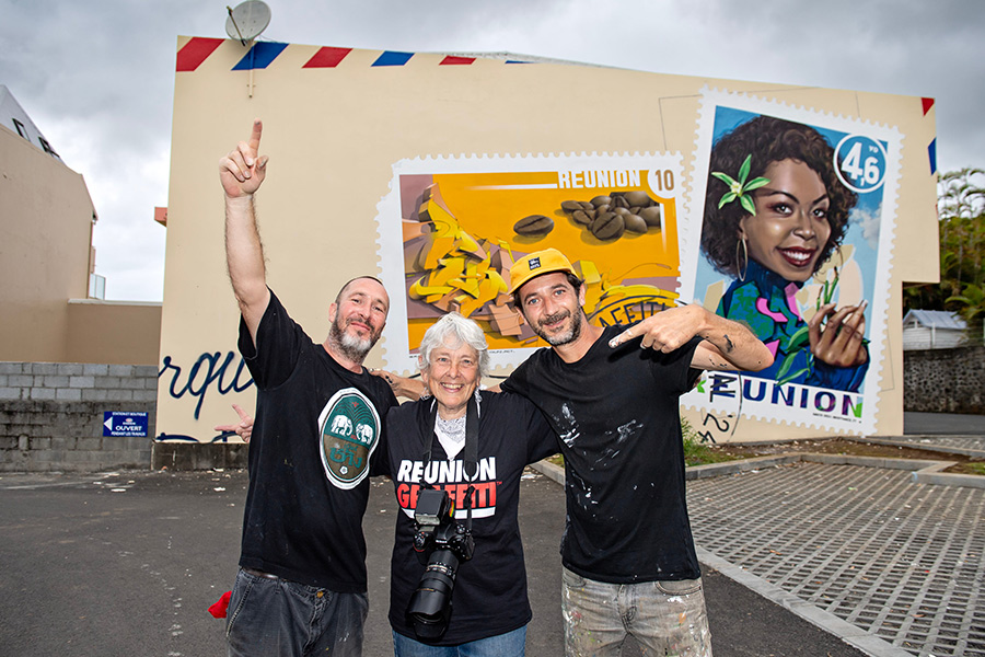
Eko, the festival’s founder, extends an open invitation: “Come to Réunion, see the artists, see the walls, and the beautiful city.”
Born in 1976 on Réunion Island, Eko began his graffiti journey in 1989, inspired by hip-hop culture and gaining recognition under the tag “Saphir.” As one of the pioneers of graffiti on the island, he collaborated with local crews like SRD (Syndicat du Rap Dionysien) and later joined LSA (Le Syndicat des Artistes). Eko’s creative reach extends beyond graffiti to music and performance, and his time in mainland France deepened his appreciation for Réunion’s vibrant culture, which he was eager to elevate upon his return.
With respect for his homeland and a vision of global recognition, Eko founded the Réunion Graffiti Festival in 2019. Each year, the festival expands, now including an impressive lineup of international and local artists, community-focused programs, and interactive events for diverse audiences.
A French overseas department in the Indian Ocean, Réunion is located approximately 679 km east of Madagascar and 175 km southwest of Mauritius. Known for its stunning volcanic landscapes, including the active Piton de la Fournaise, Réunion is home to about 885,700 residents. The island’s unique blend of French, African, and Indian influences is evident in its culture, cuisine, and language, with Réunion Creole widely spoken alongside French. Since 1946, it has been governed as a French region, making it one of the European Union’s outermost regions and a part of the eurozone. This blend of European governance and Creole heritage gives Réunion its distinct identity, celebrated through its music, arts, and now, street art.
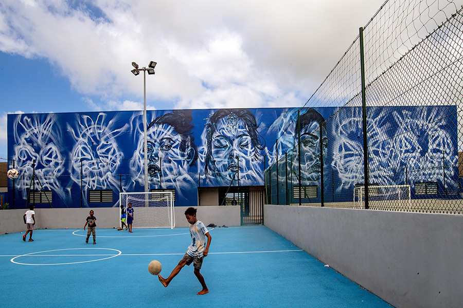
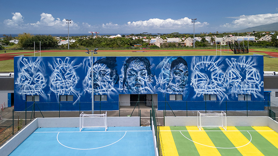
Since its inception, the festival has showcased global talent across graffiti and street art practices, hosting more than 100 artists, including renowned figures from countries such as Germany, Argentina, Spain, the U.S., India, Italy, Japan, Senegal, Switzerland, and Togo. This mix brings a dynamic blend of styles, reinforcing the island’s position as a hub for global urban art.
A key feature is Graff Park in Saint-Denis, a dedicated space for free expression where artists—from beginners to veterans—can experiment and showcase their work. Supported by both public and private funds, the festival emphasizes inclusivity, offering community workshops, recreational activities, and sessions that help budding artists learn techniques and connect with mentors.
Beyond murals, the festival highlights Réunion’s cultural vibrancy with exhibitions, live music, and dance battles. These programs blend local talent with international flair, complemented by Acts, an outreach initiative that provides regular updates and information on Réunion’s street art scene. This effort helps keep art enthusiasts connected to the evolving urban landscape on the island.
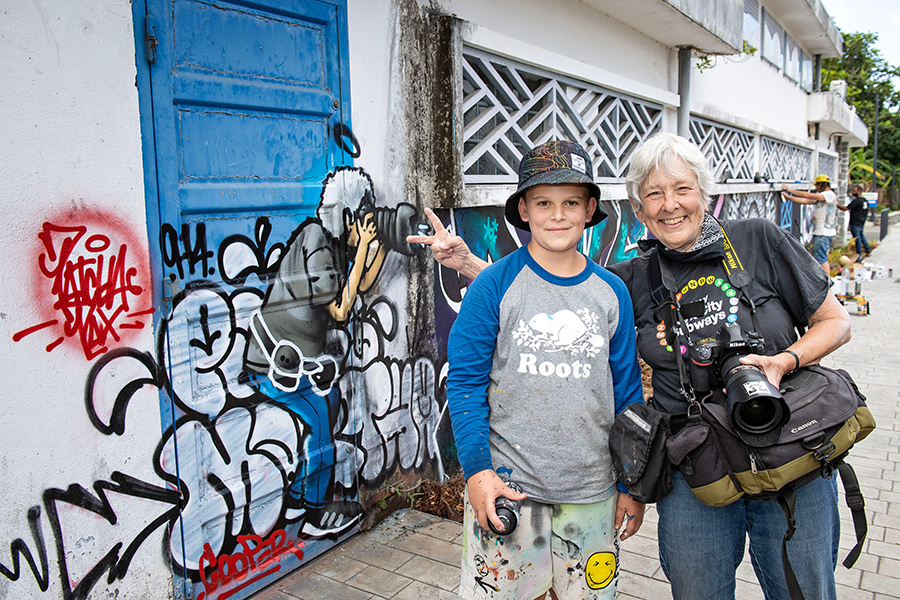
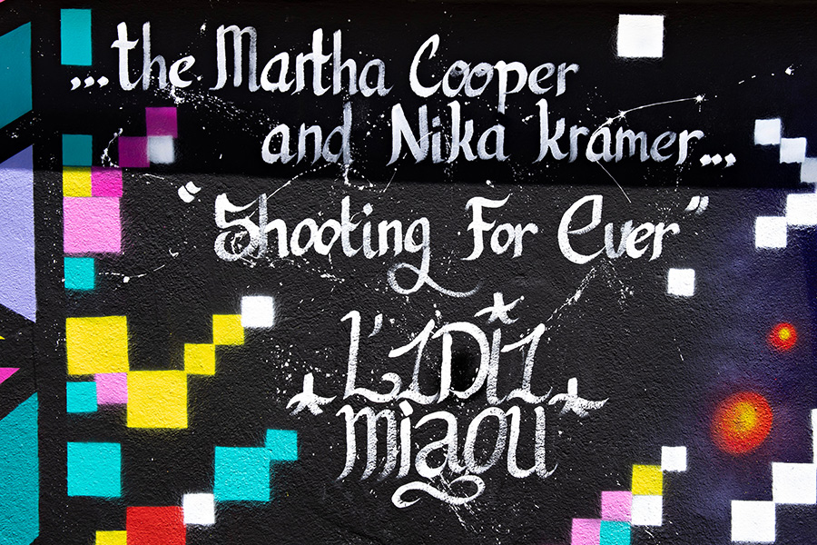
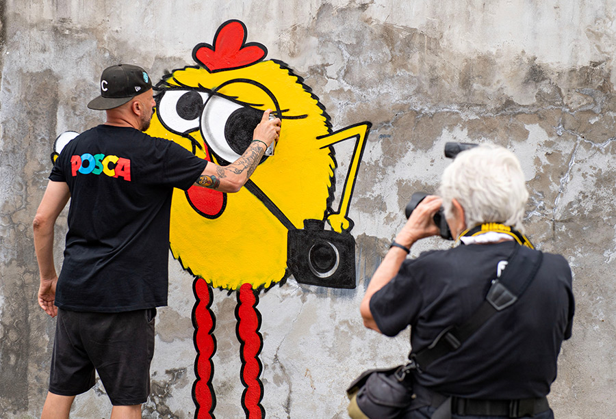
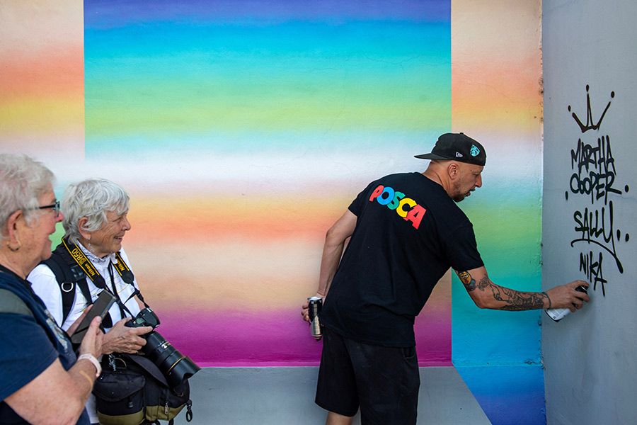
This year, renowned photographers Martha Cooper and Nika Kramer were honored guests, hosting a symposium to discuss their work documenting the hip-hop scene over many decades. New images of Réunion’s street art were captured, and Ms. Kramer conducted interviews with participants, further enriching the festival’s archive and legacy.
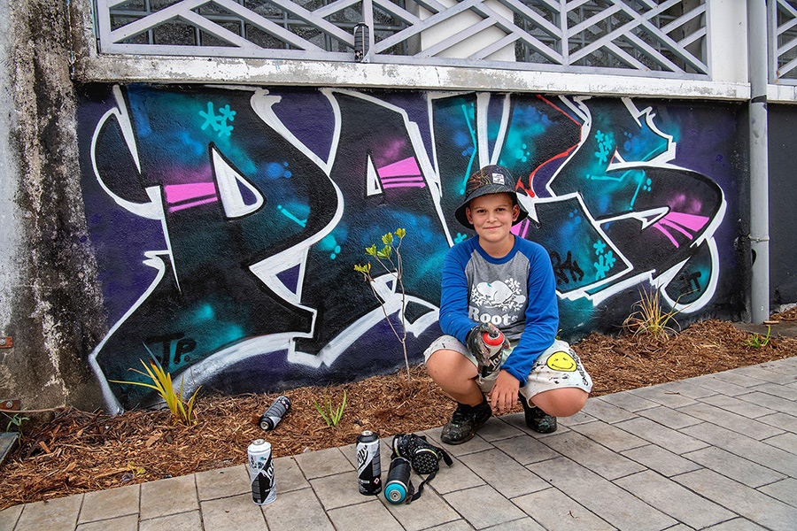
From conversation with Nika Kramer, we learn that a young enthusiastic fan of the work of photographer Martha Cooper was not only attending, but participating in the painting of walls this year at the festival. One of the youngest graffiti writers interviewed for BSA, Patcha Pax shares personally his experience here for BSA readers. Afterward is a full interview with the writer by Nika Kramer.
“I knew Martha Cooper before I met her. I had seen a report about her and the 1UP on YouTube, and my mom gave me Subway Art for Christmas 2022. So when I saw that Martha Cooper was coming to the Graffiti Reunion this year, I jumped for joy! My mom signed us up for the conference right away.
I know what Martha Cooper has done so well that during the conference, I answered the questions that Olivier Cachin asked before she did.
I also was very familiar with the 1UP video that was shown.
Meeting her was incredible because I felt as if I was living through her moments with the vandal graffiti artists, especially the 1UP crew. In my mind, I was running with her and them to secretly paint on the subways. It was like touching the real world of graffiti with my fingertips.
I saw that there was still room on the wall.
I saw MC taking a picture of Miaou, so I decided to take a photo of her and reproduce the drawing on the wall. A photograph captures a moment for a lifetime… it was my way of capturing this moment forever. It is painted forever on the wall. And so every time I see this graffiti, I will think back to that moment when MC was there, that she was taking pictures of all of us. And also of the moment when Sally and you were taking a picture of her in front of my Graffiti of her. It brings back a lot of good memories forever.
For MC’s drawing, I think I wanted to please her by drawing her. It was a gift so that she would be happy” ~ PP
NK: When did you see graffiti for the first time? PP: I first saw graffiti when I was 7 years old. I loved it straight away. I had to give a presentation in class and I chose the theme of Graffiti. So I asked Eko LSA by message on Instagram if he would be willing to come during my presentation. He accepted. It was the first time I met him.
NK: How did you get into graffiti PP: I really got into graffiti when I went to see a graffiti festival for the first time, Le Réunion Graffiti in 2021. I saw all these artists painting on huge walls. I asked Eko if I could have one. He replied “train a lot and one day I promise you that you will have your wall”. The next day, I asked my mom to sign me up for drawing classes. Then I practiced whenever I could on paper and my garden wall.
NK: Why did you start writing PAKS? PP: For my tag, I wanted a name that meant something positive. I searched for the word “Peace” in all languages. I found “Patcha” in Romani (India I think), “Pax” in Latin, and “PAKS” in Polish. So my name is Patcha Pax but I write it PAKS most often.
NK: What do you love about the graffiti scene in Réunion? PP: In Réunion, I like the fact that there are many different styles of graffiti. I mainly like the lettering, like that of Arêm and Lego. But I also like certain drawings like those of Macak, Bayko, and Ador.
My mother immediately accepted my passion for graffiti because she always says that she prefers to see me express myself on walls outside rather than sitting for hours in front of a television screen. So she left me a huge wall in the garden to paint whatever I wanted.
My grandparents were not interested in graffiti at all, but now, when they travel, they look for graffiti walls in cities and send me photos. On Sundays, instead of watching television shows about cars, my grandpa watches videos about graffiti with me.
PP: So ! I think I answered all your questions. My vacation is almost over. I go back to school on Monday.
I was very sad at the end of the Réunion Graffiti Festival because it was an incredible week. In 2 weeks I will be at the Run Colorz festival in St Louis so it will be awesome! I will send you photos if you want. I hope your vacation ended well in Réunion and you liked our island.
NK: When did you see graffiti for the first time? M: I discovered graffiti when I was in primary school, a little before the 2000s.The teacher gave us a lesson on prevention against damage, particularly graffiti. It had the opposite effect on me (ha, ha), On my way to school from home I started to spot all the graffiti, (a lot of “kope” tags at the time). But at that time, in Réunion, it was still mysterious. I didn’t understand much about it.
NK:How did YOU get into graffiti? M: In 2005, a friend tagged it in my school notebook. I was impressed by his hand style, which was brutal, precise, and aesthetic. I immediately felt in love with this universe: since that day, graffiti has taken an important place in my life. I quickly started drawing, meeting people on the scene, testing the equipment, finding spots, and understanding the history behind this movement.
It was a brilliant passion for the teenager that I was: diving into a mysterious universe, where you had to make yourself known while remaining anonymous, where you had to come close to the forbidden just for the sake of painting,… Something to break the monotony of my days!
NK:Why did you start writing Miaou? M: Miaou was my nickname as a child, so it was quite natural that I decided to use it on the wall. In the end, it’s cool because it’s also a fun and memorable name, which allowed me to stand out to people who aren’t necessarily from the graffiti scene.
NK: What do you love about the graffiti scene in Réunion? M: The graffiti scene in Réunion is cool because you can paint in flip flops (ha ha)… More seriously, the scene is constantly active and has nothing to envy from other countries. I find that there is a very good level on the island, regardless if you are getting up illegally or legally, in graffiti or street art. The fact that there are many players around challenges us to improve and to stay in the game. But this competition is healthy, we all know each other.
From an interview with Nika Kramer, Ceet talks about his life in China and how his chicken character developed.
“So the first time I saw graffiti was in about 1983-84. I began painting in 1988, but my participation with the culture before that was break dancing.” Nika Kramer:How did you get into the chickens?
CEET: My chicken story started 22 years ago in China. I was in Shenzhen. I couldn’t speak Mandarin, and the Chinese couldn’t speak English, so we had a big problem communicating. So I started to draw everything: what I was doing, everything I wanted to eat, everything I wanted to do. I started to draw everywhere. And I communicated like this for the first time.
And then, step by step, I learned Mandarin. And I live in Hong Kong. Why? Because a company brought me to China to do graffiti work. I came one time, two times, three times, and I stayed longer each time. One day I got the apartment and I stayed there and I lived there. It’s very simple. I like to live there because it is amazing. Many people respect me. I learned a lot about how to paint graffiti using brushes, oil, and sculptures, and I started to have very nice connections with the many people there. This is how I matured my art practice and now and I put my chickens everywhere.
Spanish artist Gonzalo Borondo, from Valladolid, arrives at LuzMadrid Festival with Redentora, a site-specific installation that continues his steady movement …Read More »